Skip to content
Code CRFTD15 for £15 off
Free Shipping on Orders over £399.

Collection: Zellige

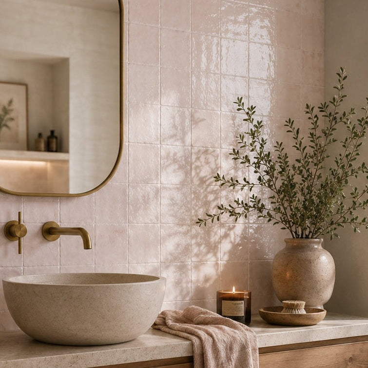
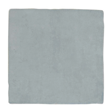
Few tile styles create quite the same atmosphere as Zellige. These square tiles capture that familiar combination of soft colour, tonal variation and a gently luminous surface, giving the wall a depth that a perfectly uniform tile simply can't replicate. In Light Blue, Pink and White Pearl, they can be used to create anything from a quietly tonal backdrop to a much more characterful tiled wall.

3 products

A large part of the appeal is that the wall never reads as one completely flat colour. Small changes from tile to tile catch the light differently, so your eye moves across the surface rather than seeing a perfectly repeated grid.

That is particularly effective with a square format because the tiles don't have a strong directional shape competing for attention. The colour, surface and grout become the things that create the character.

It's also why Zellige-style tiles can feel more relaxed than a highly uniform ceramic, even when the overall layout is very simple. The structure is regular; the surfaces aren't quite as predictable.

Light Blue, Pink and White Pearl are all relatively soft colours, but they can produce surprisingly different rooms depending on what sits alongside them.

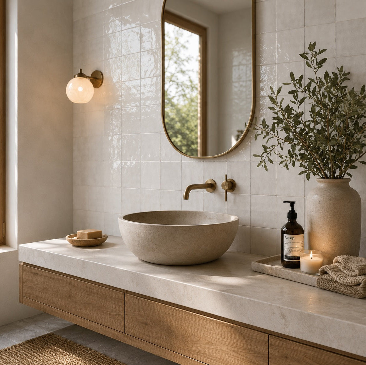
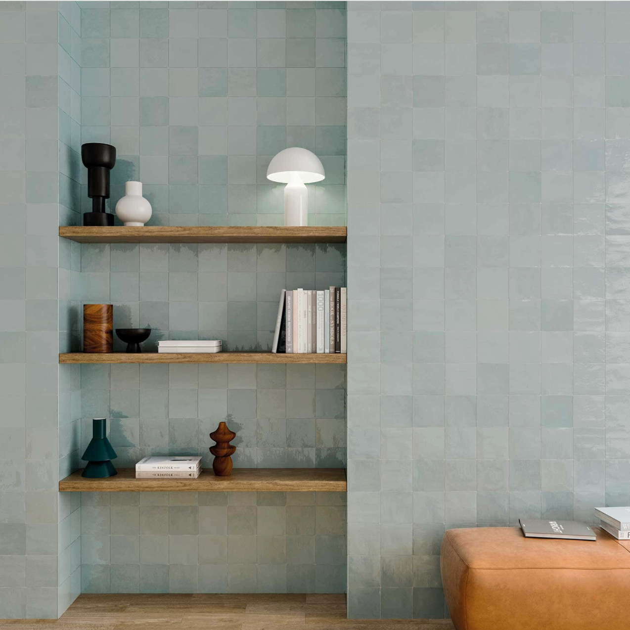
Light Blue can feel fresh with warm timber and natural stone, while Pink can be softened with creams and warm whites or given more definition with darker fittings. White Pearl is the easiest to take in a number of directions, particularly if you want the texture and variation of the tile to provide the interest rather than relying on a strong colour.

I'd be wary of trying to match the tile too precisely elsewhere. With a varied surface, picking out one of the quieter tones in the tile often creates a more natural-looking scheme than repeating the main colour everywhere.

With a tile like this, variation shouldn't be treated as something to hide. It's one of the reasons the finished wall feels more interesting.

When several pieces are installed together, subtle differences in tone and reflection create an almost painterly effect. Some tiles catch more light, some appear slightly deeper in colour, and the overall surface develops a rhythm that you simply don't get from identical pieces.

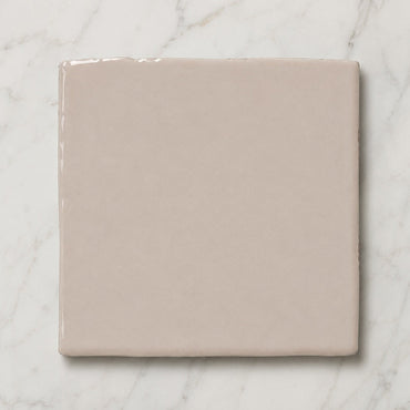
That also means you should expect the finished wall to have more movement than the product image suggests. A single sample is useful for understanding the colour and finish, but seeing several tiles together is a much better indication of the character you'll get across a full wall.

The grout is particularly important here because there are already subtle differences between the individual tiles.

A closely matched grout allows those differences to flow together, giving you a softer, more continuous surface. A contrasting grout reinforces every joint and turns the square format into a much stronger graphic grid.

Neither is inherently right. It depends on whether you want the individual tiles to be the feature or the overall wash of colour and light. With the softer shades in particular, a close grout can create a beautiful, almost seamless effect, while a stronger joint makes the installation feel much more structured.

The 13 × 13cm format gives you a quiet canvas, which means the surrounding design can take the collection in very different directions.

Used across a full bathroom, it can create an immersive, softly coloured backdrop. Used more selectively behind a basin, bath or open shelving, the tonal variation becomes a smaller feature.

You can also change the feel through the layout and grout without changing the tile itself. That's one of the strengths of this style: the individual tile is deliberately simple, so the surface, colour and installation choices have room to do the interesting work.

You might like