

Collection: Sage Tiles
Sage wall tiles have a softness that makes them remarkably easy to live with. Sitting somewhere between green, grey and earthy neutrals, sage can bring colour to a room without becoming the dominant feature. Depending on the finish and surrounding materials, it can feel fresh and contemporary, warm and natural, or quietly traditional - which is part of what makes sage so versatile.

-


Mediterrano Sage Porcelain Wall Tile 5x40cm
Mediterrano Sage brings together soft green tones and subtle surface variation to create a calm, understated wall tile inspired by...
£46.99 -

Sutton sage Matt Porcelain Wall Tile 6x30cm
Fresh, uplifting and full of charm, Sutton sage brings a lighter, more playful energy to the collection. The gentle green...
£22.49 -


Riviera Olive Ripple Gloss Wall Tile 6.5x20cm
Earthy and softened in tone, Riviera Olive draws inspiration from aged olive pigments and sun-washed Mediterranean interiors. The rippled gloss...
£31.99 -


London Sage 10x20cm
London Sage 10x20cm The high-gloss ceramic surface not only enhances the gentle green tone but also reflects light to keep...
£22.99 -


Countrywide Sage Handmade Effect Wall Tile 7.5x30cm
Muted sage tones give this collection a softer, more organic feel while the lightly glazed surface keeps the finish understated...
£22.99 -


Underground Sage 10x20cm
Metro Sage Flat Gloss Wall Tiles 10x20cm Add calm and contemporary character to your walls with the Metro Sage Flat...
£22.99 -

Palais Olive Gloss Wall Tile 20x6.5cm
Earthy and grounded, Palias Olive captures the relaxed beauty of Mediterranean landscapes. The muted green tone feels warm and natural,...
£31.19 -

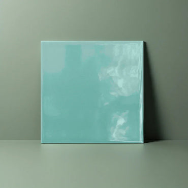
Modern Square Sage Green Flat Gloss 15x15cm
Modern Square Sage Green Flat Gloss 15x15cm Bring a fresh, feel-good vibe to your home with our Modern Square Sage...
£22.99 -


Modern Square Sage Green Flat Matt 15x15cm
Modern Square Sage Green Flat Matt 15x15cm Add a calming, organic touch to your interior with the Modern Square Sage...
£22.99


Why does sage feel so calm?
Sage works beautifully with warm materials
How do you stop sage becoming too pale?
Sage in kitchens, bathrooms and beyond