

Collection: Riviera
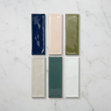
There’s something wonderfully tactile about Riviera. The gently rippled surface catches the light differently across each tile, giving what is otherwise a simple rectangular format a surprising amount of depth. It has an easy, slightly nostalgic quality, but the clean proportions and varied colour palette make it just as comfortable in a contemporary setting.

-
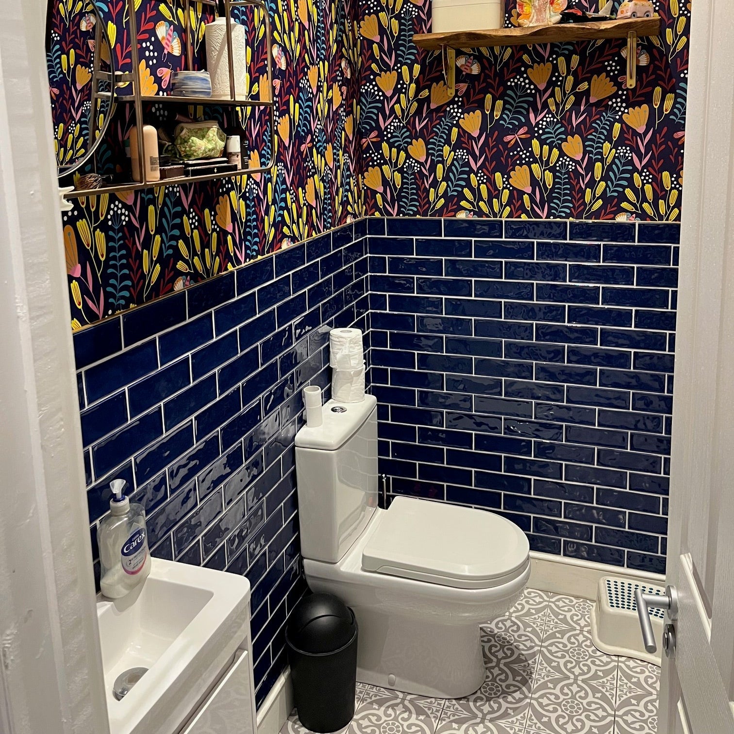
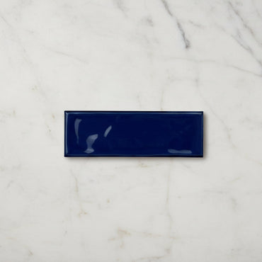
Riviera Blue Ripple Gloss Wall Tile 6.5x20cm
A softened blue ceramic wall tile with a reflective rippled surface inspired by coastal ceramics and weathered Mediterranean tones. The...
£31.99 -
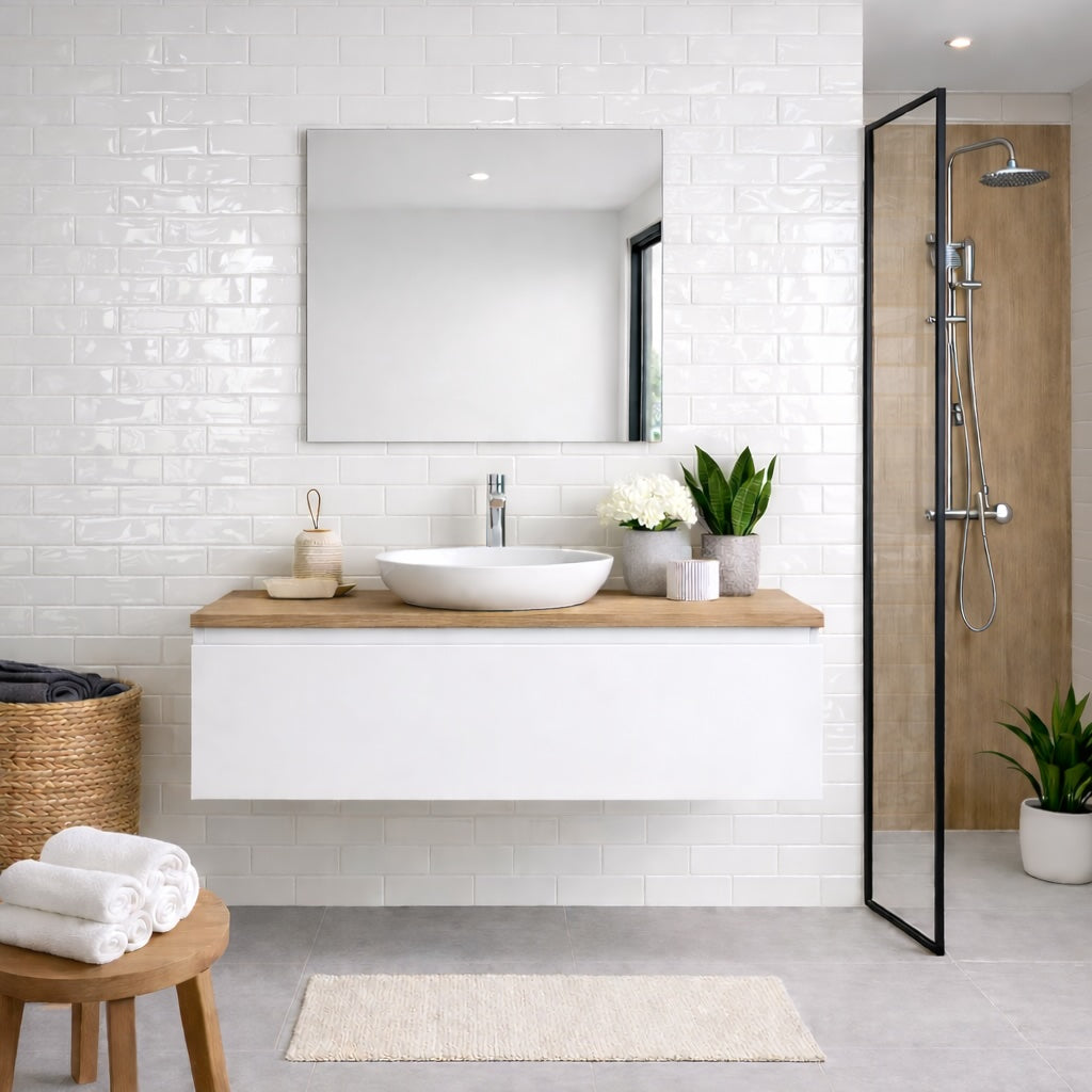
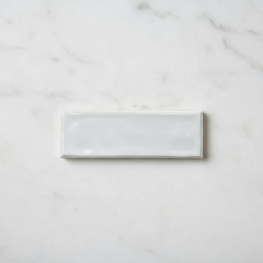
Riviera White Ripple Gloss Wall Tile 6.5x20cm
A crisp white ceramic wall tile with a softly rippled gloss surface that reflects light gently across the wall. Clean...
£31.99 -


Riviera Olive Ripple Gloss Wall Tile 6.5x20cm
Earthy and softened in tone, Riviera Olive draws inspiration from aged olive pigments and sun-washed Mediterranean interiors. The rippled gloss...
£31.99 -
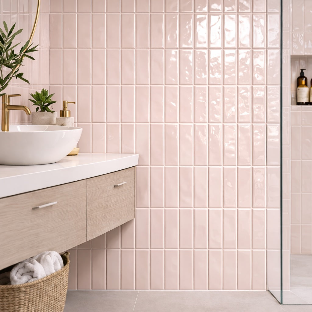
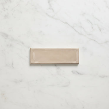
Riviera Soft Pink Ripple Gloss Wall Tile 6.5x20cm
A muted blush-toned ceramic wall tile with a softly rippled gloss finish. Riviera Soft Pink introduces warmth subtly through colour...
£31.99 -
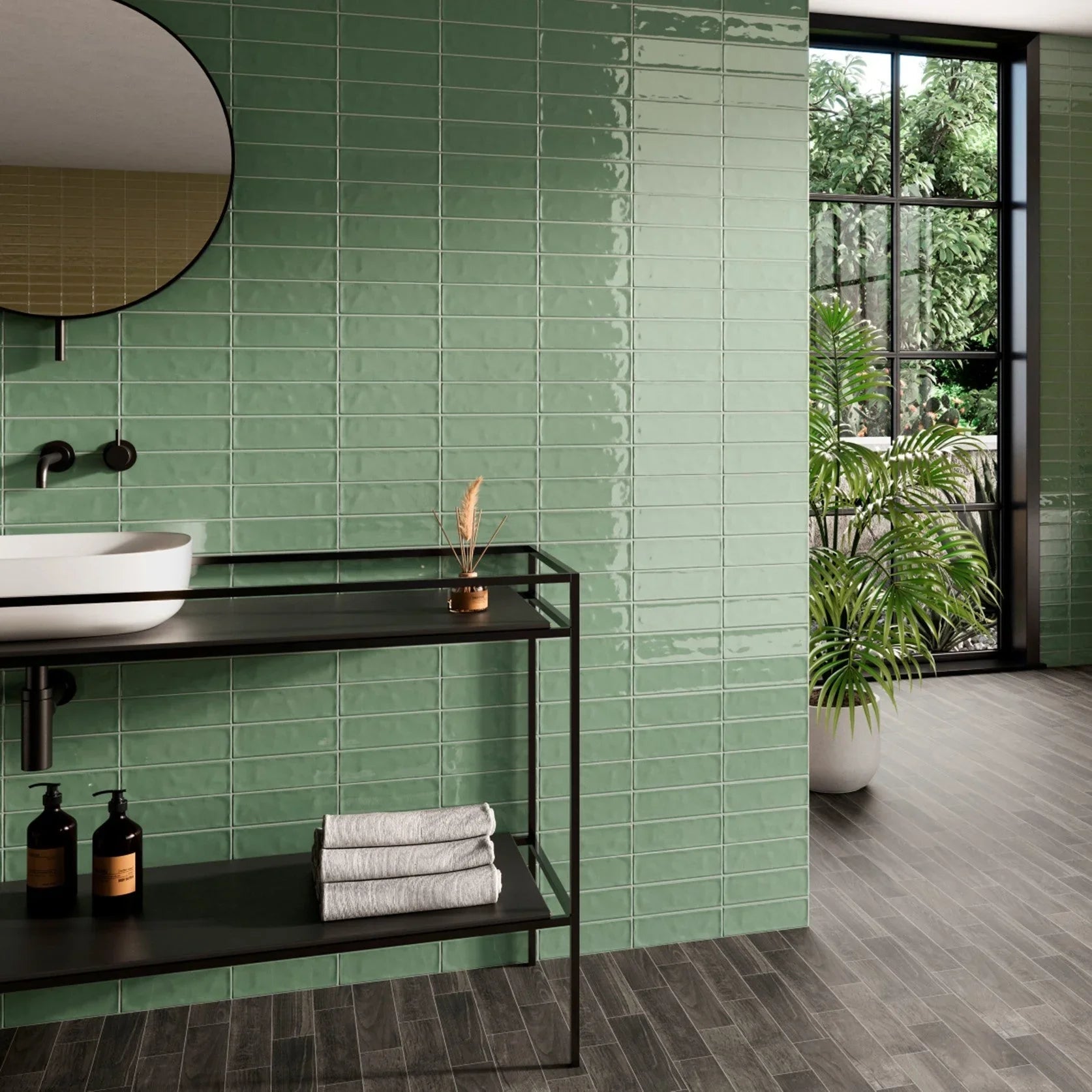
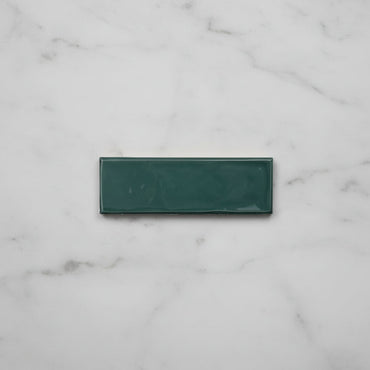
Riviera Green Ripple Gloss Wall Tile 6.5x20cm
Riviera Green combines deeper mineral tones with a softly rippled gloss finish that gives the surface a more fluid, handcrafted...
£31.99 -
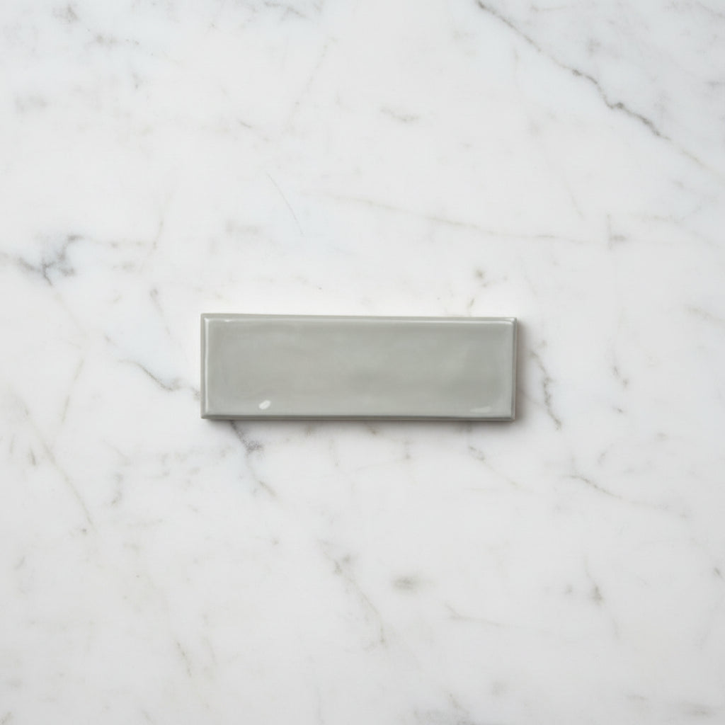
Riviera Pearl Ripple Gloss Wall Tile 6.5x20cm
Riviera Pearl sits between warm white and pale stone, offering a softer neutral with subtle depth through the undulating gloss...
£31.99


Why the ripple makes Riviera different
Choosing a Riviera colour
The ripple changes how you see the wall
Grout, pattern and those little waves of light