

Collection: Precinct
Precinct takes a very simple approach to wall tiling: clean proportions, flat surfaces and colour that does most of the talking. The longer rectangular format gives the wall a strong, considered rhythm, while the varying shades range from quiet White through to much richer Blue, Turquoise, Aqua and Caramel. It is a collection that proves a straightforward tile doesn't have to produce a straightforward room.

-
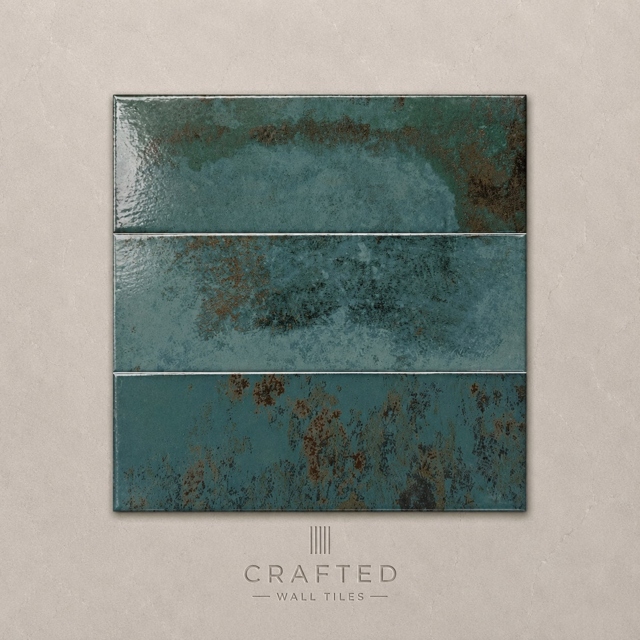
Precinct Turquoise Wall Tile 10x30cm
Vibrant, expressive and full of personality, Precinct Turquoise is designed for interiors that embrace colour with confidence. Inspired by artisan...
£44.99 -
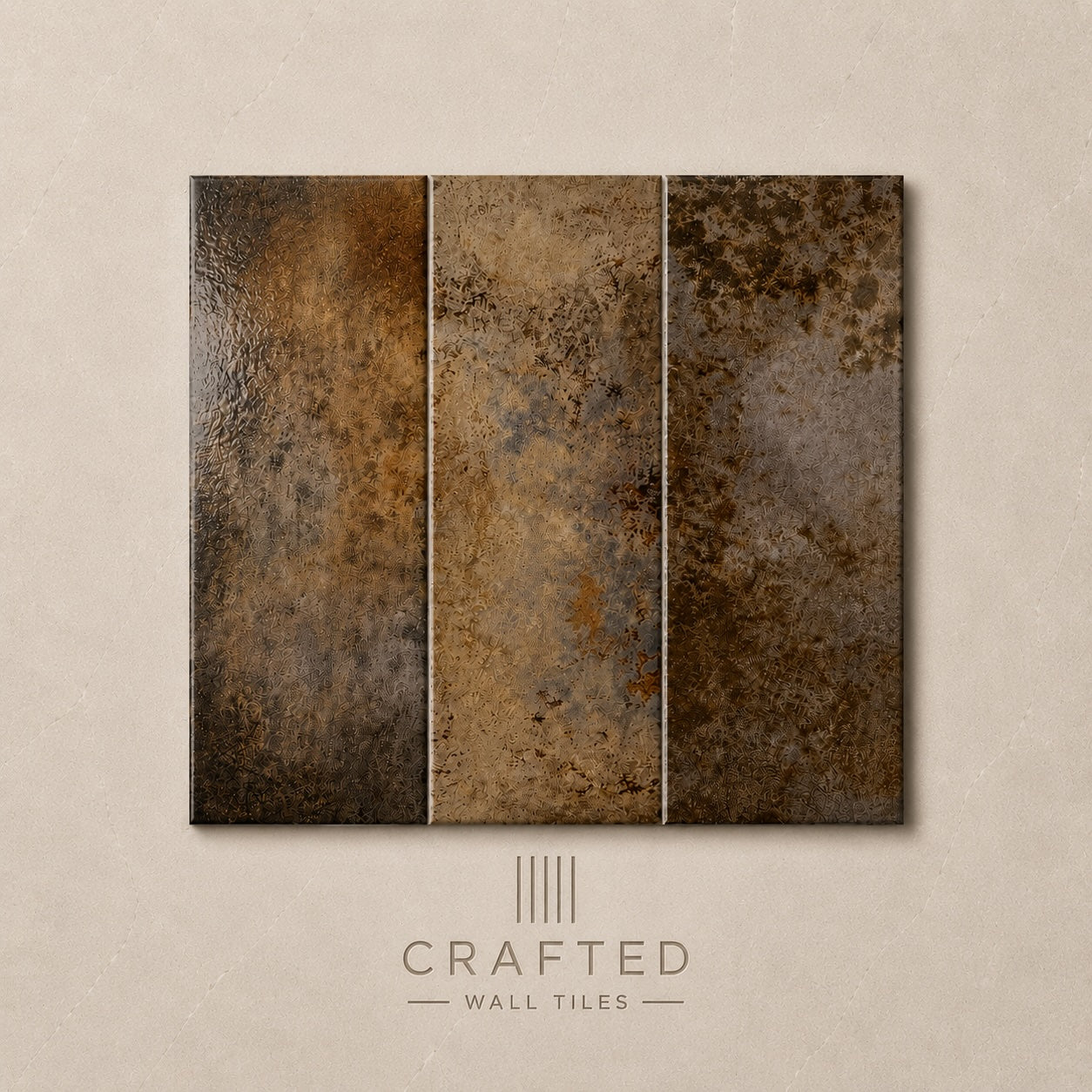
Precinct Caramel Wall Tile 10x30cm
Warm, earthy and full of character, Precinct Caramel draws inspiration from natural clay tones and sunlit Mediterranean interiors. The rich...
£44.99 -
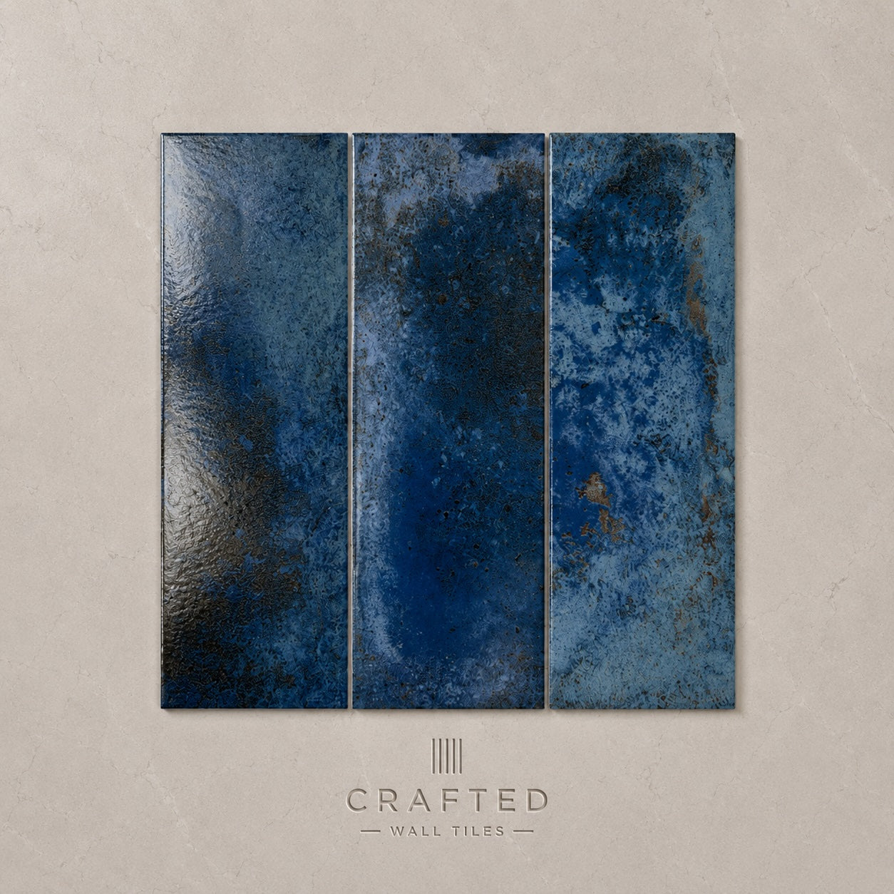
Precinct Blue Wall Tile 10x30cm
Confident without being overpowering, Precinct Blue introduces depth and atmosphere into interior spaces. The rich colour brings a sense of...
£44.99 -
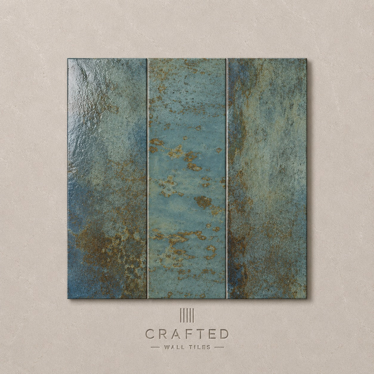
Precinct Aqua Wall Tile 10x30cm
Fresh and uplifting, Precinct Aqua captures the relaxed atmosphere of coastal interiors while maintaining a sophisticated, contemporary feel. The soft...
£44.99 -
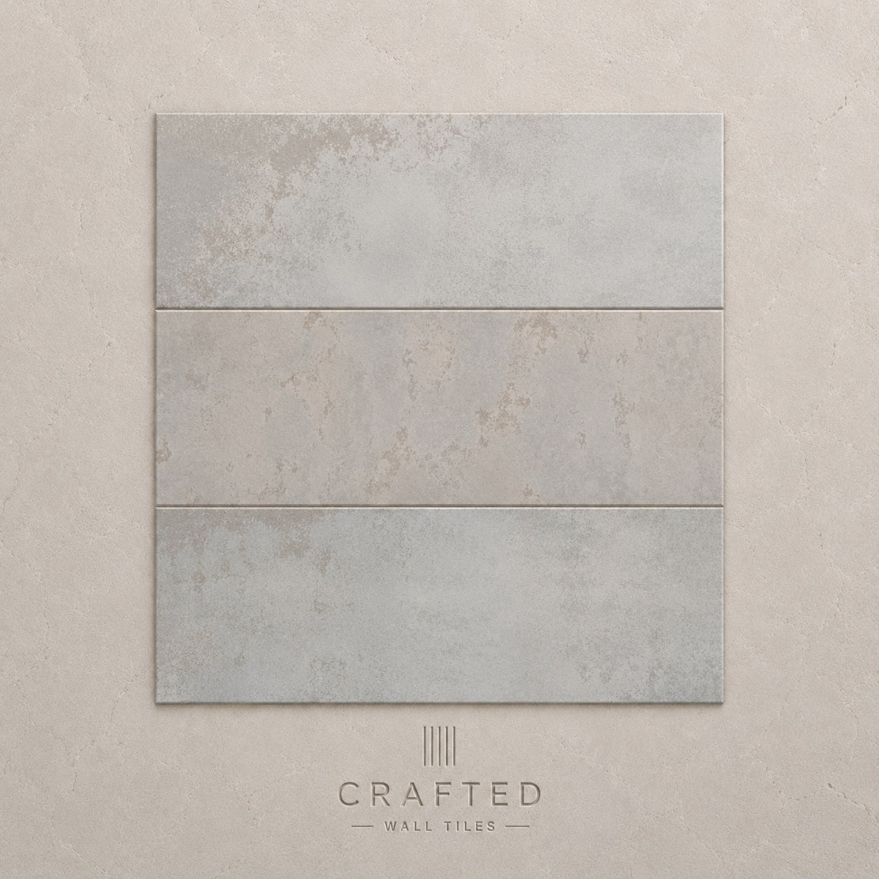
Precinct White Wall Tile 10x30cm
White remains one of the most enduring choices for interior walls, yet Precinct White offers far more character than a...
£44.99
When simplicity becomes a strength
Colour is doing the work here
The 10 × 30cm proportion changes the rhythm
Give a flat tile some contrast