Skip to content
Code CRFTD15 for £15 off
Free Shipping on Orders over £399.

Collection: Realm

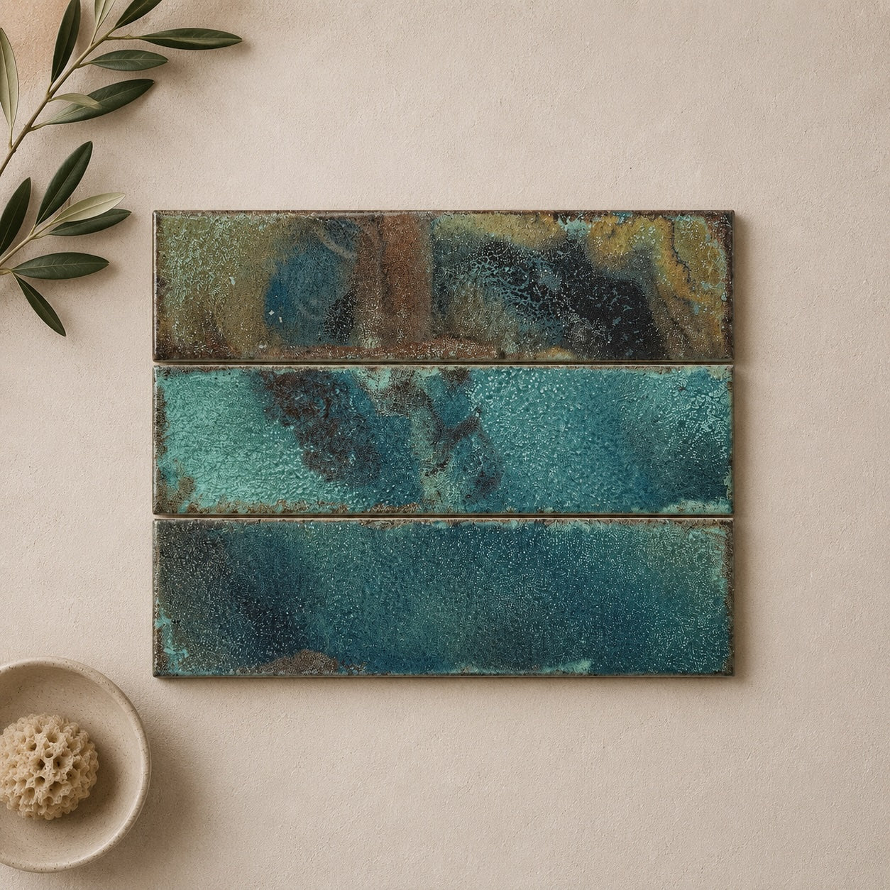
Realm has the sort of glaze that rewards a second look. The surface is richly varied, with colour pooling and shifting across each tile to create a distinctly artisanal appearance. Blue, Red, Garnet, Amber, Pearl and Green each bring a very different mood, but the common thread is a glaze with enough depth and irregularity to make a wall feel genuinely layered rather than simply coloured.

6 products

  • Realm Blue Wall Tile 31.5x8cm

    Realm Blue captures the charm of traditional handcrafted ceramics with a colour that feels both timeless and effortlessly relaxed. Reminiscent...

    £28.39
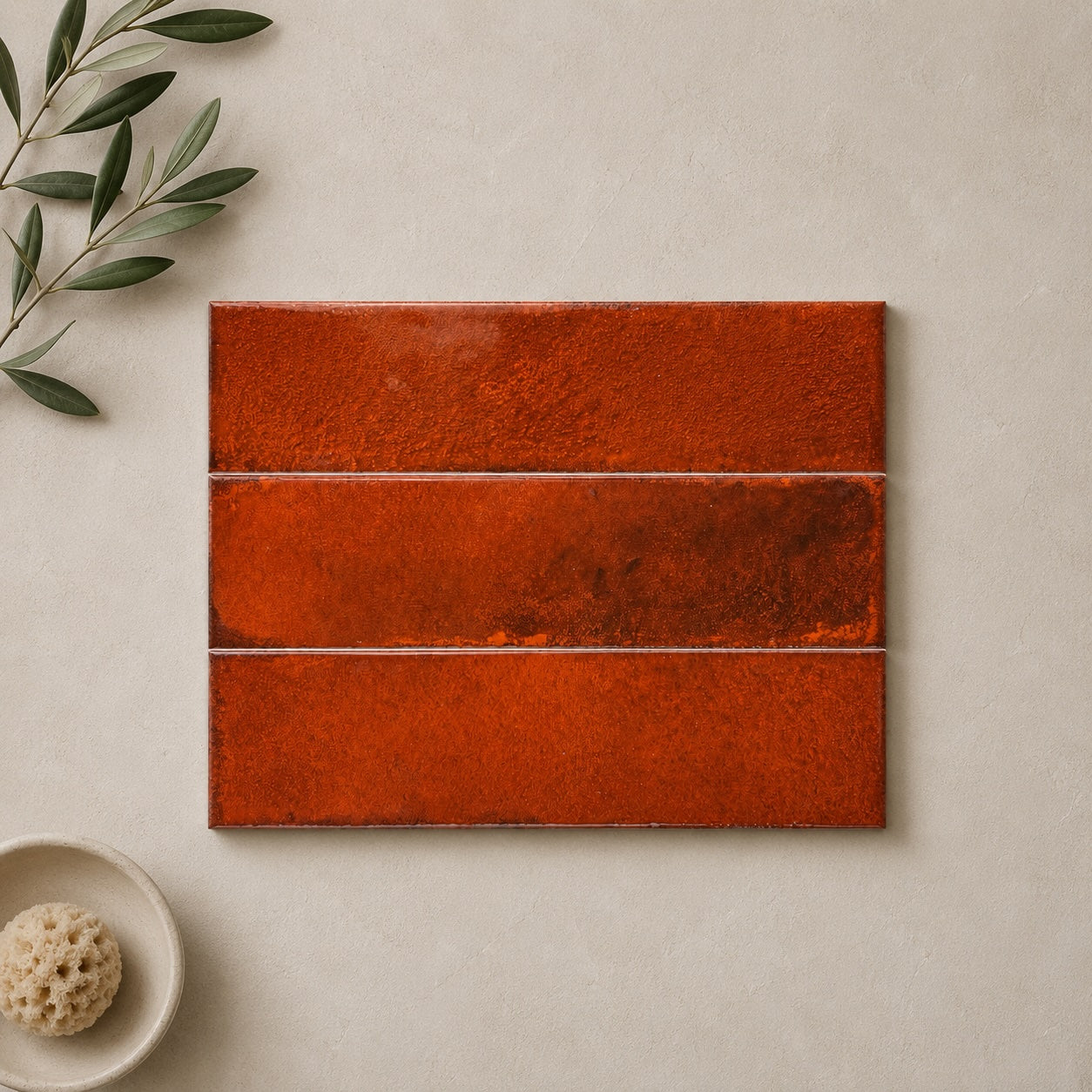
  • Realm Red Wall Tile 31.5x8cm

    Bold yet beautifully grounded, Realm Red takes inspiration from traditional terracotta pigments and handcrafted ceramics found throughout Southern Europe. The...

    £28.39
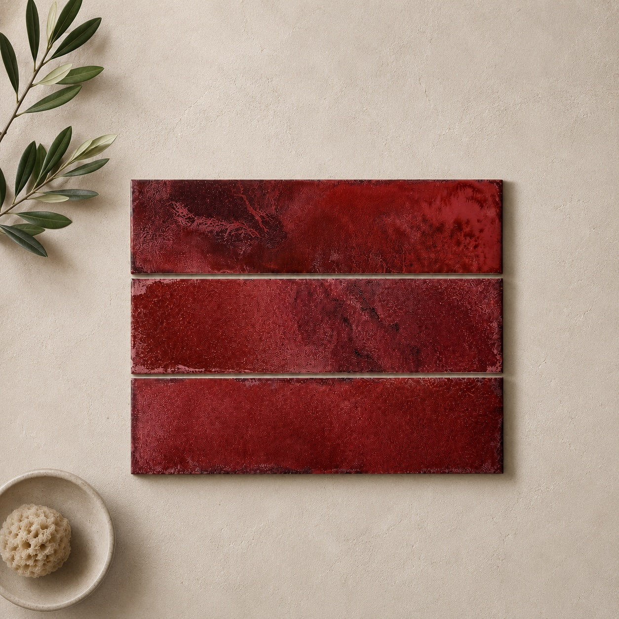
  • Realm Burgundy Wall Tile 31.5x8cm

    Deep and atmospheric, Realm Burgundy recalls the rich tones found within historic European interiors. It is a colour with presence,...

    £28.39
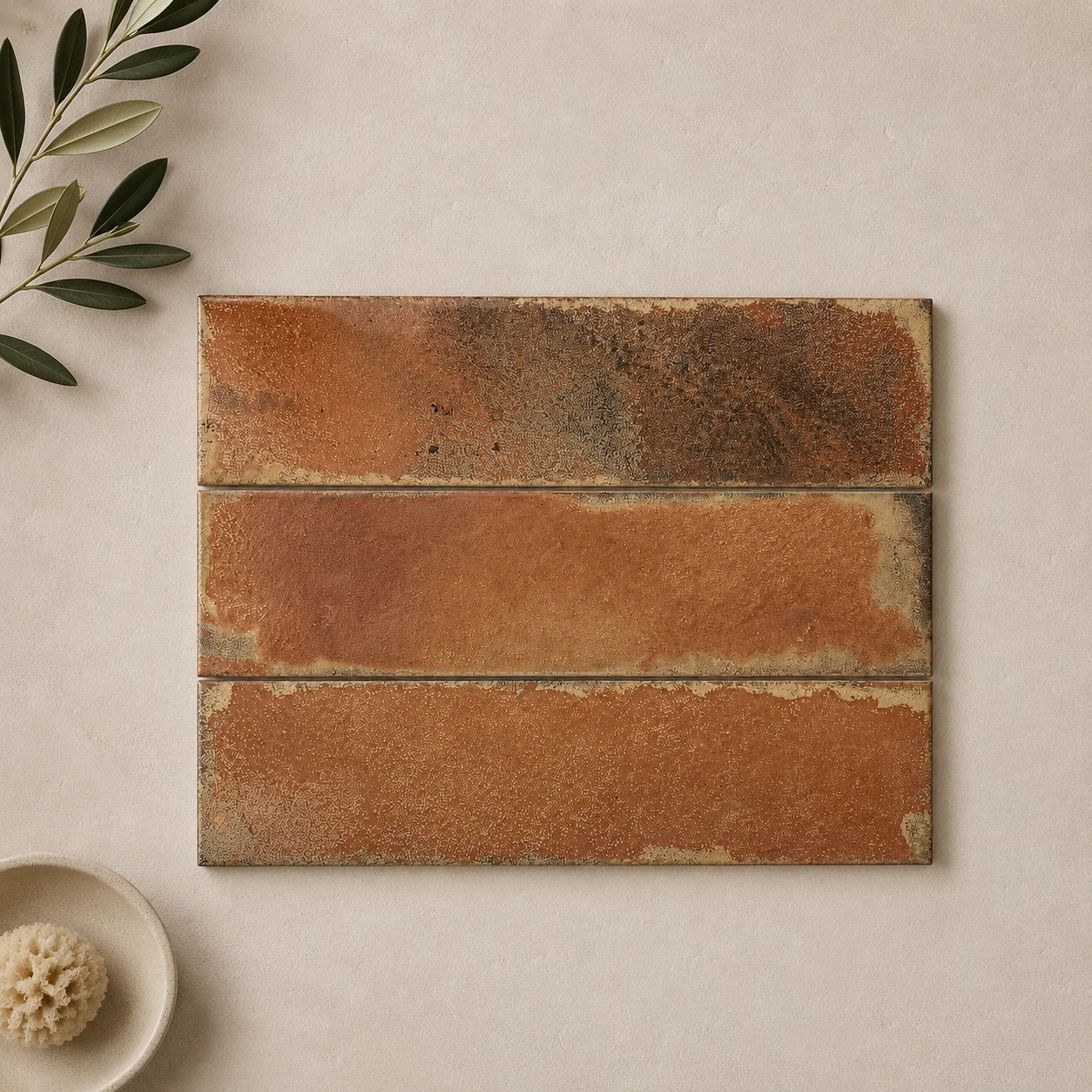
  • Realm Amber Wall Tile 31.5x8cm

    Warm and inviting, Realm Amber feels inspired by Mediterranean courtyards, terracotta rooftops and interiors shaped by natural light. The rich...

    £28.39
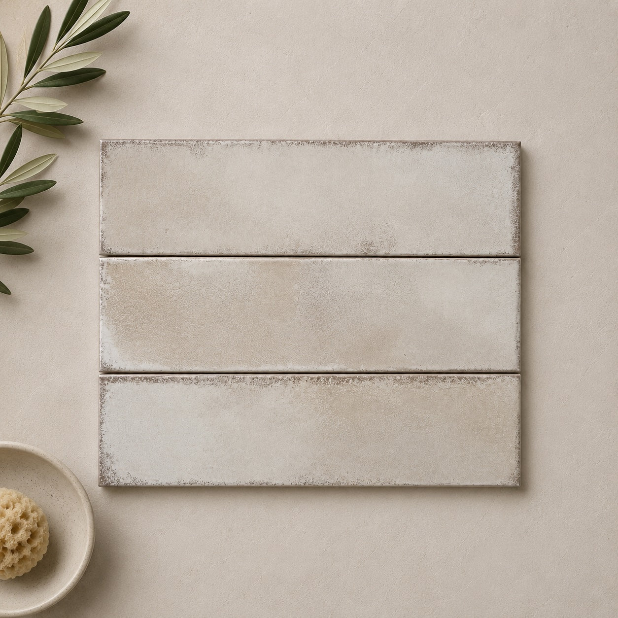
  • Realm Pearl Wall Tile 31.5x8cm

    Realm Pearl captures the quiet beauty of weathered limestone, sun-bleached plaster and natural materials softened by time. Its gentle neutral...

    £28.39
  • Realm Green Wall Tile 31.5x8cm

    Realm Green captures the charm of traditional handcrafted ceramics while feeling entirely at home in contemporary interiors. The rich green...

    £28.39
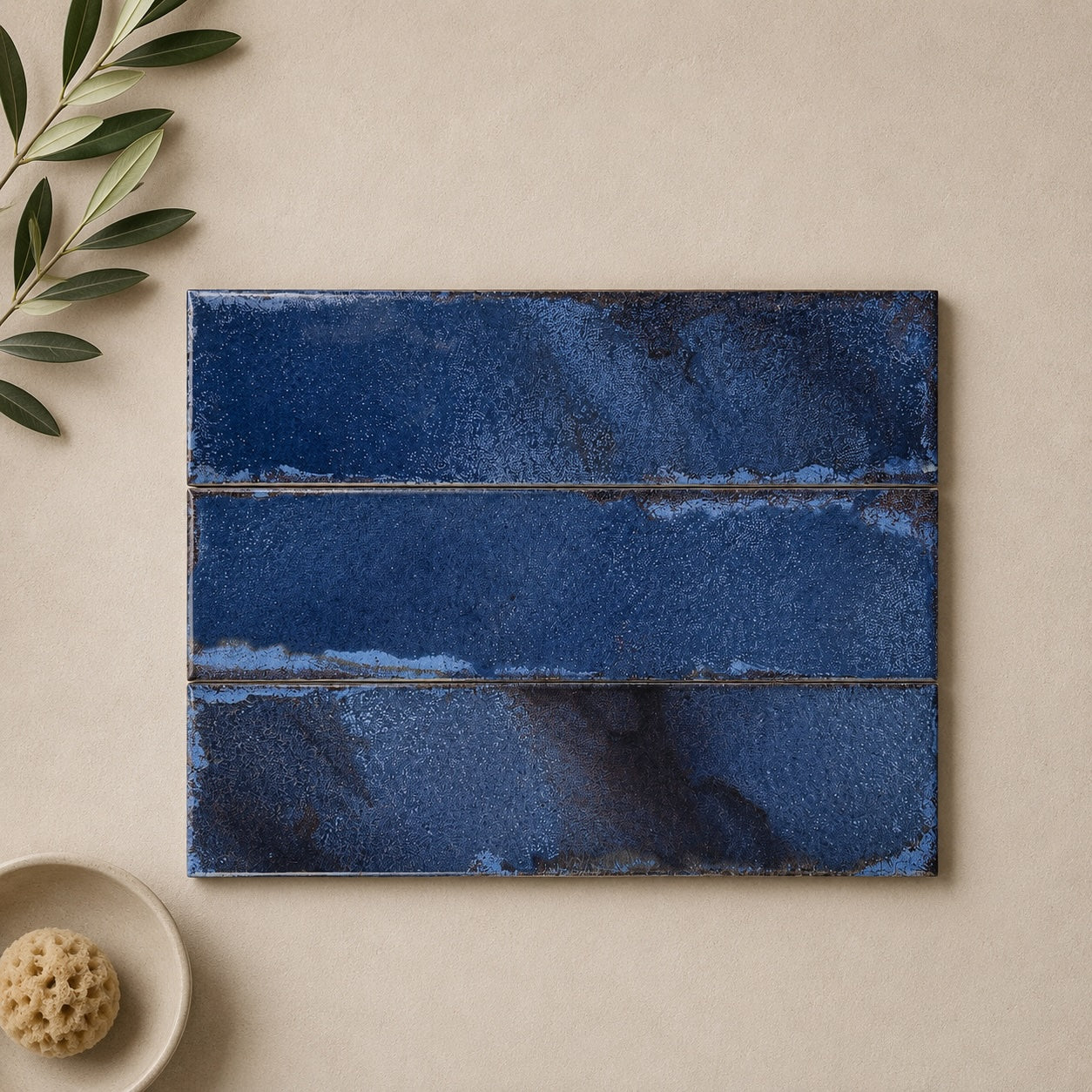
Realm is a tile where the colour will naturally become one of the strongest elements in the room. The deeper Blue, Garnet and Green shades can create an enveloping backdrop, while Amber and Red bring considerably more warmth. Pearl takes a quieter approach, allowing the variation in the glaze to provide the interest.

With a heavily varied tile, I'd resist trying to introduce another major pattern alongside it. That doesn't mean the rest of the room needs to be plain - timber, stone, aged metal and interesting cabinetry can all work beautifully - but giving the eye somewhere quieter to rest makes the glaze much more noticeable.

It's also worth looking at the less obvious tones within the tile. Realm's stronger colours aren't completely one-dimensional, so a surrounding material that picks up one of those secondary tones can often work better than an exact match to the dominant colour.

The artisanal appearance comes from the variation within the glazed surface. Individual tiles can contain noticeably different concentrations of colour, with areas that appear deeper, softer or more translucent than others.

Once they're installed together, those differences become part of the overall composition. Rather than seeing six identical rows of colour, the eye moves between lighter and darker areas, which gives the wall a much more organic quality.

This is particularly important to understand when ordering samples. One tile can't tell you exactly what a whole wall will look like - and that's not a flaw. With a collection like Realm, the interest comes partly from seeing those individual pieces work together. If you're choosing between colours, it's worth considering how much variation you actually want rather than judging the shade from a single piece alone.

Realm can be especially effective when you give it a clear architectural role. A vanity wall, kitchen splashback, shower enclosure or fireplace surround can all provide a defined area where the glaze becomes the focal point.

Using it across a larger wall creates a different effect. The variation becomes more immersive, and the colour starts to feel like part of the room rather than a decorative detail placed onto it.

The amount of natural light is worth considering here. Directional light can reveal much more of the glaze's depth than an evenly lit wall, while warmer artificial lighting can make Amber, Red and Garnet feel considerably richer in the evening. A sample viewed under your own lighting can therefore tell you much more than a screen image.

Realm already contains considerable visual information through its colour variation, so the surrounding finishes can be used to control how dramatic the overall scheme feels.

Natural timber and warm stone can soften the stronger colours, while simple cabinetry and clean-lined sanitaryware provide an interesting contrast to the irregular glaze. If you're using Pearl, you have considerably more freedom to introduce darker or more decorative elements elsewhere because the tile itself is doing less of the visual heavy lifting.

One useful trick is to repeat a secondary colour from the glaze rather than its dominant shade. It creates a connection between the tile and the rest of the room without making everything look colour-matched.

You might like