

Collection: Matt
Matt wall tiles have a quieter way of shaping a room. Without a glossy surface reflecting every source of light, the colour and texture tend to feel softer and more grounded, making matt a particularly good choice when you want the walls to sit naturally within the wider scheme. From gentle neutrals to deeper colours and textured finishes, matt tiles can create anything from a calm backdrop to a much more tactile focal point.

-
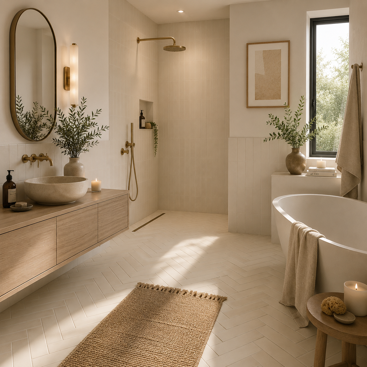
Sutton Beige Matt Porcelain Wall Tile 6x30cm
Simple, versatile and effortlessly warm, Sutton beige provides a fresh backdrop for both contemporary and traditional interiors. The matt finish...
£22.49 -
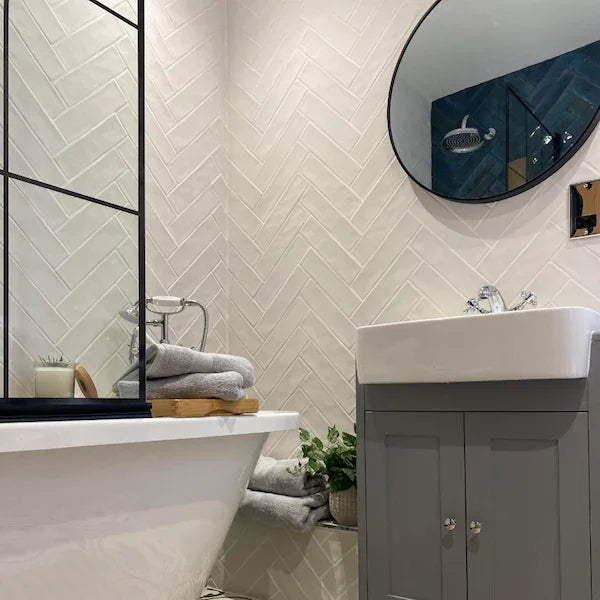
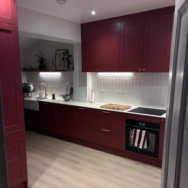
Cotswold White Matt Handmade Effect Wall Tile 7.5x30cm
Cotswold Matt White takes a quieter approach to white wall tiles. The soft matt finish creates a more understated appearance,...
£44.99 -
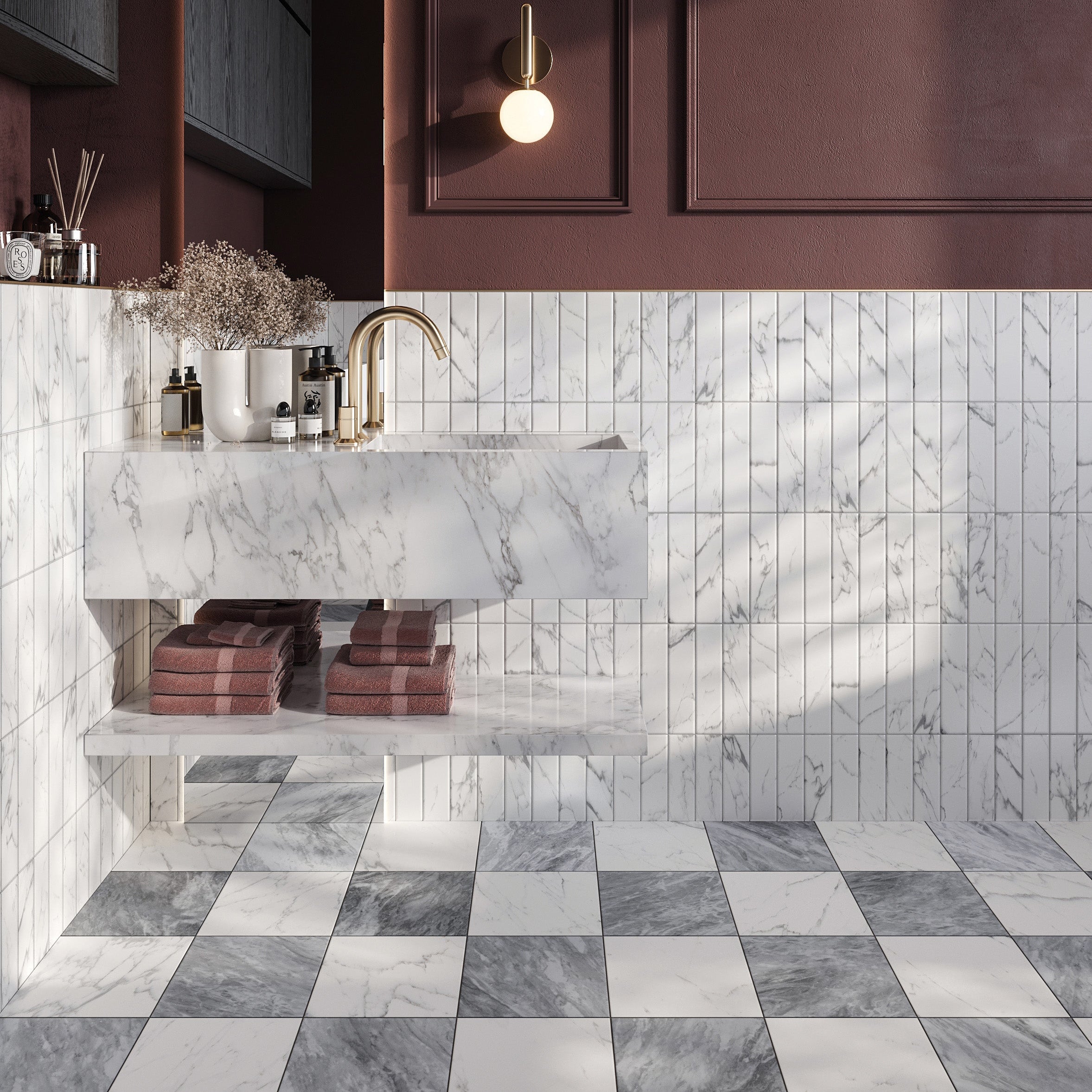
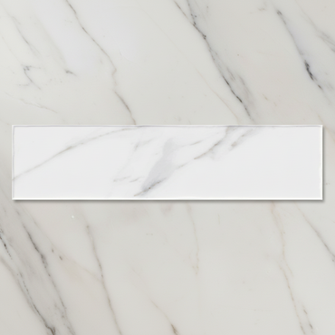
Chelsea White Marble Porcelain Tile 6x25cm
White has long been associated with marble, but Chelsea Marble White takes a softer approach. The textured matt finish removes...
£36.99 -
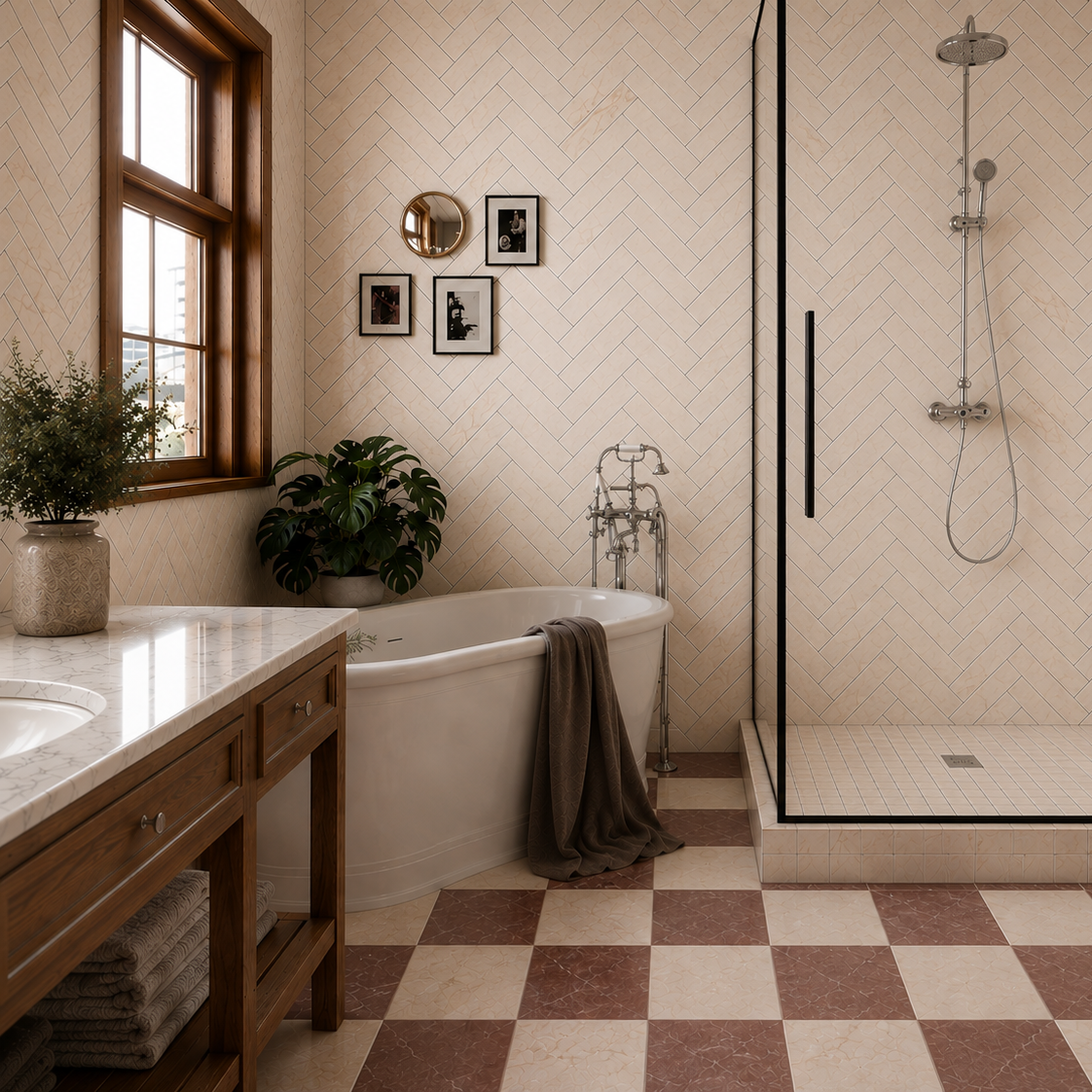
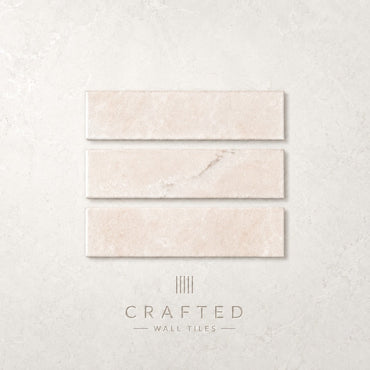
Chelsea Cream Marble Porcelain Tile 6x25cm
There is a quiet warmth to Chelsea Marble Cream that immediately softens a space. Sitting comfortably between ivory and natural...
£36.99 -
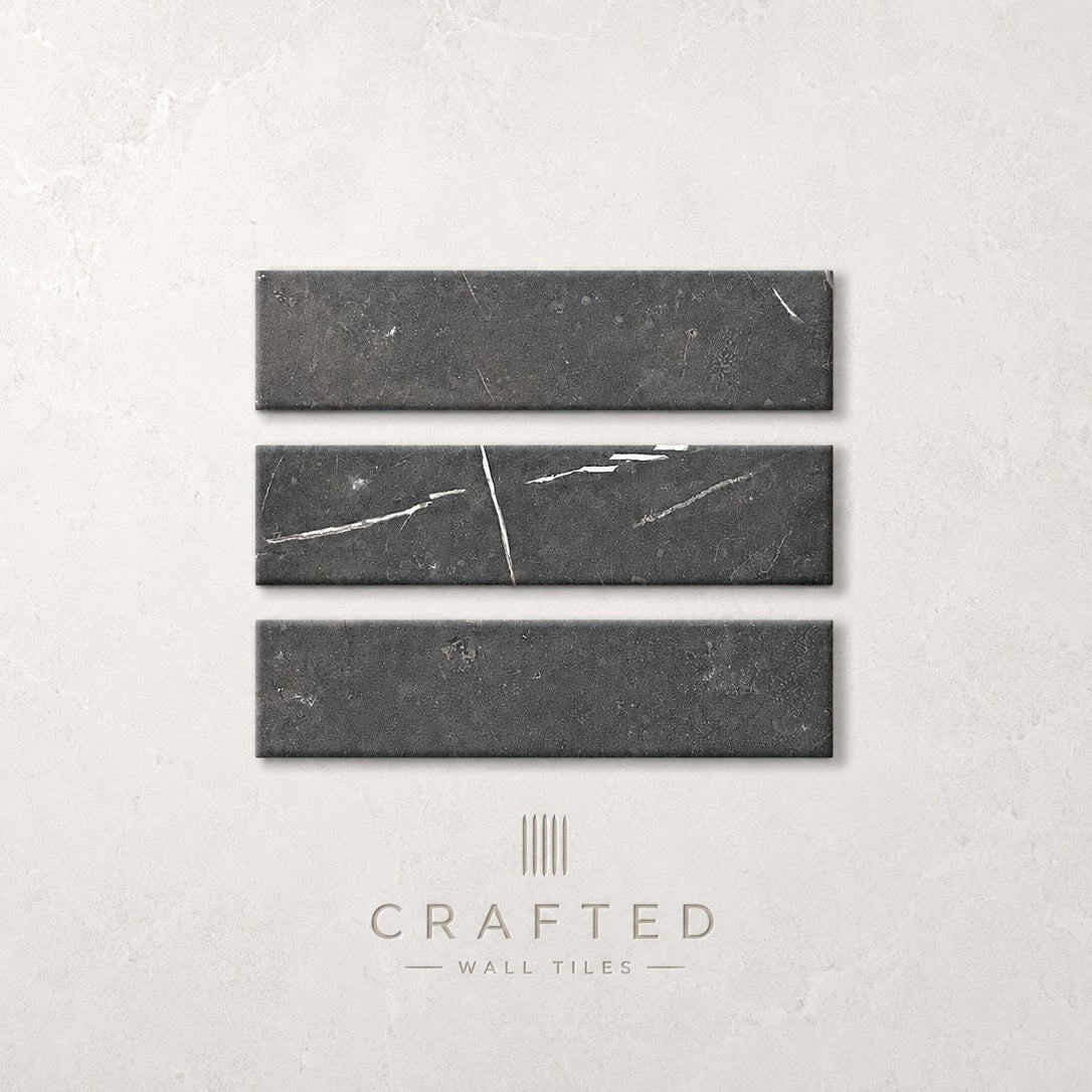
Chelsea Black Marble Porcelain Floor 6x25cm
Confident and architectural, Chelsea Marble Black introduces depth and contrast without overwhelming a space. The darker tone brings a sense...
£36.99 -
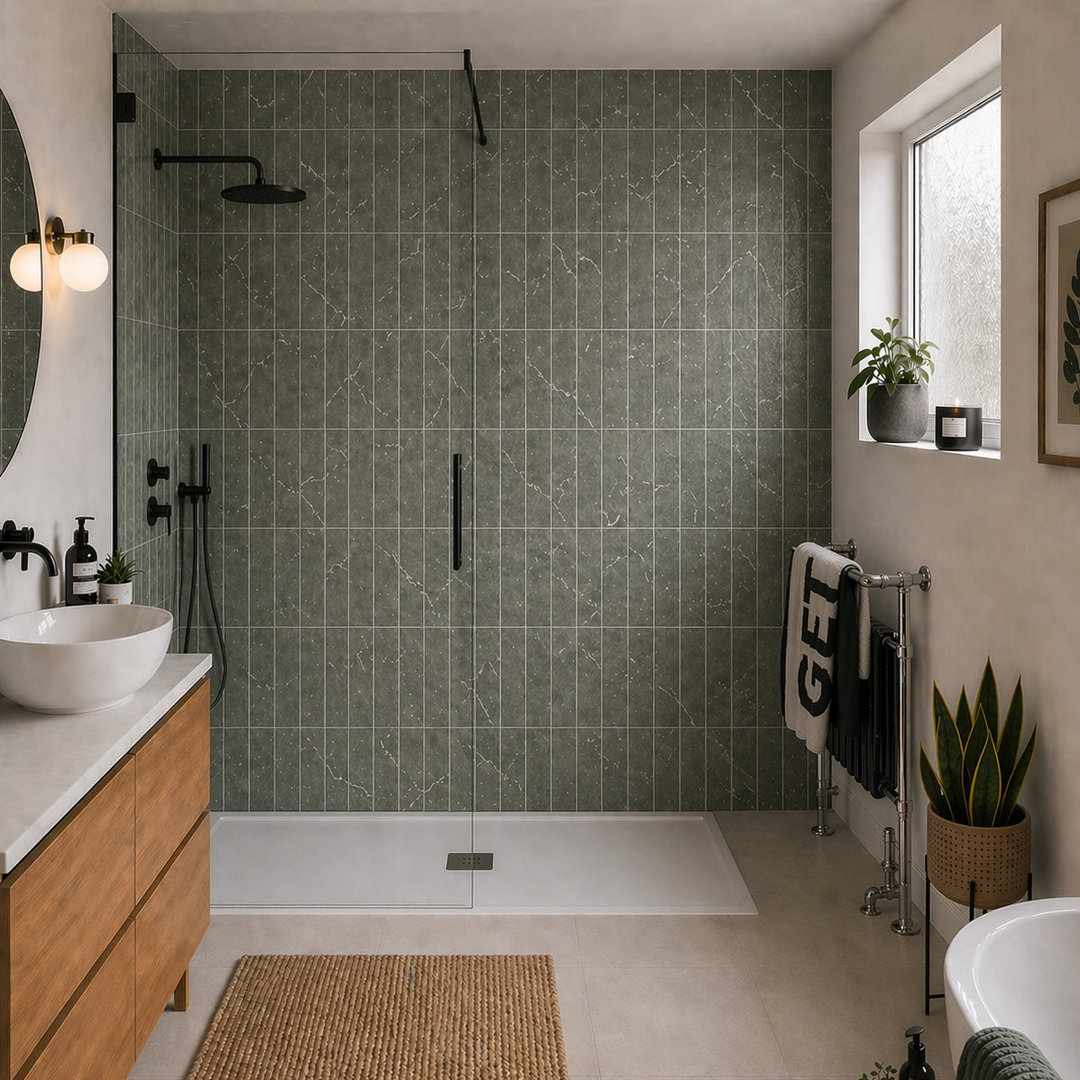
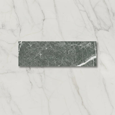
Chelsea Green Marble Porcelain Tile 6x25cm
Green has a unique ability to feel both calming and characterful, and Chelsea Marble Green captures that balance beautifully. Inspired...
£36.99 -
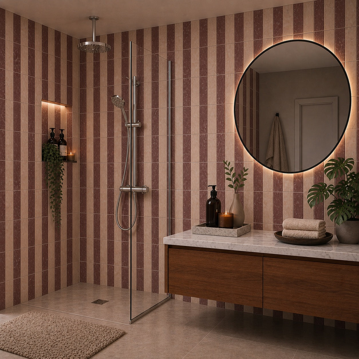
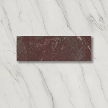
Chelsea Rose Marble Porcelain Tile 6x25cm
Chelsea Marble Rose introduces warmth through soft colour rather than bold statement. The muted blush tone feels elegant and contemporary,...
£36.99 -

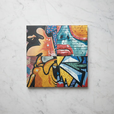
Graffiti Funky Tile 20x20cm
Graffiti Funky Tile 20x20cm – Bold, Artistic, and Modern Wall Tile Make a statement with the Graffiti Funky Tile 20x20cm,...
£46.99 -
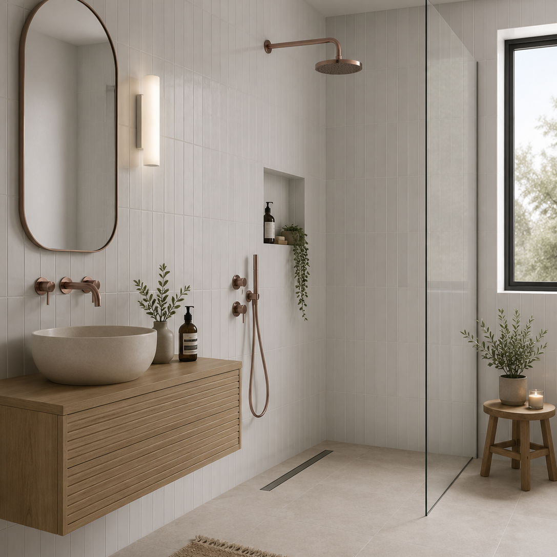
Sutton White Matt Porcelain Wall Tile 6x30cm
Simple, versatile and effortlessly timeless, Sutton White provides a fresh backdrop for both contemporary and traditional interiors. The matt finish...
£22.49 -
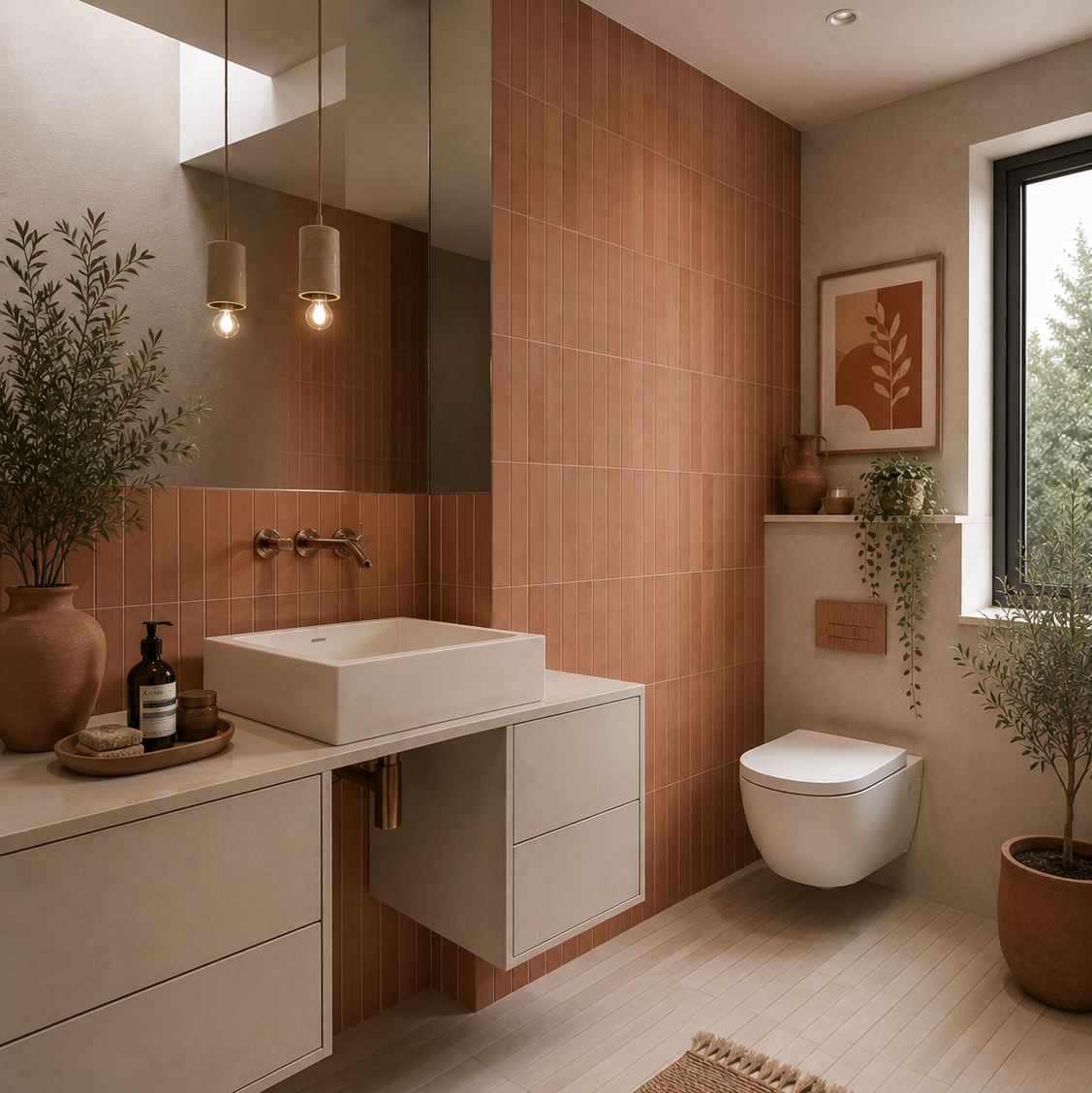
Sutton Clay Matt Porcelain Wall Tile 6x30cm
Warm and expressive, Sutton Clay draws inspiration from sun-baked earth and Mediterranean architecture. The rich terracotta tone brings an immediate...
£22.49 -
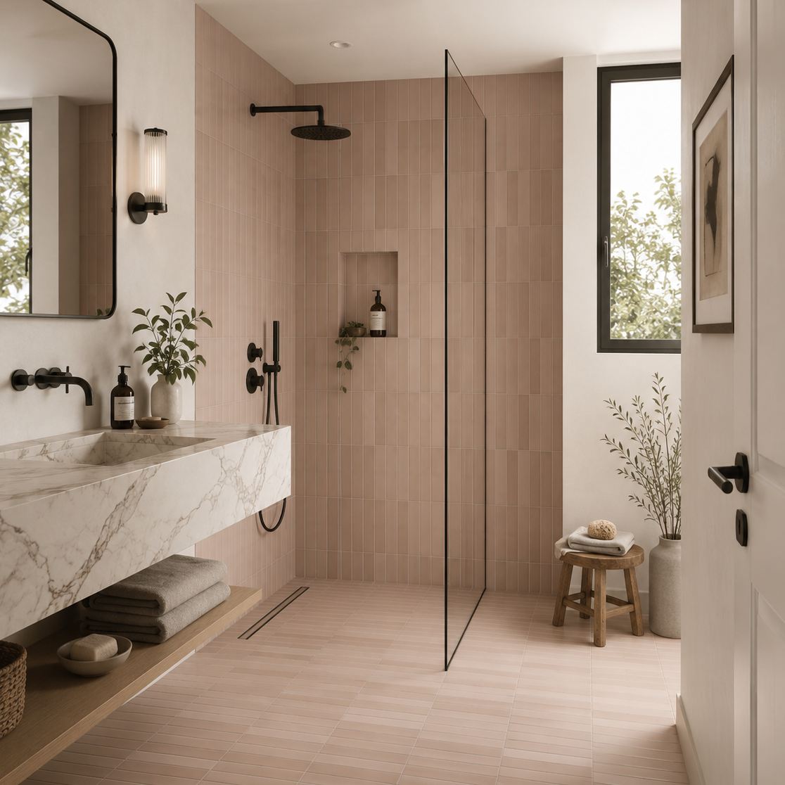
Sutton Taupe Matt Porcelain Wall Tile 6x30cm
Taupe has long been favoured by interior designers for its ability to bring warmth, sophistication and versatility to a space....
£22.49 -
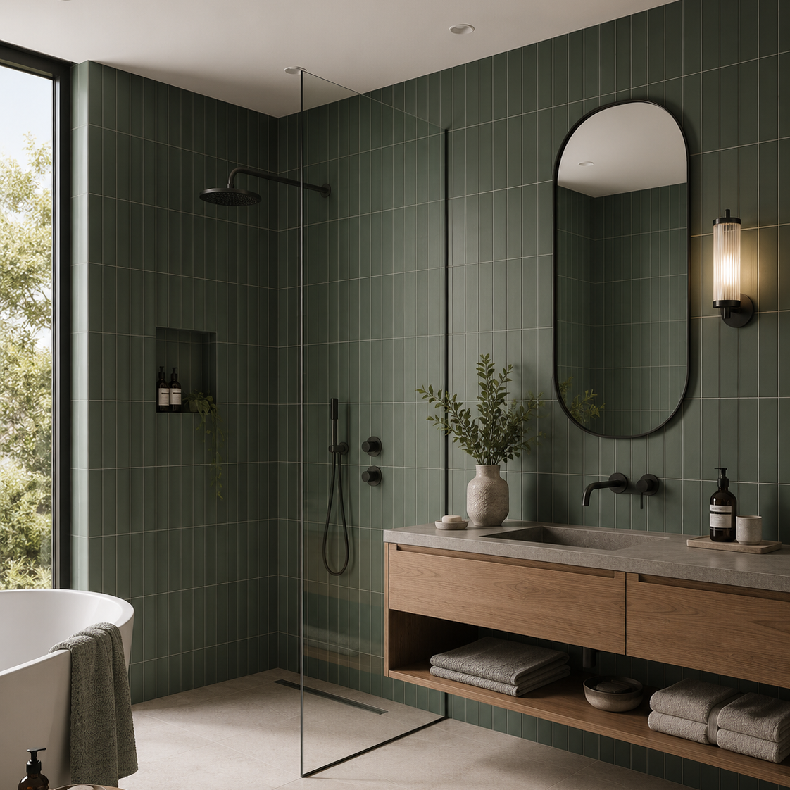
Sutton Pine Green Matt Porcelain Wall Tile 6x30cm
Inspired by the richness of natural landscapes, Sutton Pine Green introduces a grounding presence that feels both luxurious and timeless....
£22.49 -

Sutton sage Matt Porcelain Wall Tile 6x30cm
Fresh, uplifting and full of charm, Sutton sage brings a lighter, more playful energy to the collection. The gentle green...
£22.49 -
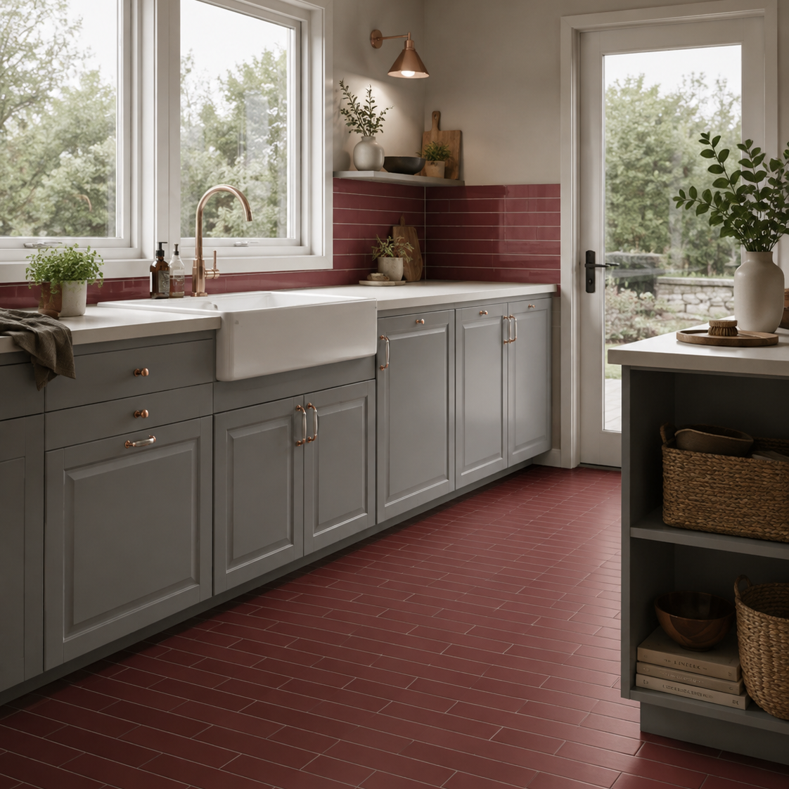
Sutton Garnet Matt Porcelain Wall Tile 6x30cm
There is something undeniably atmospheric about deep red tones when used well. Sutton Garnet brings warmth, richness and personality to...
£22.49 -
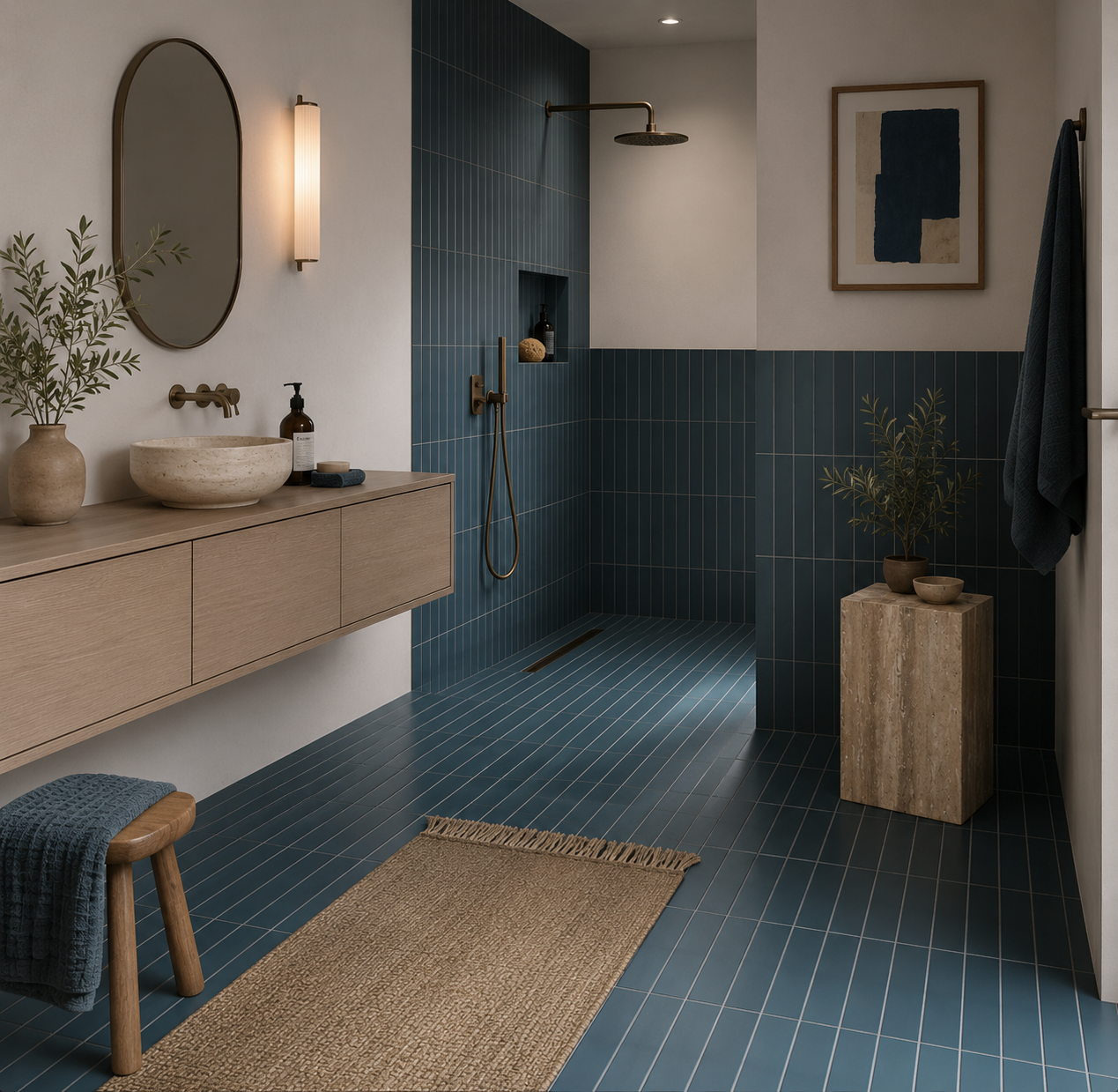
Sutton Blue Matt Porcelain Wall Tile 6x30cm
Blue has a unique ability to feel both familiar and distinctive. Sutton Blue captures that balance perfectly, introducing colour in...
£22.49 -


Mediterrano Bone Porcelain Wall Tile 5x40cm
A pale mineral-toned porcelain tile with soft movement and a smooth matt surface. Mediterrano Bone feels understated and architectural, offering...
£46.99 -


Mediterrano Golden Clay Porcelain Wall Tile 5x40cm
Golden Clay introduces a muted ochre warmth inspired by raw clay and faded mineral pigments. The soft variation within the...
£46.99 -


Mediterrano Cream Porcelain Wall Tile 5x40cm
Mediterrano Cream sits somewhere between warm white and soft stone, offering a gentle neutral base with understated tonal movement throughout...
£46.99 -


Mediterrano Orange Porcelain Wall Tile 5x40cm
Muted terracotta tones give Mediterrano Orange a warmth reminiscent of sun-baked clay and Mediterranean plaster walls. Softer and more chalky...
£46.99 -


Mediterrano White Porcelain Wall Tile 5x40cm
A softer take on a classic white wall tile, Mediterrano White features delicate variation through the surface that gives the...
£46.99 -


Mediterrano Sage Porcelain Wall Tile 5x40cm
Mediterrano Sage brings together soft green tones and subtle surface variation to create a calm, understated wall tile inspired by...
£46.99 -


Mediterrano Blue Porcelain Wall Tile 5x40cm
A muted blue porcelain tile with soft tonal movement and a smooth matt finish. The colour feels washed and relaxed...
£46.99


How matt tiles changes the feel of a room
Where a matt wall can solve a design problem
Why colour can feel richer in matt
Make matt more interesting through contrast