Skip to content
Code CRFTD15 for £15 off
Free Shipping on Orders over £399.

Collection: New York

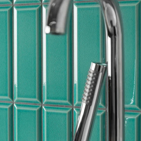
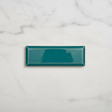
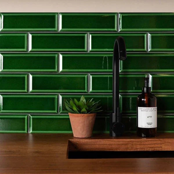
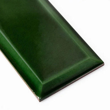
New York Metro shows just how much personality can come from a very familiar tile shape. The deep Emerald and characterful Crackle Green bring a much richer, more decorative feel, while White is available in both matt and gloss for two very different takes on the same neutral backdrop. It’s a collection where the finish can be just as important as the colour.

4 products

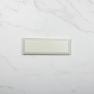
A green tile can feel completely different depending on what happens on its surface. The Emerald gloss has a strong reflective quality, so the colour picks up highlights and appears deeper as the light moves across the wall. Crackle Green has a more artisanal visual character, with the crackled surface introducing another layer of detail.

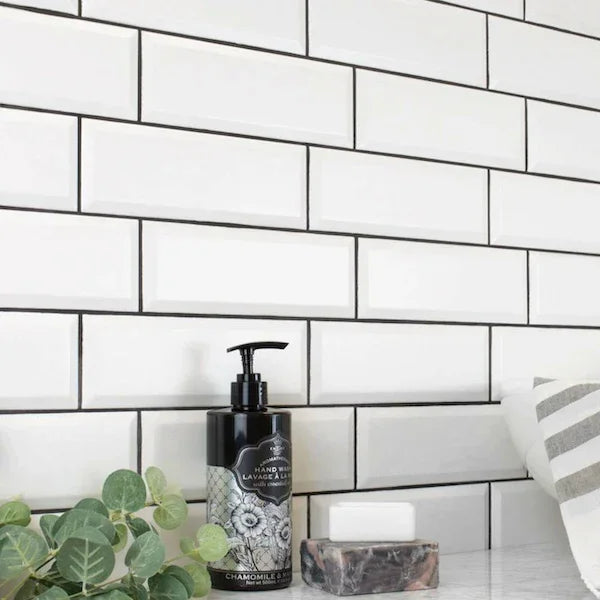
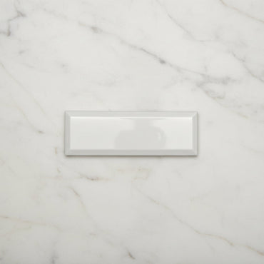
White is a useful comparison because the colour stays the same while the finish changes. Matt White gives you a softer, more restrained wall, whereas Gloss White reflects more of the surrounding room and feels brighter.

It is a good reminder that choosing a tile is not simply about picking a colour from a screen. The relationship between colour, finish and light can alter the way that colour actually feels once it's on the wall.

Crackle introduces a network of fine lines across the glazed surface, so the wall has more detail than a completely smooth tile. Rather than reading as one consistent block of green, the surface has a more layered, handcrafted appearance.

That becomes particularly noticeable once several tiles are installed together. The crackle catches light differently from the surrounding glaze, and the result feels less uniform than a standard gloss metro tile.

There is also a practical consideration with crackle finishes: the manufacturer's installation and sealing guidance should always be followed, as crackle-glazed tiles can require different treatment from a standard glazed surface. It's one of those details worth checking before the tiles are installed rather than assuming every glazed tile behaves in exactly the same way.

Emerald is a strong colour, but strong doesn't necessarily mean difficult to use. The trick is to give it enough contrast and restraint elsewhere in the room.

Warm timber works particularly well because it stops the green feeling too cold, while brass or brushed metal can bring out the richer side of the glaze. Pale stone, cream cabinetry and softer neutral walls can also provide enough visual space around the colour.

I'd avoid trying to repeat Emerald everywhere. A deep wall colour tends to feel more sophisticated when it is allowed to be the dominant note rather than one of several equally strong colours competing for attention.

Crackle Green can be treated slightly differently because the finish already introduces additional detail. Keeping the surrounding surfaces simple lets that texture remain noticeable rather than disappearing into a busy scheme.

With such a familiar rectangular tile, the laying pattern can quietly transform the whole wall.

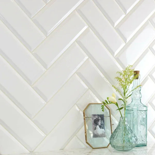
A standard brick bond reinforces the classic metro character, while stacking the tiles creates a much cleaner, more contemporary grid. Herringbone introduces considerably more movement and can turn an otherwise simple tile into a strong decorative feature.

The finish matters here too. A very reflective green combined with a highly directional pattern can create a much busier effect than the same layout in matt white.

That's why I'd choose the tile, finish and pattern together. The layout shouldn't be an afterthought - with a relatively simple tile, it becomes one of the main things defining the finished wall.

You might like