

Collection: Sutton
Sutton is all about quiet detail. Its slim rectangular proportions create a neat, directional rhythm, while the matt surface and very subtle tonal variation stop the wall from feeling overly clinical.

-
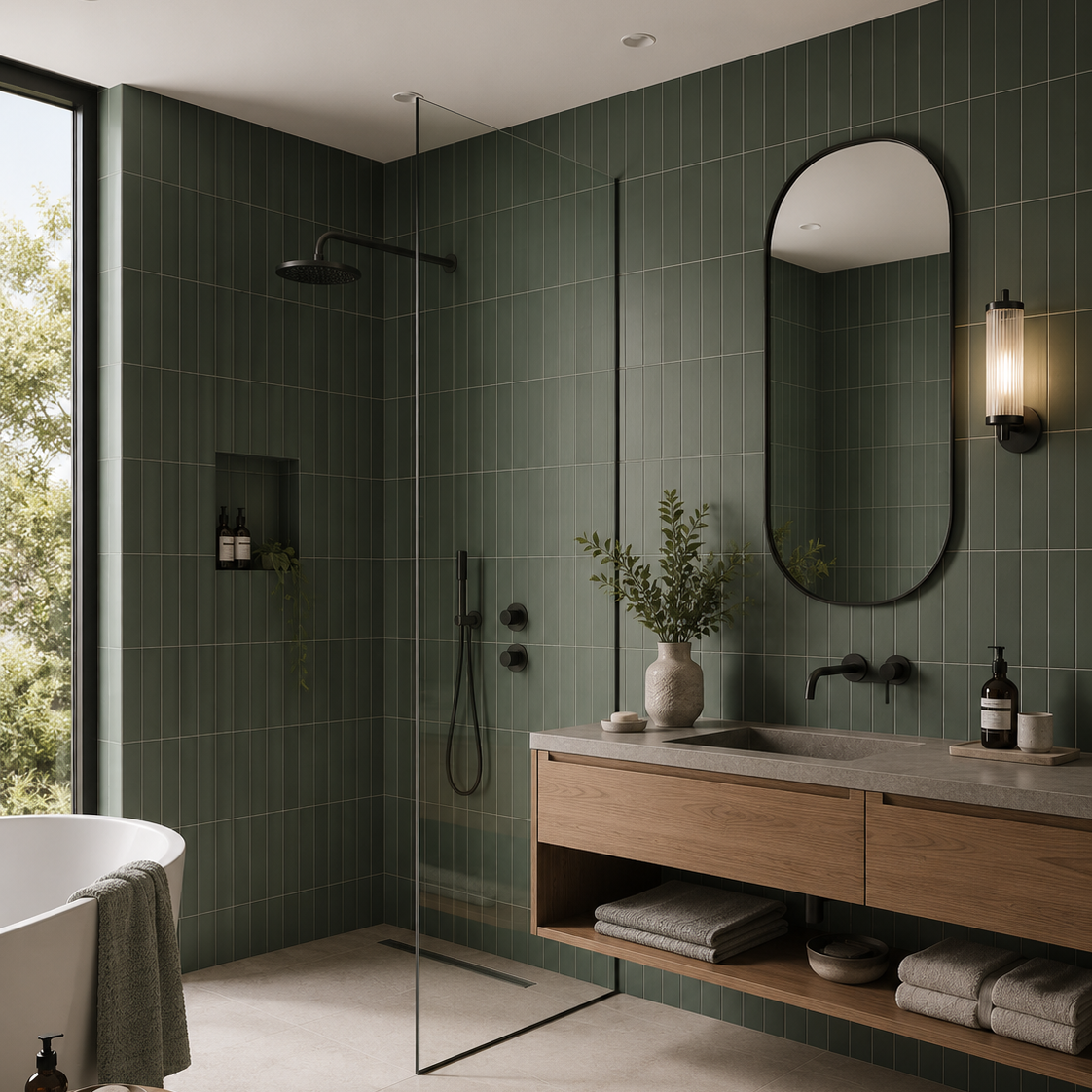
Sutton Pine Green Matt Porcelain Wall Tile 6x30cm
Inspired by the richness of natural landscapes, Sutton Pine Green introduces a grounding presence that feels both luxurious and timeless....
£22.49 -
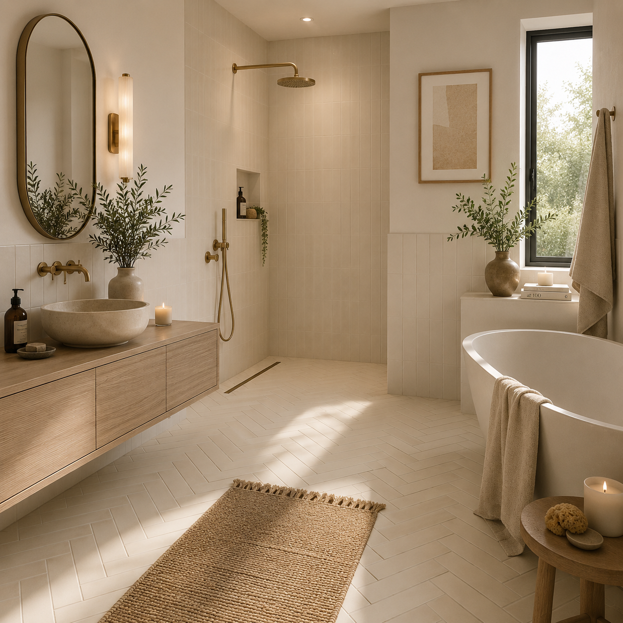
Sutton Beige Matt Porcelain Wall Tile 6x30cm
Simple, versatile and effortlessly warm, Sutton beige provides a fresh backdrop for both contemporary and traditional interiors. The matt finish...
£22.49 -
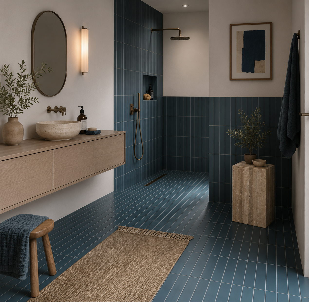
Sutton Blue Matt Porcelain Wall Tile 6x30cm
Blue has a unique ability to feel both familiar and distinctive. Sutton Blue captures that balance perfectly, introducing colour in...
£22.49 -
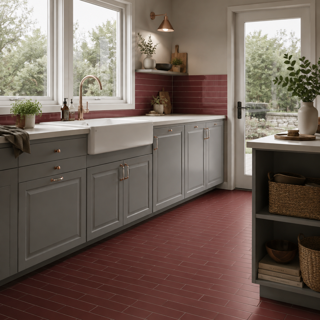
Sutton Garnet Matt Porcelain Wall Tile 6x30cm
There is something undeniably atmospheric about deep red tones when used well. Sutton Garnet brings warmth, richness and personality to...
£22.49 -
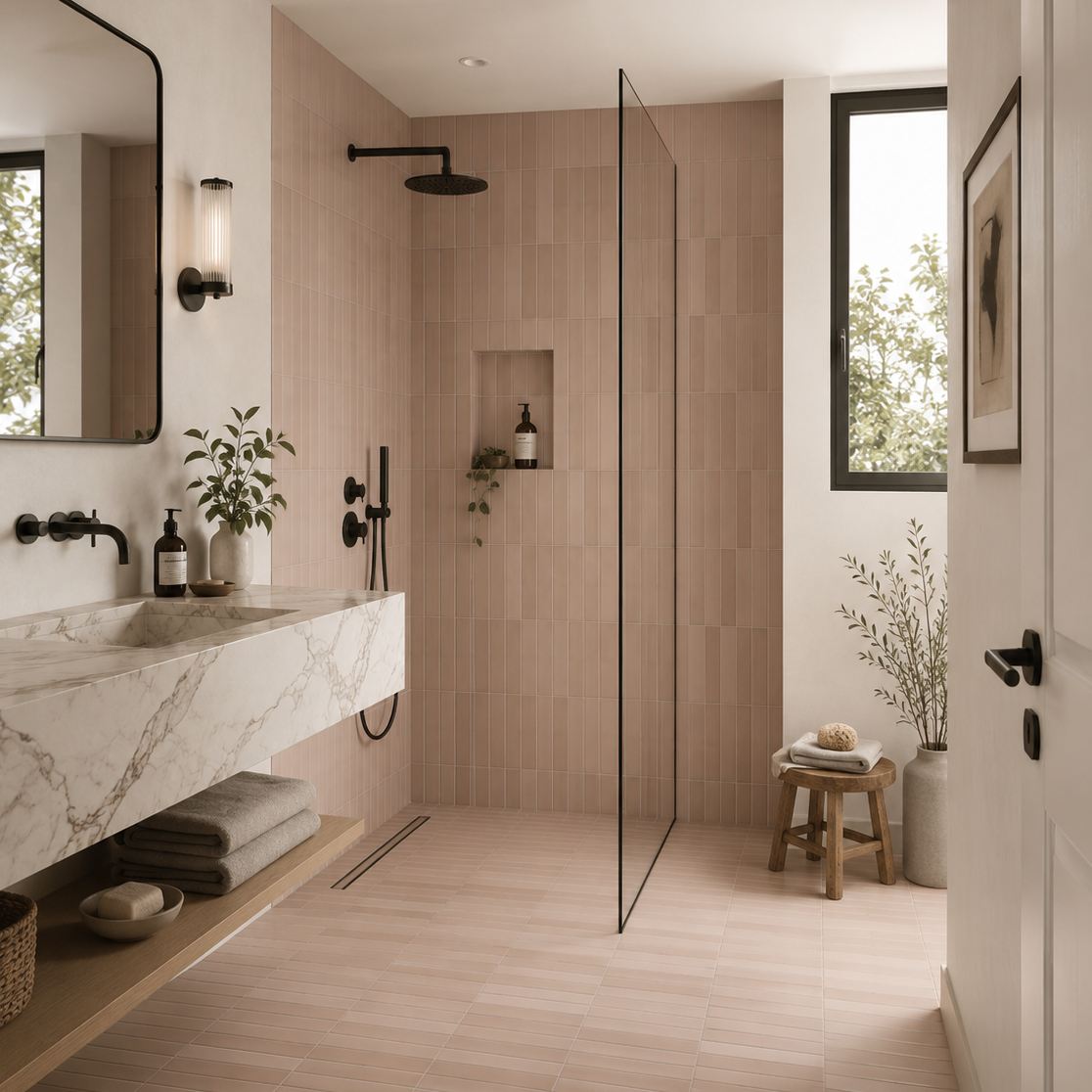
Sutton Taupe Matt Porcelain Wall Tile 6x30cm
Taupe has long been favoured by interior designers for its ability to bring warmth, sophistication and versatility to a space....
£22.49 -

Sutton sage Matt Porcelain Wall Tile 6x30cm
Fresh, uplifting and full of charm, Sutton sage brings a lighter, more playful energy to the collection. The gentle green...
£22.49 -
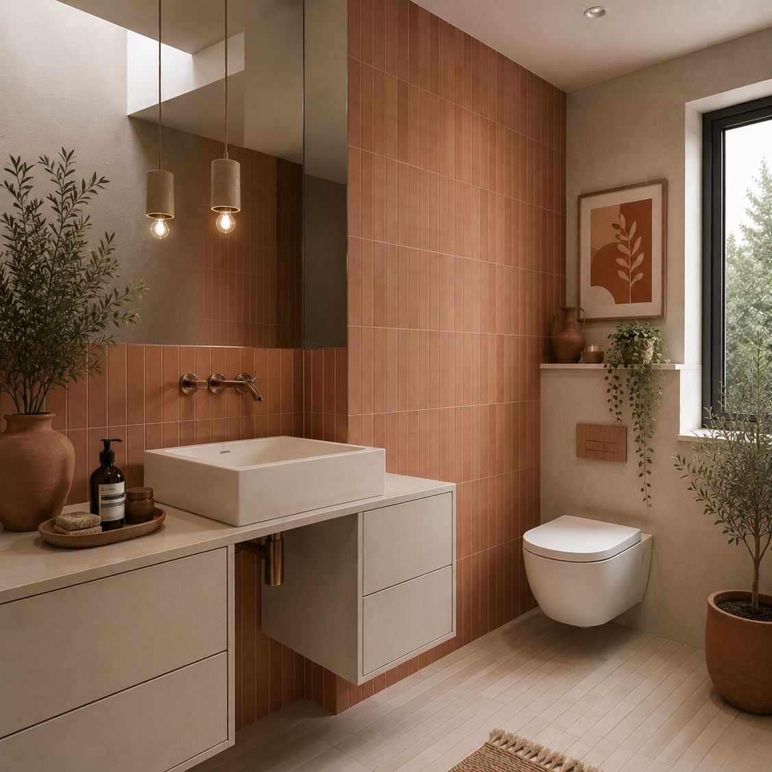
Sutton Clay Matt Porcelain Wall Tile 6x30cm
Warm and expressive, Sutton Clay draws inspiration from sun-baked earth and Mediterranean architecture. The rich terracotta tone brings an immediate...
£22.49 -
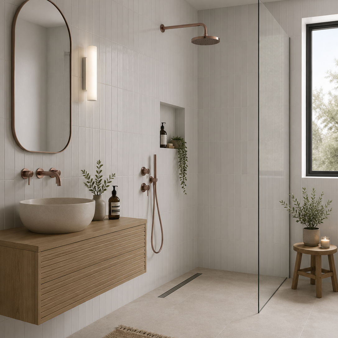
Sutton White Matt Porcelain Wall Tile 6x30cm
Simple, versatile and effortlessly timeless, Sutton White provides a fresh backdrop for both contemporary and traditional interiors. The matt finish...
£22.49

Why subtle variation can be more effective than obvious variation
The slim format creates a very different rhythm
Let the undertone guide the rest of the scheme
Where matt Sutton becomes particularly useful