Skip to content
Code CRFTD15 for £15 off
Free Shipping on Orders over £399.

Collection: Chelsea

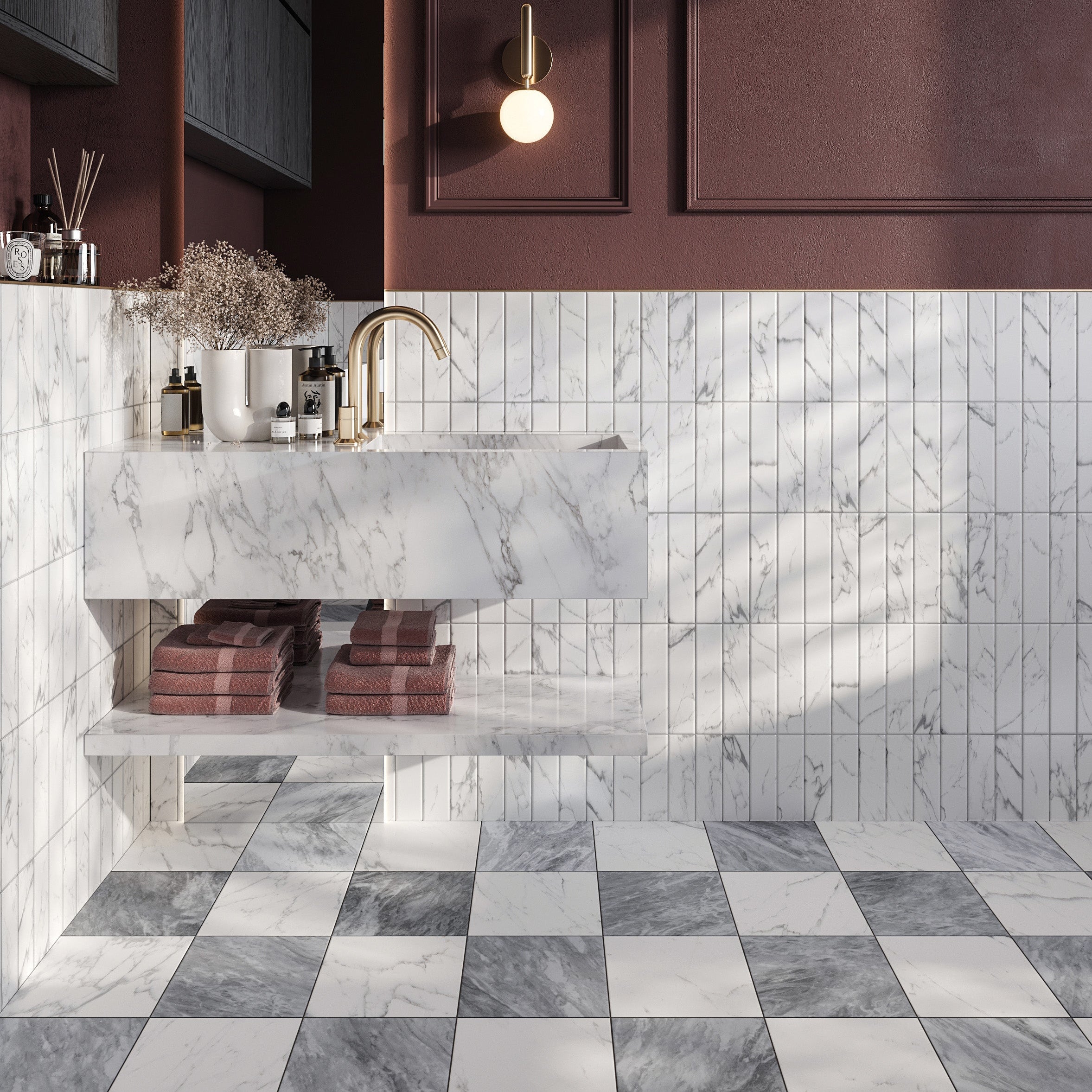
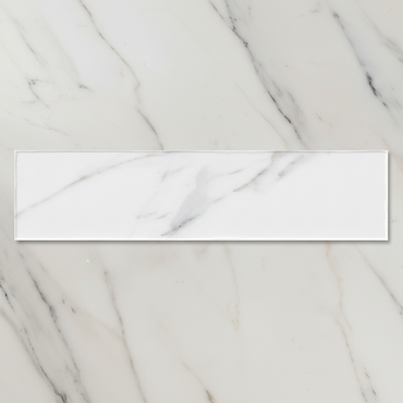
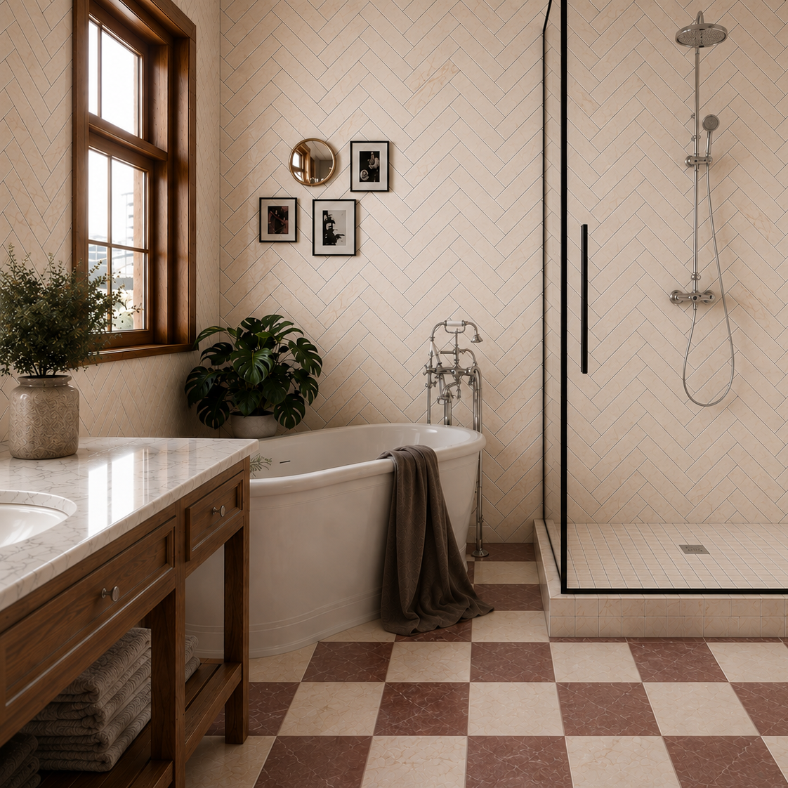
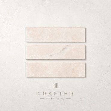
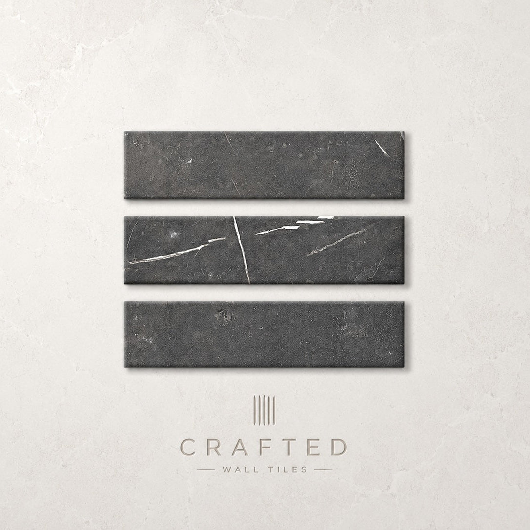
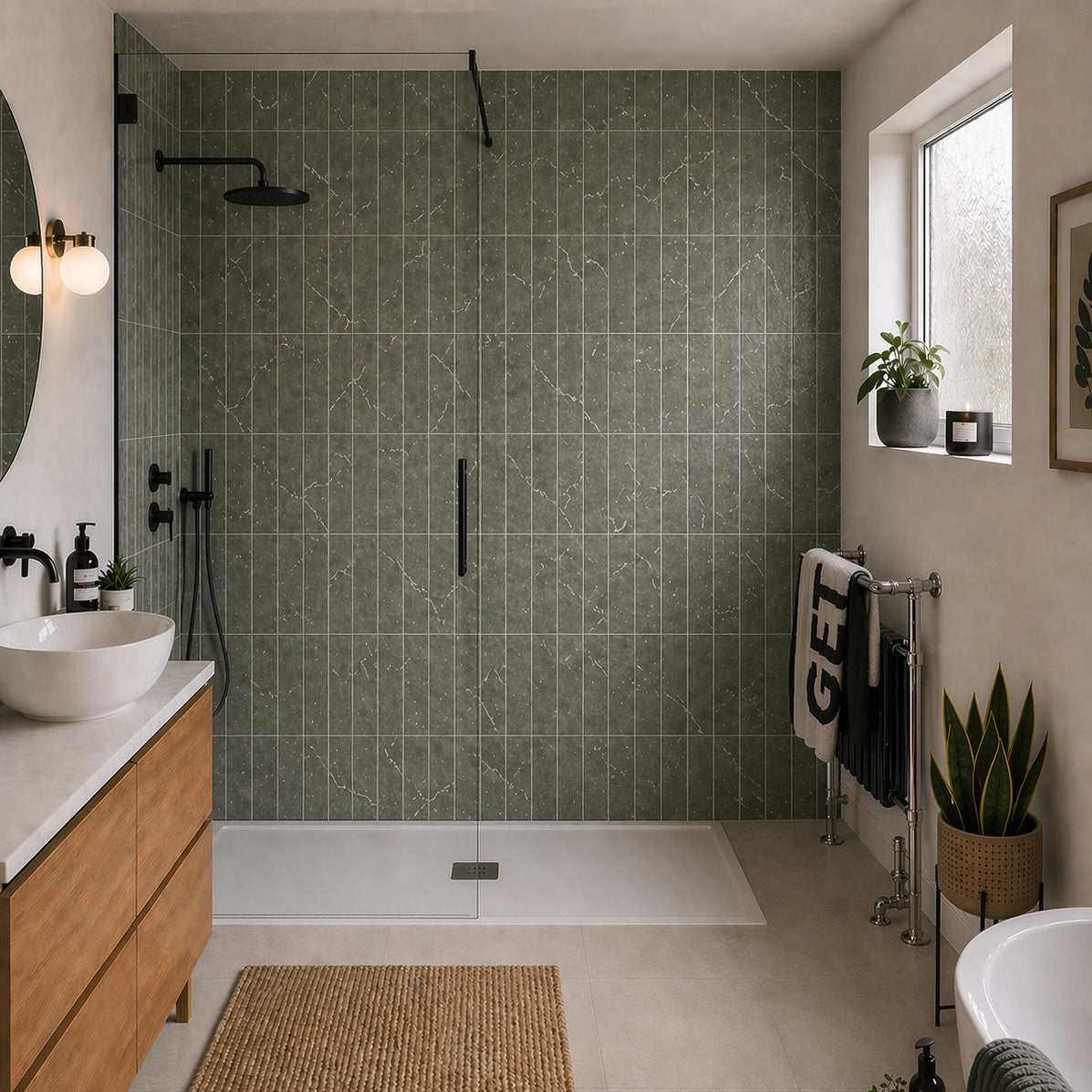
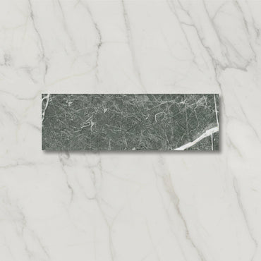
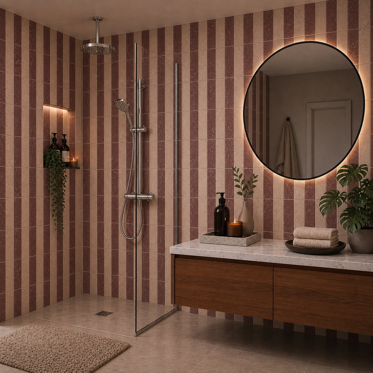
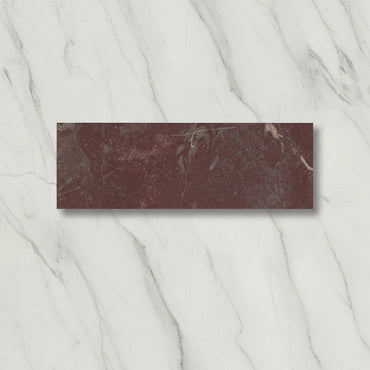
Chelsea Marble takes the classic appeal of marble and gives it a softer, more tactile feel. The textured matt surface takes some of the formality out of the stone effect, while the veining adds enough movement to make a wall feel considered without becoming overly decorative. Green, Black, Cream, White and Rose each give the marble effect a very different personality.

5 products

Marble is often associated with polished, highly reflective surfaces. Chelsea Marble takes a different approach. The matt finish absorbs much of the light rather than throwing it back into the room, which makes the veining feel softer and the overall surface less formal.

The texture adds another layer. Instead of the wall relying entirely on the printed marble pattern for interest, you also get a subtle change in how light falls across the surface. This can be particularly useful in bathrooms, where a completely polished marble effect can sometimes feel quite stark.

It also makes Chelsea Marble easier to combine with warmer materials. Timber, brushed metal and natural-toned finishes can sit comfortably alongside it without having to compete with a highly reflective surface.

One of the easiest mistakes with marble-effect tiles is choosing everything else before looking closely at the stone pattern. Chelsea Marble is more interesting when you allow the veining to influence the palette around it.

Look beyond the overall colour and notice the quieter tones running through the design. Those secondary colours can be a much better starting point for paint, cabinetry or accessories than trying to match the dominant shade exactly.

Green and Rose can be particularly effective when balanced with warmer neutrals, while Black and White give you a stronger contrast between the marble effect and the rest of the room. Cream is naturally softer and works beautifully with timber and other earthy materials.

The aim is to create a relationship with the veining rather than recreate the whole pattern elsewhere.

The surface texture is important because it affects how the marble pattern is perceived. On a completely smooth tile, the eye tends to concentrate almost entirely on the printed veining. With Chelsea Marble, the texture creates small changes in light and shadow across the face, giving the pattern another dimension.

That can make the wall feel more natural because the surface isn't behaving like a completely flat image.

It is also something worth considering when choosing where to use it. Directional light from a window or wall fitting can reveal more of the texture than even overhead lighting, so the same tile may appear relatively quiet in one position and much more tactile in another.

Chelsea Marble doesn't necessarily need to cover every wall to make an impression. Using it behind a vanity, around a bath or on a shower wall can give the room a clear focal point while allowing the remaining surfaces to stay quieter.

This can be particularly effective with Green, Black and Rose, where the colour and veining already provide considerable visual weight.

On the other hand, Cream and White can work beautifully across larger areas because the softer palette allows the texture and veining to become more subtle background detail.

A useful rule is to decide whether you want the marble pattern to be the first thing you notice or something you discover as you look closer. The amount of wall you cover can make a surprisingly large difference.

You might like