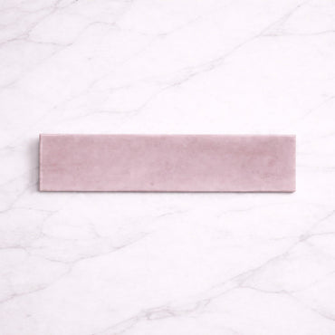
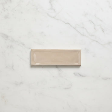
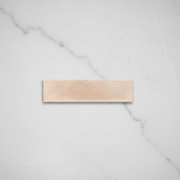
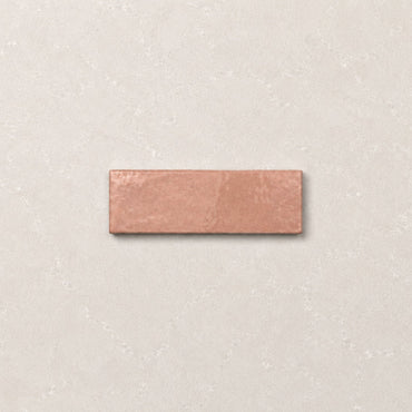
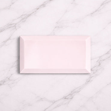
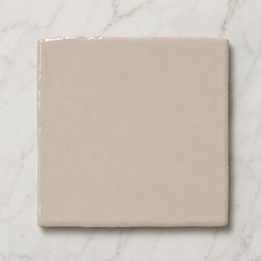
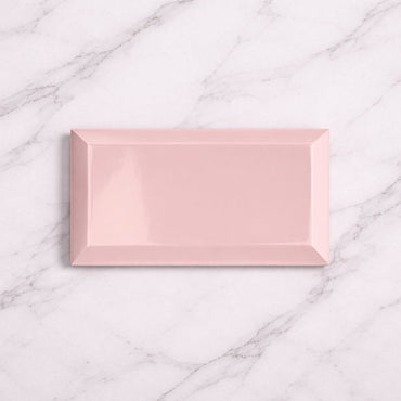
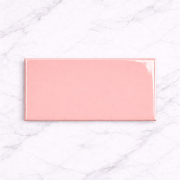
Collection: Pink Tiles
Pink wall tiles can be much more versatile than they first appear. Soft pinks can sit almost like a warm neutral, bringing colour without dominating the room, while richer rose tones create a more noticeable focal point. The difference often comes down to undertone, finish and what you place alongside the tile. Used thoughtfully, pink can feel calm and sophisticated.
-
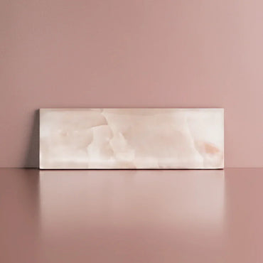
Opal Pink Gloss Wall Tiles 7.5x30cm
A softened pink wall tile with a rich gloss finish and gentle handcrafted character. The reflective glaze gives the colour...
£19.99 -
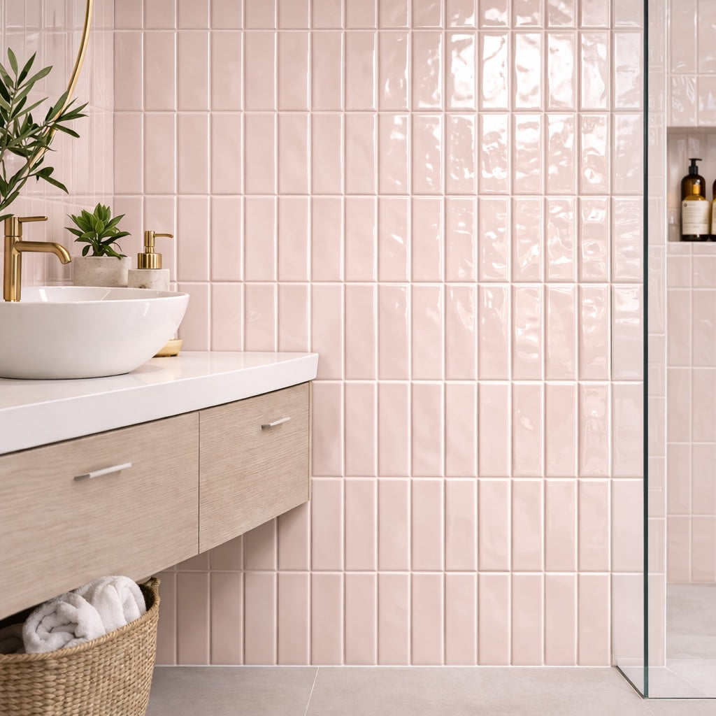
Riviera Soft Pink Ripple Gloss Wall Tile 6.5x20cm
A muted blush-toned ceramic wall tile with a softly rippled gloss finish. Riviera Soft Pink introduces warmth subtly through colour...
£31.99 -
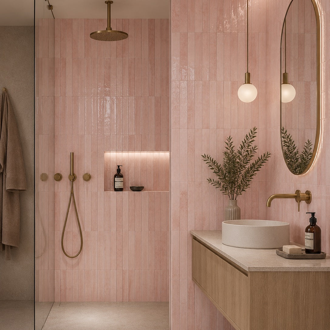
Bali Pink Wall Tile 5x40cm
Softly expressive and effortlessly contemporary, Bali Pink reimagines the use of colour within interior spaces. Rather than demanding attention, it...
£24.99 -
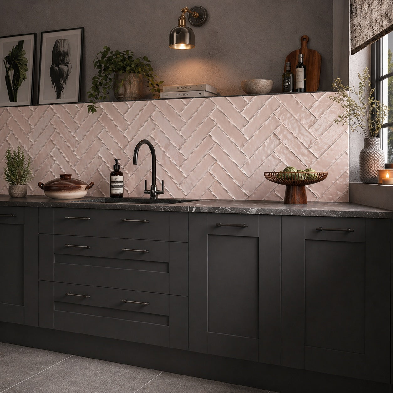
Verona Baby Pink Wall Tiles 7.5x30cm
Soft, warm and understated, Verona Baby Pink introduces colour in a more subtle and considered way. The glossy finish enhances...
£44.99 -
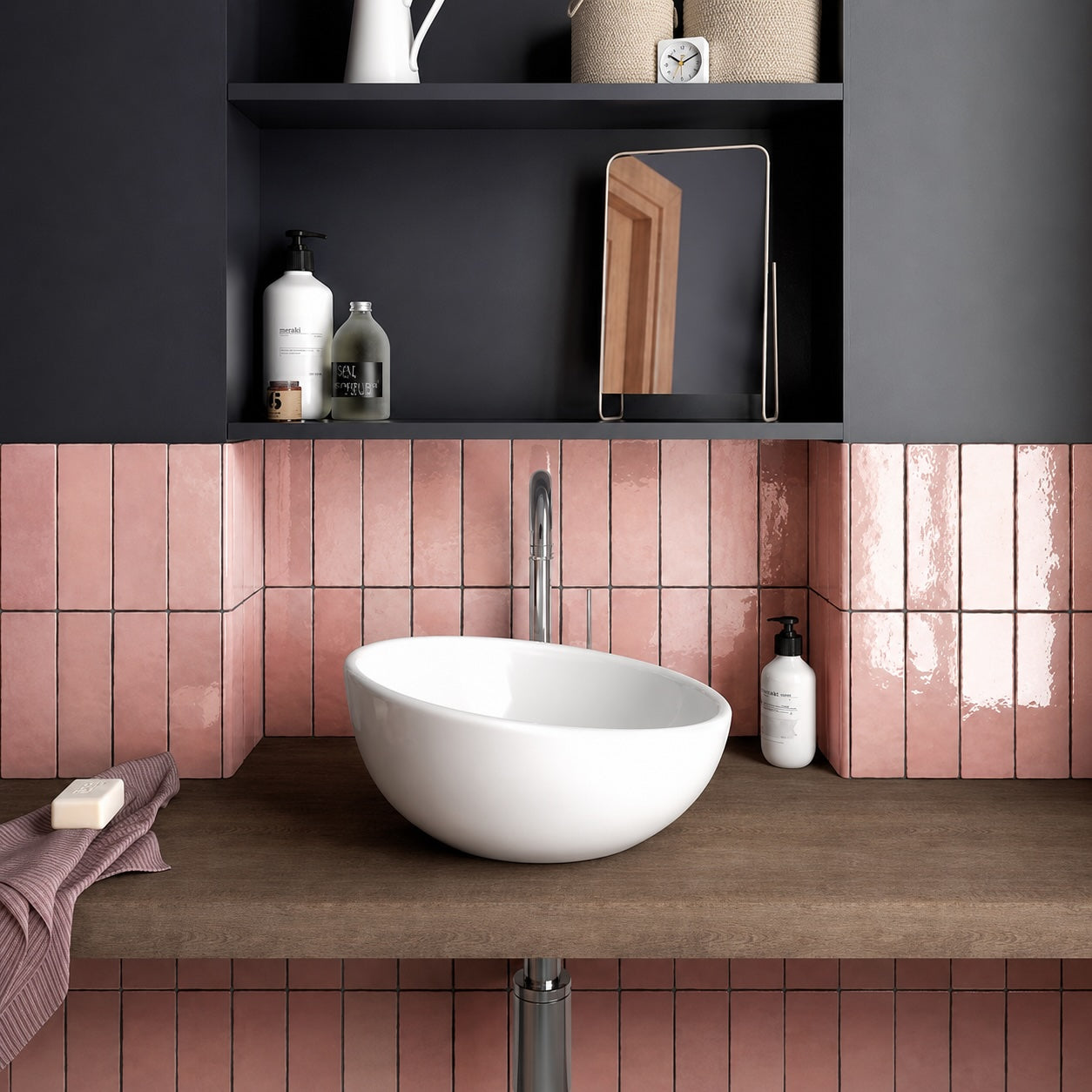
Artesano Rose Wall Tiles 6.5x20cm
Soft, warm and quietly sophisticated, Artesano Rose offers a fresh interpretation of pink for contemporary interiors. Rather than feeling overtly...
£46.99 -
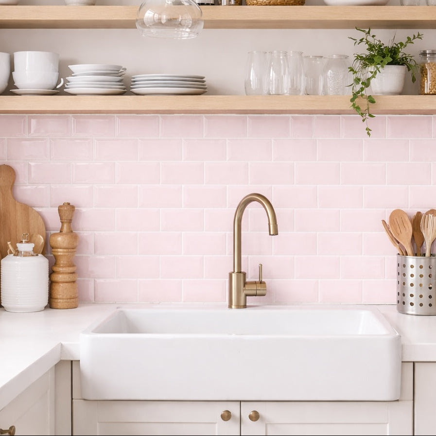
London Baby Pink 10x20cm
London Baby Pink 10x20cm Soft, sweet, and effortlessly stylish. The Metro Baby Pink Gloss 10x20cm tile offers a subtle blush...
£22.99 -
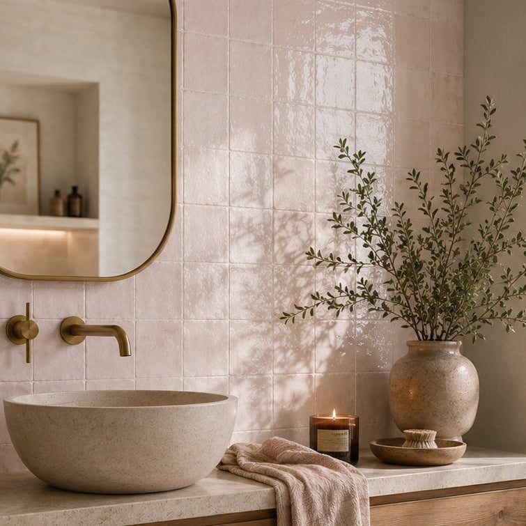
Zellige Pink Blush Wall Tiles 13x13cm
Soft blush tones and handcrafted detailing give Zellige Pink a warm, relaxed character. The gloss finish enhances the depth of...
£31.99 -
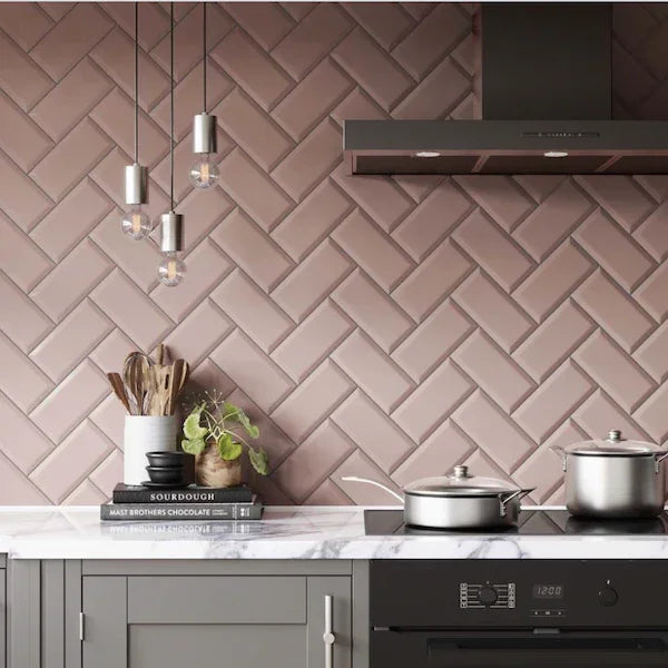
London Pink Blush 10x20cm
London Pink Blush 10x20cm Soft, modern, and full of character. The Metro Pink Blush Gloss 10x20cm tile adds a gentle...
£22.99 -
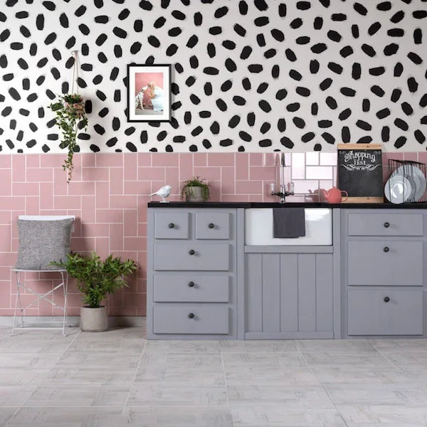
Underground Pink 10x20cm
Underground Pink 10x20cm Add a soft pop of colour with the Metro Pink Flat Gloss Wall Tiles 💗. These stylish 10x20cm...
£22.99 -
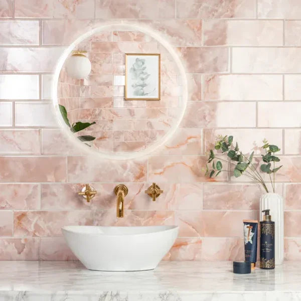
Onyx Metro Pearl Pink Wall Tiles 10x30cm
Onyx Metro Pearl Pink Wall Tile 10x30cm – Elegant, Subtle Luxury for Your Walls Transform your interior with the soft...
£34.99 -
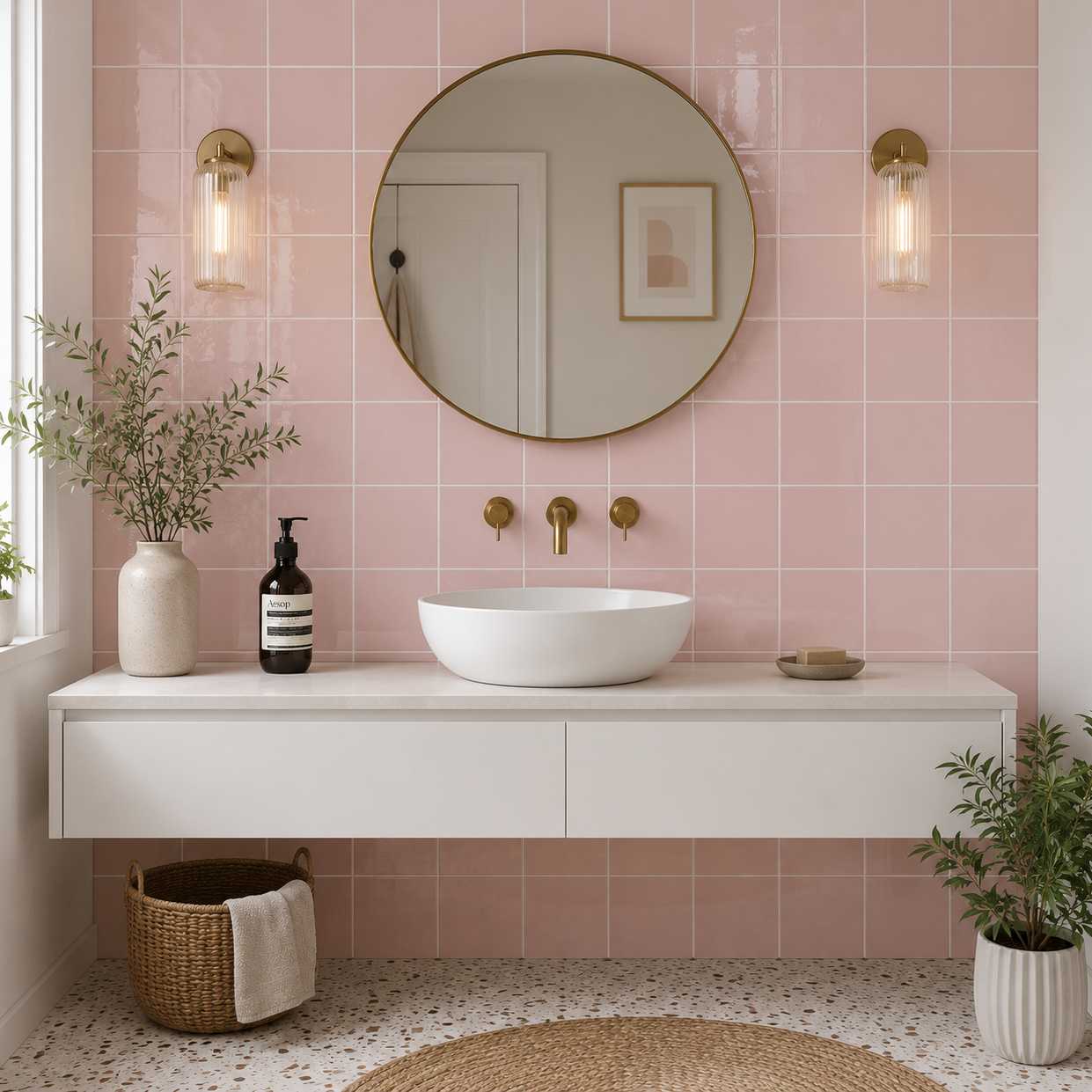
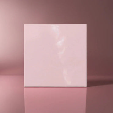
Modern Square Pink Flat Gloss 15x15cm
Modern Square Pink Flat Gloss 15x15cm Bring a soft splash of colour and contemporary charm to your space with the...
£22.99 -
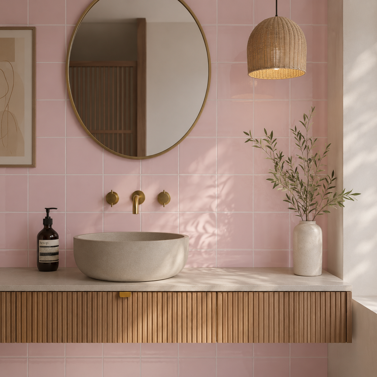
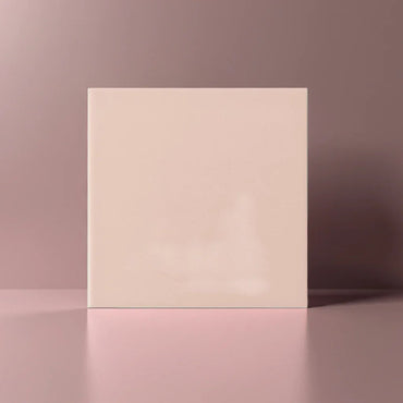
Modern Square Pink Flat Matt 15x15cm
Modern Square Pink Flat Matt Wall Tiles 15x15cm Add a soft pop of colour with the Modern Square Pink Flat...
£22.99
When does pink work like a neutral?
Very soft pinks can behave more like an off-white or warm beige than a traditional statement colour. Their warmth gives a room a little more personality, but they are still gentle enough to cover a substantial area without becoming visually overwhelming.
This is particularly useful in bathrooms, where soft pink can take the edge off an otherwise very white scheme. Instead of creating a strong contrast, it sits between the sanitaryware, flooring and other finishes, making the room feel warmer as a whole.
The key is the undertone. A dusty, muted pink can feel almost architectural, whereas a brighter, more saturated pink will naturally attract much more attention.
If you're unsure where a particular pink sits, look at it alongside a plain white tile. The comparison makes its warmth, softness or saturation much easier to judge.
Bathrooms are an obvious starting point, but pink can be equally effective in cloakrooms, kitchens and smaller areas where you want to introduce more personality.
A soft pink splashback can bring warmth into a neutral kitchen without requiring a major change to the cabinetry. In a cloakroom, a stronger pink can be used more confidently because the space is small and naturally suited to a bolder design decision.
The amount of pink matters too. Used sparingly, it behaves like an accent. Carried across a full wall, it becomes part of the architecture and usually feels much more deliberate.
Rather than asking whether pink is "too much", consider how much of the room you want the colour to influence.
What goes well with pink tiles?
Pink works particularly well when you balance its warmth rather than simply trying to repeat the colour elsewhere.
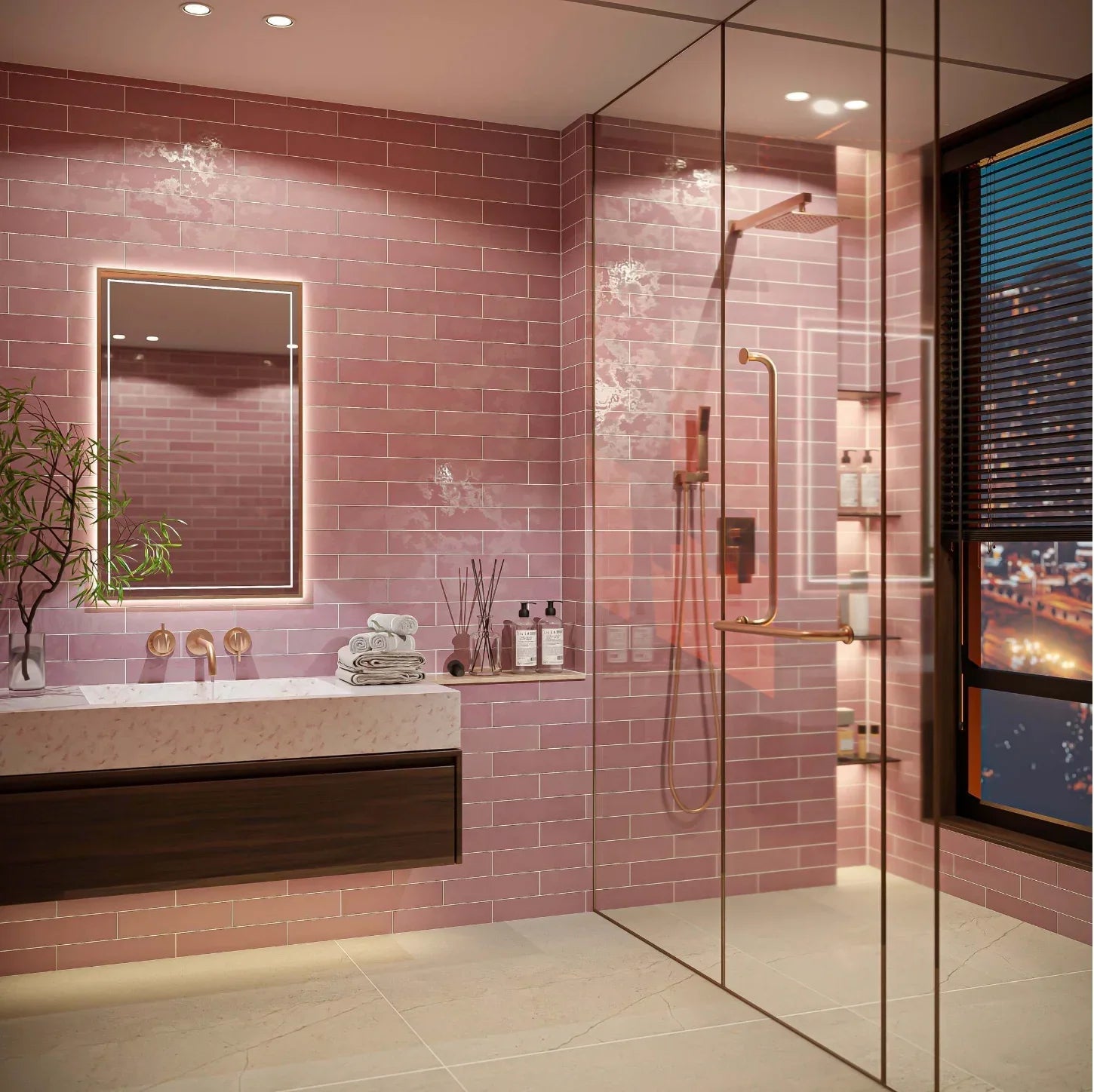
Warm timber is an obvious pairing because it reinforces the softer side of pink. Natural stone and creamy neutrals can create a similarly gentle palette, while brass introduces a warmer, more decorative quality.
For something more contemporary, darker elements can provide useful contrast. Black taps, dark cabinetry or deeper stone can stop a soft pink from becoming too sweet and give the room a much sharper edge.
Green can also work beautifully with pink, particularly when both colours are slightly muted. Rather than treating them as contrasting statement colours, think of them as two natural tones that balance each other.
How can you make pink feel sophisticated rather than overly sweet?
The easiest way is to pay attention to what surrounds it.
A soft pink tile alongside lots of glossy white, delicate accessories and additional pastel colours will naturally push the room towards a softer, more playful aesthetic. That can be lovely, but it's not the only direction available.
Introduce stronger material contrast instead. A matt stone worktop, natural timber, brushed brass or dark metalwork can give the pink a more grown-up setting. Simpler sanitaryware and cleaner-lined cabinetry can also make the tile feel much more contemporary.
You can also use pink more architecturally. Carrying it through a complete shower area or across the wall behind a vanity often feels more intentional than using a small isolated section of colour.
Why does lighting matter so much with pale pink?
Pink can change quite dramatically depending on the light because its appearance is closely tied to its warm undertones.
In bright daylight, a soft pink can appear quite fresh and almost neutral. Under warm artificial lighting, those same undertones can become more pronounced, making the colour feel richer and warmer in the evening.
This is particularly noticeable with gloss tiles, which reflect nearby colours back into the surface. A pink wall beside warm timber or cream paint may therefore appear much warmer than the same tile against cool white cabinetry.
That's why a pink sample is worth viewing in the actual room and alongside the materials you're choosing. You're not only judging the tile's colour — you're judging how that colour behaves within its surroundings.