Skip to content
Code CRFTD15 for £15 off
Free Shipping on Orders over £399.

Collection: Cotswold

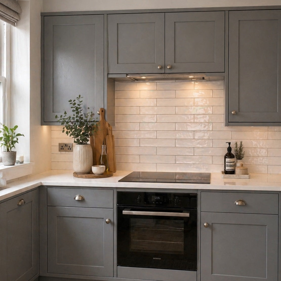
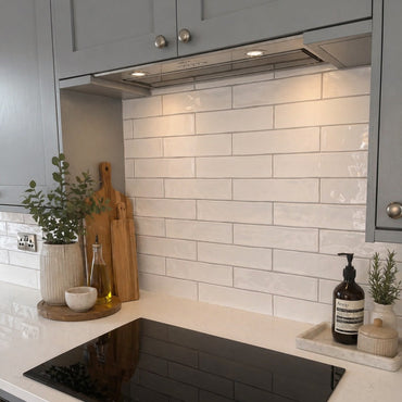
Cotswold has the kind of imperfect charm that makes a tiled wall feel as though it has been there for years rather than installed yesterday. Its handmade character comes through in the softly irregular shape and surface, while the choice of formats and finishes lets you decide just how traditional or contemporary you want the result to feel. In gloss white, the glaze adds another layer of light; the matt option keeps things quieter and more understated.

3 products

The appeal of Cotswold is in the small differences. The tiles don't have the perfectly machine-straight appearance of a highly uniform ceramic, so the edges and surfaces create subtle changes as they meet.

That matters because a completely regular tile creates a very predictable grid. Cotswold breaks that grid up just enough for the wall to feel more natural. You notice it particularly when light catches the uneven surface or when several rows are viewed together — the individual pieces don't disappear into a perfectly repetitive pattern.

It is also why Cotswold can work so well with simple surroundings. The tile itself provides the detail, so clean cabinetry, natural timber or understated sanitaryware can create a useful contrast rather than competing with it.

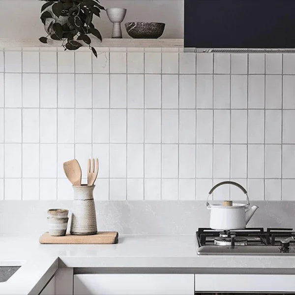
The 7.5 × 15cm and 7.5 × 30cm versions aren't simply two sizes of the same idea. Their proportions change the rhythm of the finished wall.

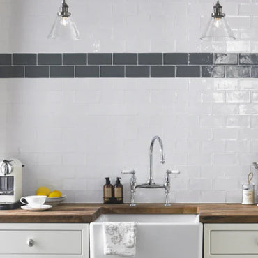
The shorter format creates more frequent joints and therefore a more detailed, traditional feel. It works beautifully when you want the individual tiles to be part of the visual character.

The longer format gives the eye more uninterrupted tile surface, making the installation feel calmer while retaining Cotswold's handmade irregularity. This can be a particularly nice balance in a contemporary bathroom or kitchen where you want some warmth without making the wall feel overly busy.

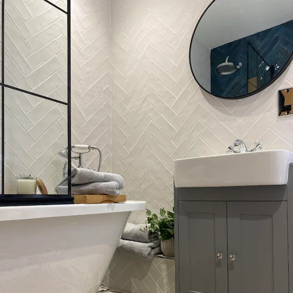
It's worth choosing the format alongside the laying pattern. A small handmade tile in a herringbone arrangement, for example, becomes much more decorative than the same collection laid in a straightforward brick bond.

The gloss and matt versions create quite different relationships with light. Gloss reflects more of what is happening around it, so the irregular surface becomes more noticeable as highlights move across the wall. This can bring a white tiled wall to life, particularly where it receives natural or directional light.

The matt finish is quieter. Without the same level of reflection, more attention falls on the shape and subtle texture of the individual tiles rather than the way they catch the light.

Neither is necessarily more "handmade" than the other — they simply emphasise different characteristics. If you want the wall to feel brighter and more luminous, gloss has an advantage. If you're drawn to a softer, more natural appearance, matt can be the better fit.

With a handmade-effect tile, grout can either celebrate the irregularity or allow it to sit more quietly within the overall wall.

A closely matched grout softens the joints and allows the uneven edges to blend together. This gives you more of the relaxed, continuous feel often associated with handmade tiles. A contrasting grout traces every individual piece and makes the differences in shape much easier to see.

The laying pattern changes that again. A simple brick bond lets the character of the tile speak for itself, while herringbone creates a much stronger visual pattern. With the smaller format especially, herringbone can become quite decorative, so it is worth considering the other patterns and textures already present in the room.

A useful way to think about it is: do you want the tile's imperfections to be the detail, or do you want them to become part of a larger pattern? That decision can guide both your grout and layout.

You might like