Skip to content
Code CRFTD15 for £15 off
Free Shipping on Orders over £399.

Collection: London

There’s a reason the classic metro tile has stayed popular for so long: its simple shape gives you an enormous amount of freedom. London takes that familiar format and lets colour, grout and layout do the styling. From White and soft Cream to Cobalt, Green, Sage, Blush and Baby Pink, the same tile can feel traditional, playful, dramatic or surprisingly contemporary depending on how you put it together.

7 products

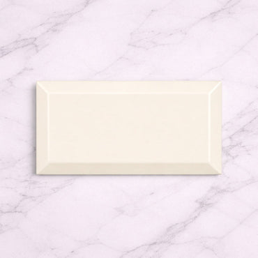
  • London Cream 10x20cm

    London Cream 10x20cm Warm, soft and effortlessly elegant — the Metro Cream Gloss tile brings timeless charm to kitchens and...

    £22.99
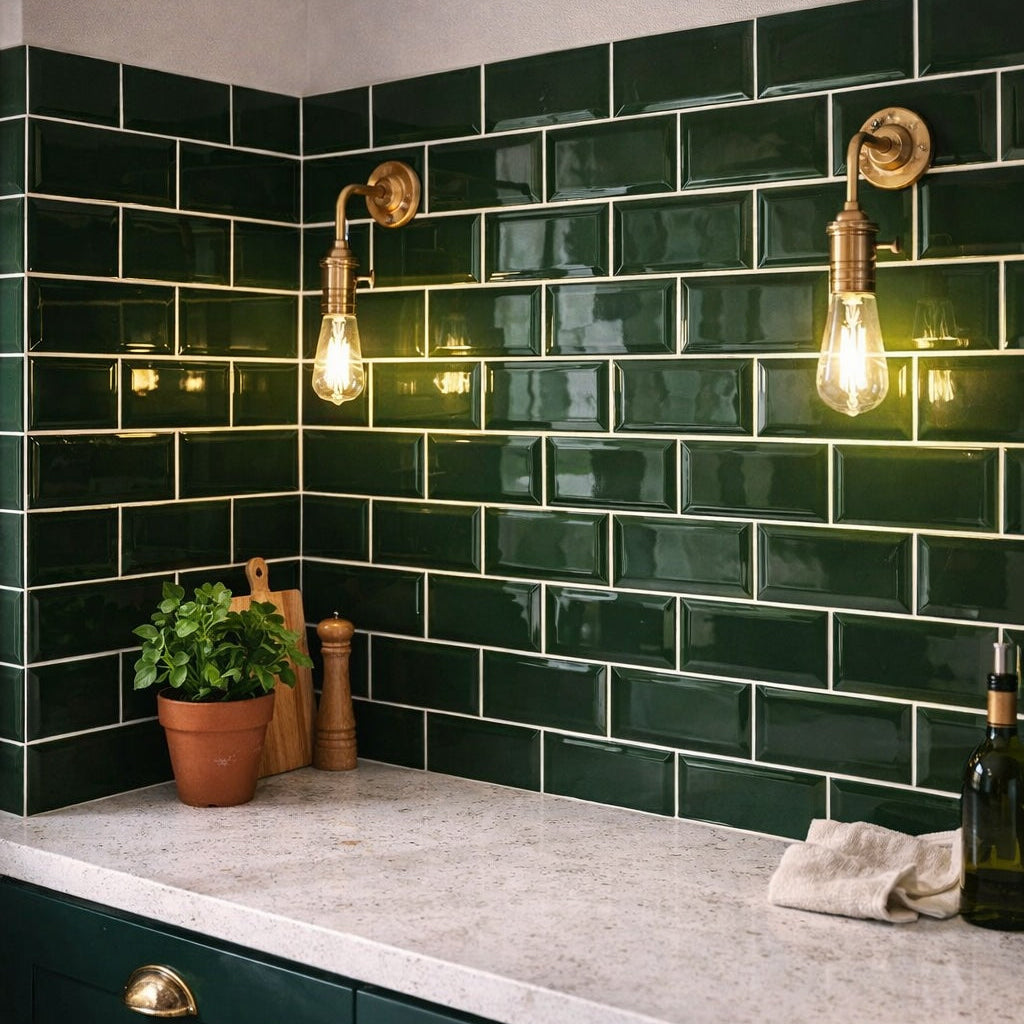
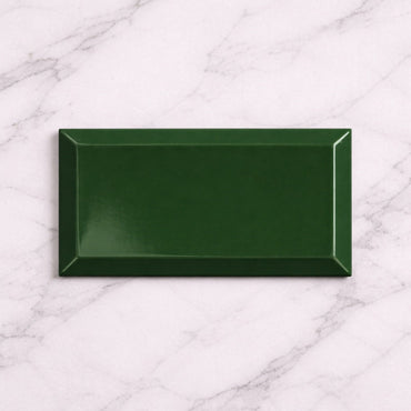
  • London Green 10x20cm

    London Green 10x20cm Bring the outdoors in — with a glossy green twist. The Metro Green Gloss 10x20cm tile delivers...

    £22.99
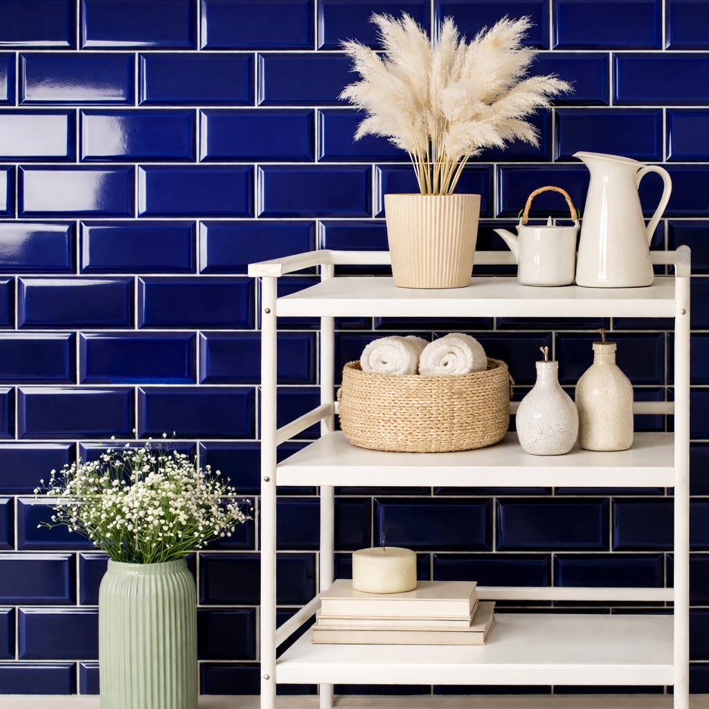
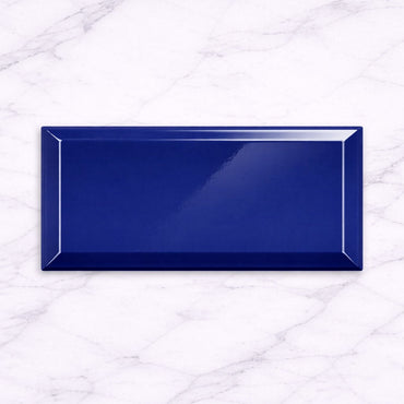
  • London Cobalt 10x20cm

    London Cobalt 10x20cm Bold, vibrant, and full of energy. The Metro Cobalt Blue Gloss 10x20cm tile brings a striking burst...

    £22.99
  • London Pink Blush 10x20cm

    London Pink Blush 10x20cm Soft, modern, and full of character. The Metro Pink Blush Gloss 10x20cm tile adds a gentle...

    £22.99
  • London Sage 10x20cm

    London Sage 10x20cm The high-gloss ceramic surface not only enhances the gentle green tone but also reflects light to keep...

    £22.99
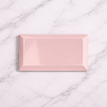
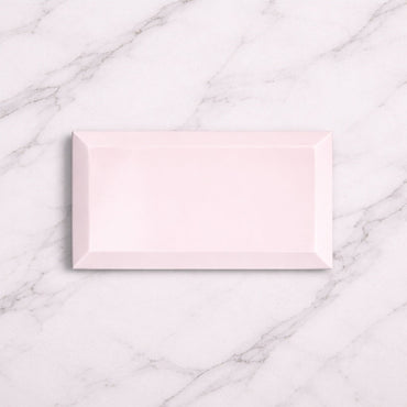
  • London Baby Pink 10x20cm

    London Baby Pink 10x20cm Soft, sweet, and effortlessly stylish. The Metro Baby Pink Gloss 10x20cm tile offers a subtle blush...

    £22.99
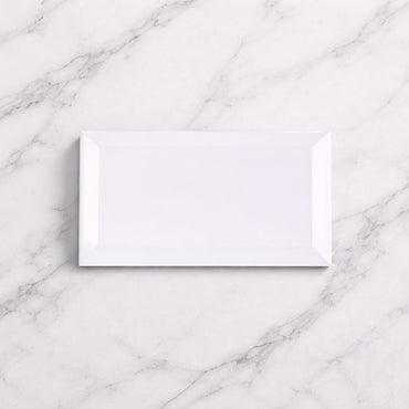
  • London White 10x20cm

    London White 10x20cm Clean, bright, and endlessly versatile. The Metro White Gloss 10x20cm wall tile from Metro Tiles UK is...

    £22.99
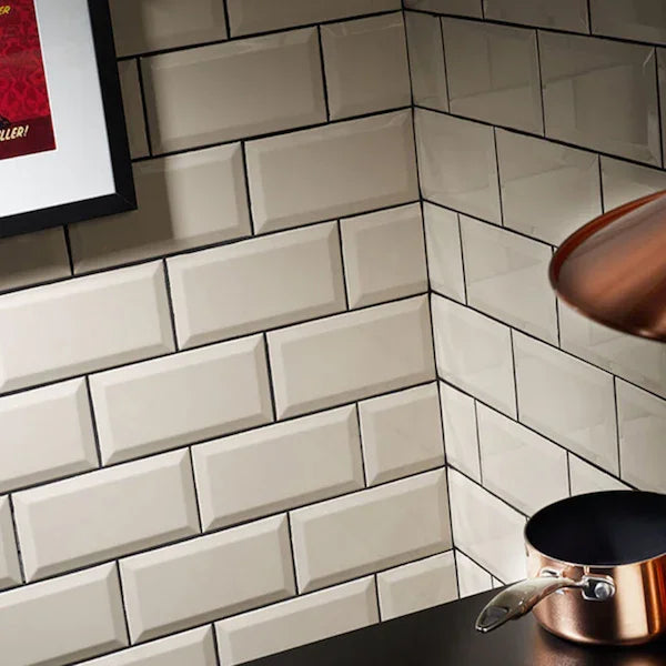
The appeal of a metro tile is partly its simplicity. Because the shape isn't trying to make a statement of its own, it can sit comfortably alongside very different interiors and materials.

That also makes it unusually adaptable when you change other parts of a room. A White metro tile can feel traditional with a framed kitchen, more contemporary with flat-fronted cabinetry, or almost industrial when paired with dark metalwork. The tile hasn't changed - the context has.

The 10 × 20cm proportions also create a useful middle ground. They're substantial enough that the wall doesn't become dominated by grout lines, but small enough to create a clear rhythm when laid across a larger area.

With a straightforward tile like London, the laying pattern becomes one of the easiest ways to give the wall a distinct personality.

A traditional brick bond offsets each row and gives the familiar metro look most people associate with this format. Stack the tiles instead and the same collection becomes much more orderly and contemporary, particularly when the grout is closely matched.

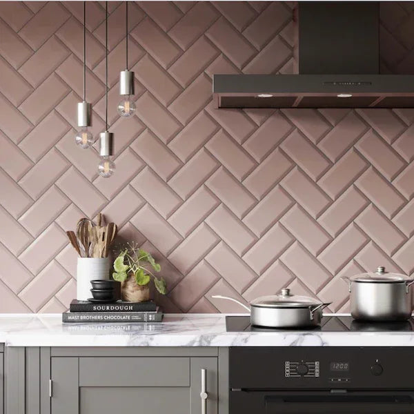
A vertical arrangement changes the emphasis again, drawing attention upwards rather than across the wall. Herringbone introduces considerably more movement and turns the individual tiles into a decorative pattern in their own right.

This is why it's worth choosing your layout before ordering rather than treating it as something for the tiler to decide on later. With a simple tile, the arrangement becomes part of the design.

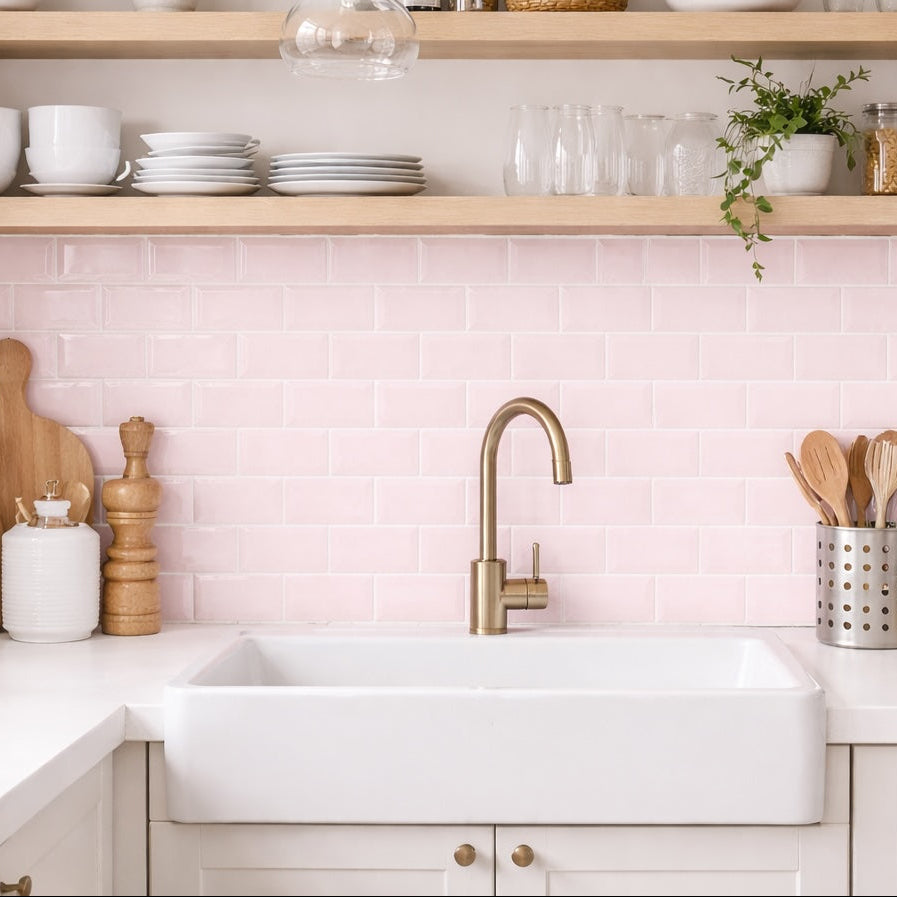
London's palette gives you plenty of opportunity to change the atmosphere without changing the tile itself. White and Cream provide quieter backdrops, while Cobalt and Green have considerably more visual weight. Sage offers something softer, while Blush and Baby Pink can introduce warmth without necessarily making the room feel overtly colourful.

For stronger shades, don't feel obliged to repeat the exact colour elsewhere. A Cobalt wall can work beautifully with warm timber and brass because the contrast gives the blue more depth. Sage can sit naturally alongside warm whites and oak, while pink can be balanced with stone, cream or darker accents.

A useful trick is to look at the temperature of the colour rather than simply its name. A warm white beside a soft pink will feel very different from a cool white, even though both are technically "white."

Metro tiles are one of the clearest examples of how grout can change the appearance of an installation.

A matching grout allows the tiles to visually blend together, making the wall feel calmer and putting greater emphasis on the overall colour. Contrast the grout and the joints become part of the pattern, creating a much stronger grid.

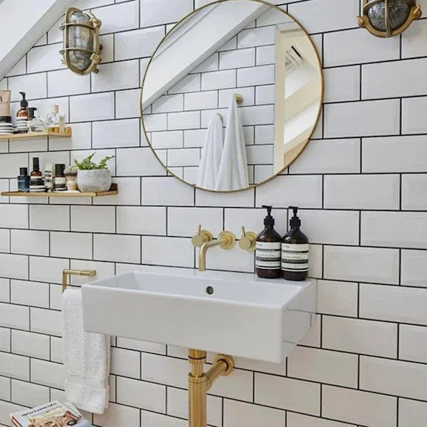
This can be particularly effective with White London tiles. A dark joint can make the familiar shape feel graphic and architectural, whereas a soft neutral grout can make the same wall considerably more understated.

With coloured tiles, I'd usually think about whether you want to emphasise the tile shape or let the colour become the dominant feature. Neither approach is inherently better -they're simply different ways of using the same product.

You might like