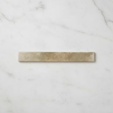
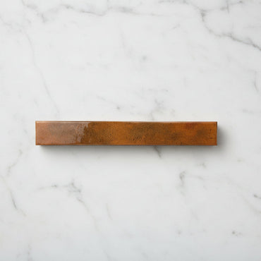
Collection: Bali
Bali makes an impression through its proportions. At 5 × 40cm, the long, slender format creates a distinctive rhythm across the wall, while the changing tones and reflective glaze keep that rhythm from feeling too rigid. The result is a tile that can look wonderfully calm in softer colours or much more dramatic in deeper shades, particularly when natural or warm light catches the glazed surface.
-
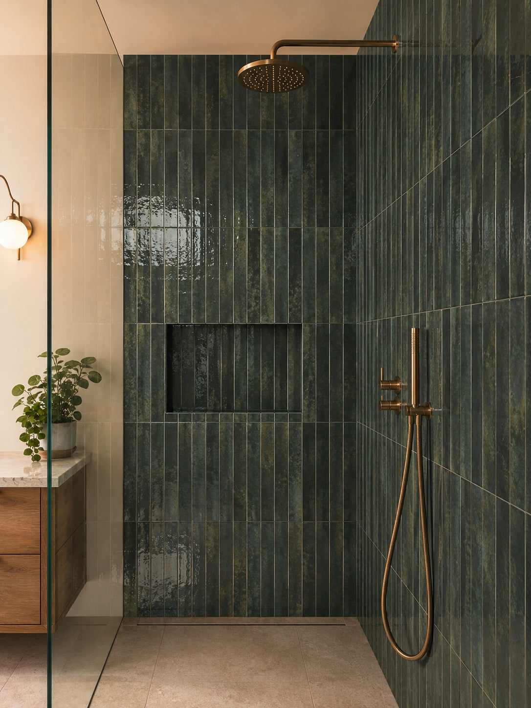
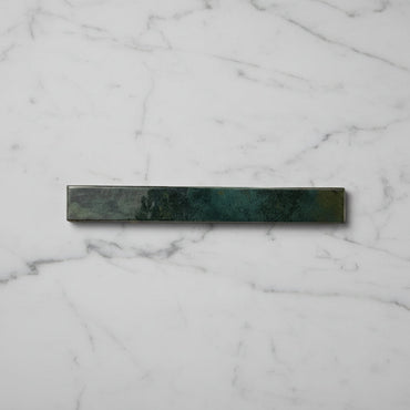
Bali Pine Green Wall Tile 5x40cm
Deep, grounding and quietly dramatic, Bali Pine Green introduces a richer palette to the collection. The colour draws inspiration from...
£24.99 -
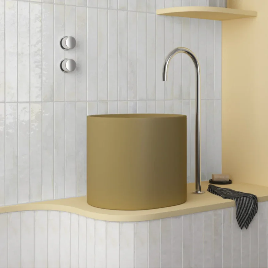
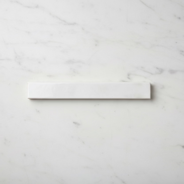
Bali White Wall Tile 5x40cm
Clean, bright and endlessly versatile, Bali White takes the simplicity of a classic white tile and elevates it through proportion...
£24.99 -
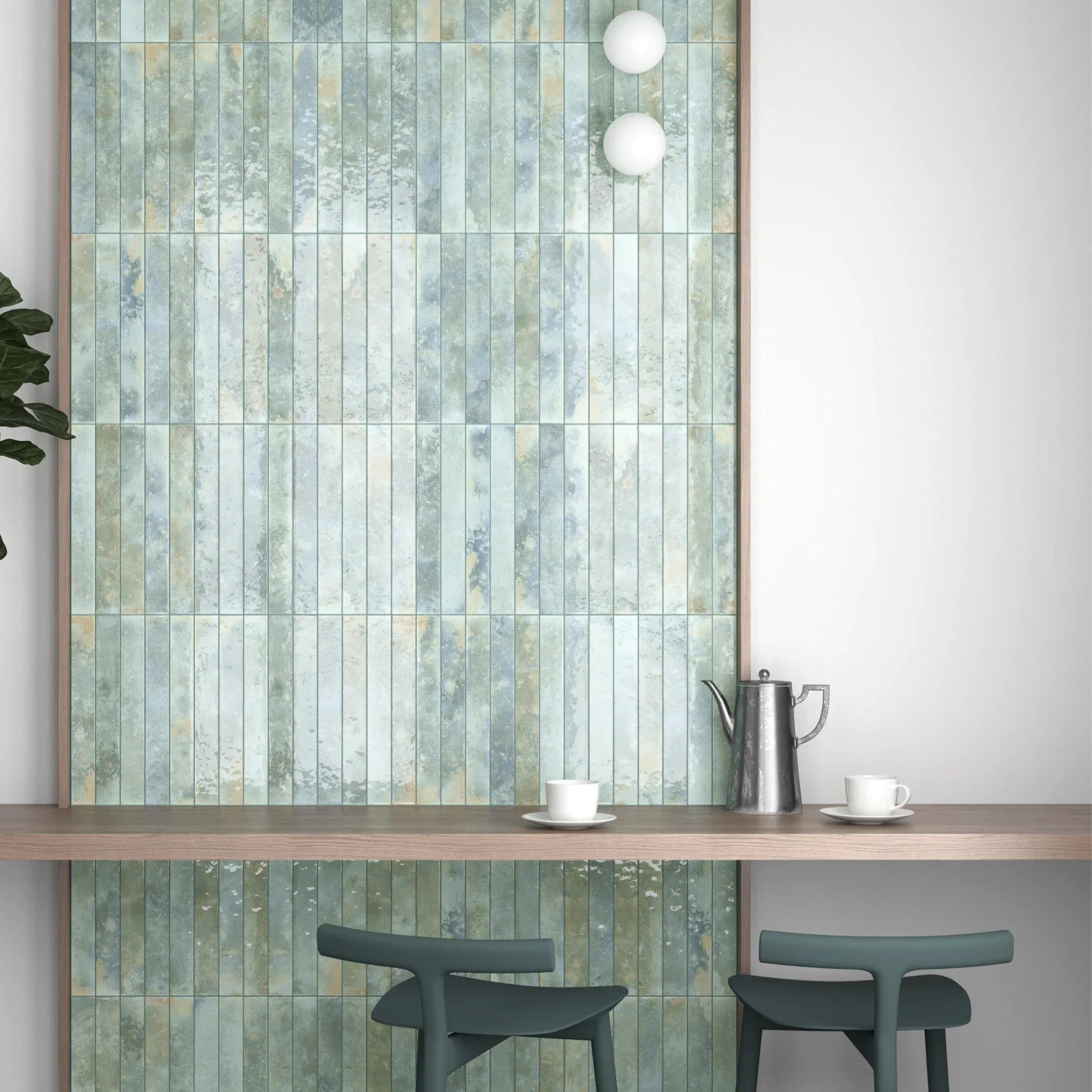
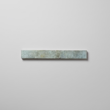
Bali Aqua Wall Tile 5x40cm
There is an effortless quality to Bali Aqua that feels instantly at home in light-filled interiors. Somewhere between blue and...
£24.99 -
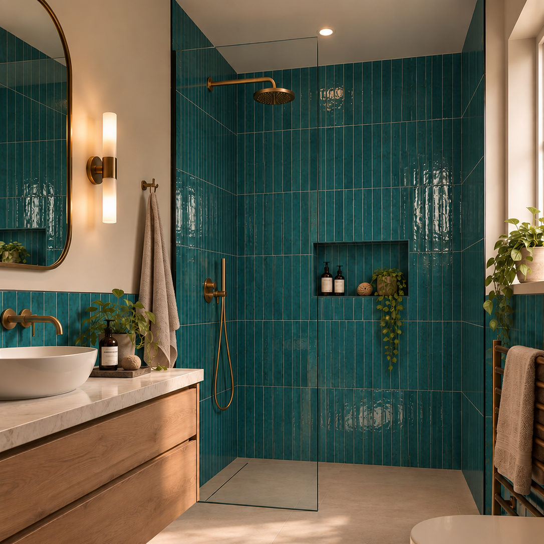
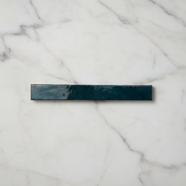
Bali Turquoise Wall Tile 5x40cm
Energetic yet refined, Bali Turquoise brings a sense of vibrancy that instantly lifts an interior. The colour recalls handcrafted ceramics...
£24.99 -
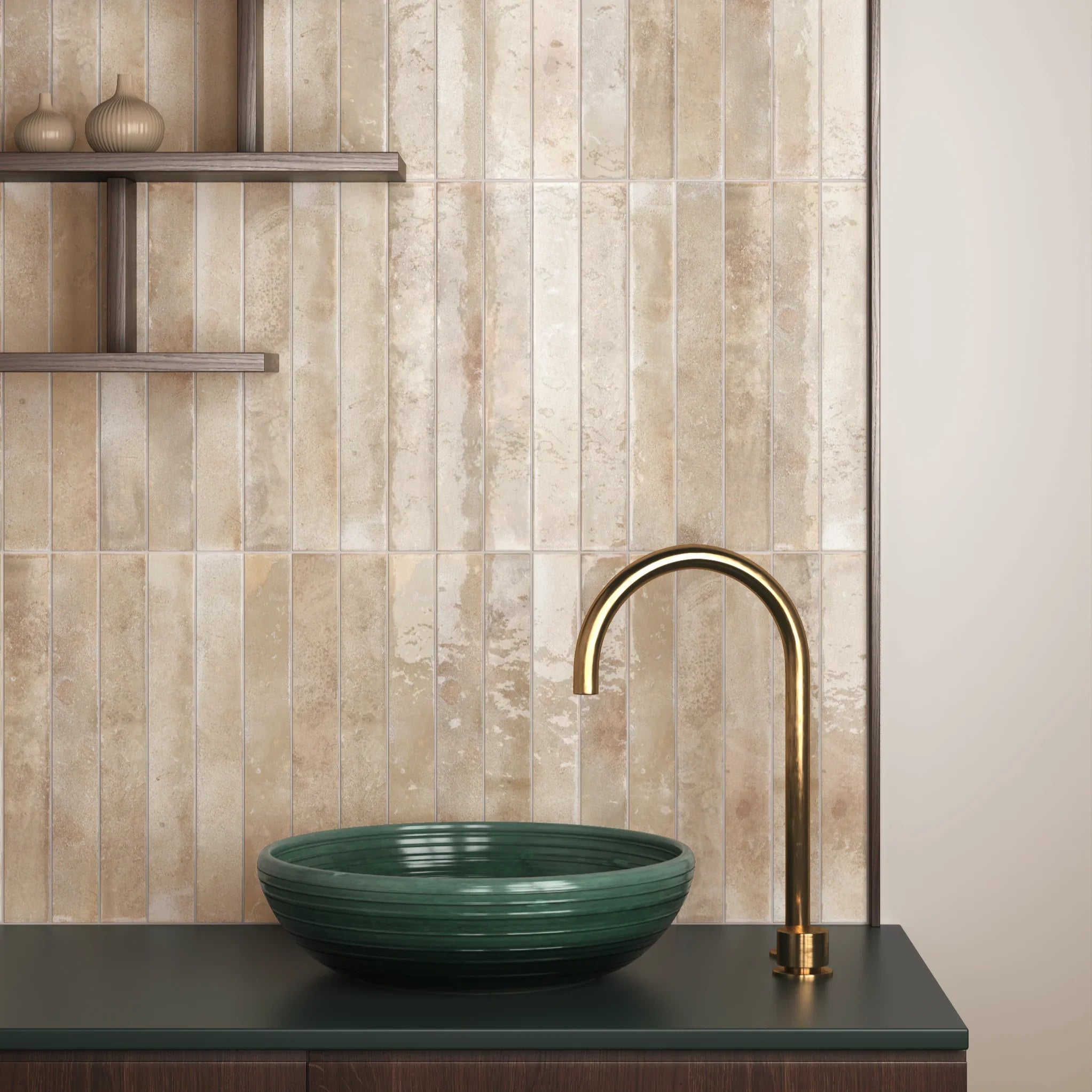
Bali Cream Wall Tile 5x40cm
Understated and versatile, Bali Cream offers a softer alternative to bright white. The warm neutral tone creates a gentle backdrop...
£24.99 -
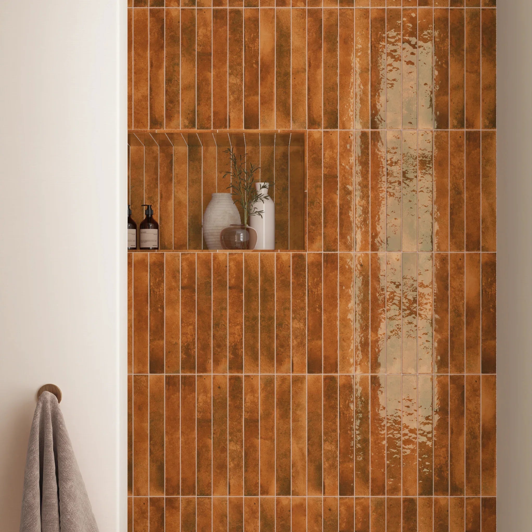
Bali Orange Wall Tile 5x40cm
Warm and full of personality, Bali Orange draws inspiration from sun-baked landscapes and Mediterranean architecture. The softened terracotta tone feels...
£24.99 -
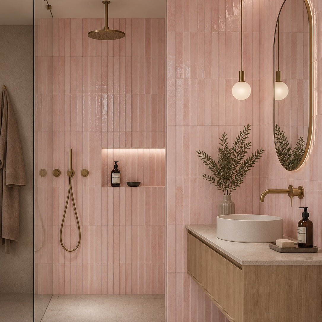
Bali Pink Wall Tile 5x40cm
Softly expressive and effortlessly contemporary, Bali Pink reimagines the use of colour within interior spaces. Rather than demanding attention, it...
£24.99
Why does the 5 × 40cm format make such a difference?
A long, narrow tile changes the way your eye reads a wall. Rather than seeing a series of compact shapes, the eye naturally follows the length of each tile, creating stronger horizontal or vertical movement depending on how it is installed.
That makes orientation particularly important with Bali. Laid vertically, the 40cm length creates a strong upward rhythm and can make a shower wall or alcove feel taller. Turn it horizontally and the same tile becomes much more architectural, drawing the eye across the room instead.
The long format can also mean fewer visible joints across a given area than a smaller tile, which gives the colour more opportunity to read as a continuous surface. This is especially effective with Bali's richer shades, where too many small grout lines could otherwise interrupt the depth of the colour.
Working with Bali's colour and light
Bali's colour is not completely static. The variation across the tiles and the reflective glaze mean that the shade can appear to shift as the light changes, which is particularly noticeable across a larger installation.
Forest Green and Turquoise can create a deep, immersive feel, while Aqua and Cream offer a softer starting point. Orange and Pink bring warmth and personality, and White gives you a much quieter backdrop.
When styling the stronger colours, I'd look at the temperature of the other materials in the room. Warm timber, stone and brass can bring out the richer side of the colour, while cooler whites and chrome create a fresher, more contemporary contrast. You don't need to match the tile exactly; often it's the relationship between warm and cool tones that makes the scheme interesting.
Let the glaze do some of the work
One of Bali's strengths is what happens when light hits the glazed surface. Instead of simply seeing the colour, you get small changes in reflection across the wall, which give the installation considerably more depth.
This can be particularly effective in bathrooms. A window, wall light or pendant positioned at an angle to the tiles can reveal much more of the surface variation than evenly distributed lighting would. It's one of those details that can be difficult to appreciate from a small product photograph.
The effect is worth considering when deciding where to use Bali. A wall that receives directional daylight or carefully positioned artificial light can make much more of the glaze than a completely shadow-free surface. This is also why viewing a sample in your own room is useful - the same colour can feel surprisingly different under different lighting conditions.
The grout and layout are part of the design
With a 5 × 40cm tile, grout isn't simply filling the spaces between the tiles; it helps determine how strongly the long format is expressed.
A closely matched grout allows the individual pieces to visually merge, putting more emphasis on the overall colour and glaze. A contrasting grout makes the long lines much more apparent and gives the wall a stronger graphic quality.
The same applies to the laying pattern. A straightforward stacked arrangement can make Bali feel very contemporary, while a brick bond breaks up the long lines and introduces more movement. Vertical stacking is particularly effective when you want to emphasise height, whereas horizontal laying can make a wall feel broader and more grounded.
Because the tile itself already has a strong proportion, I'd decide on the orientation and grout before finalising the design, rather than treating them as installation details afterwards.