

Collection: Aqua Tiles
Aqua wall tiles sit somewhere between blue and green, but their lighter, brighter character gives them a personality of their own. They can make a bathroom feel fresh and airy, bring a gentle wash of colour to a kitchen, or create a more relaxed Mediterranean feel when paired with natural materials. The finish and surrounding colours are what determine whether aqua feels crisp, soft, playful or sophisticated.

-
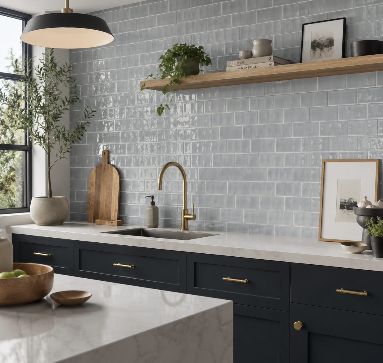
Countrywide Duck Egg Gloss Hand Made Effect Wall Tiles 7.5x15cm
Countrywide Duck Egg Mini Wall Tiles Create a soft backdrop with Countrywide Duck Egg Mini, a charming ceramic wall tile...
£17.99 -
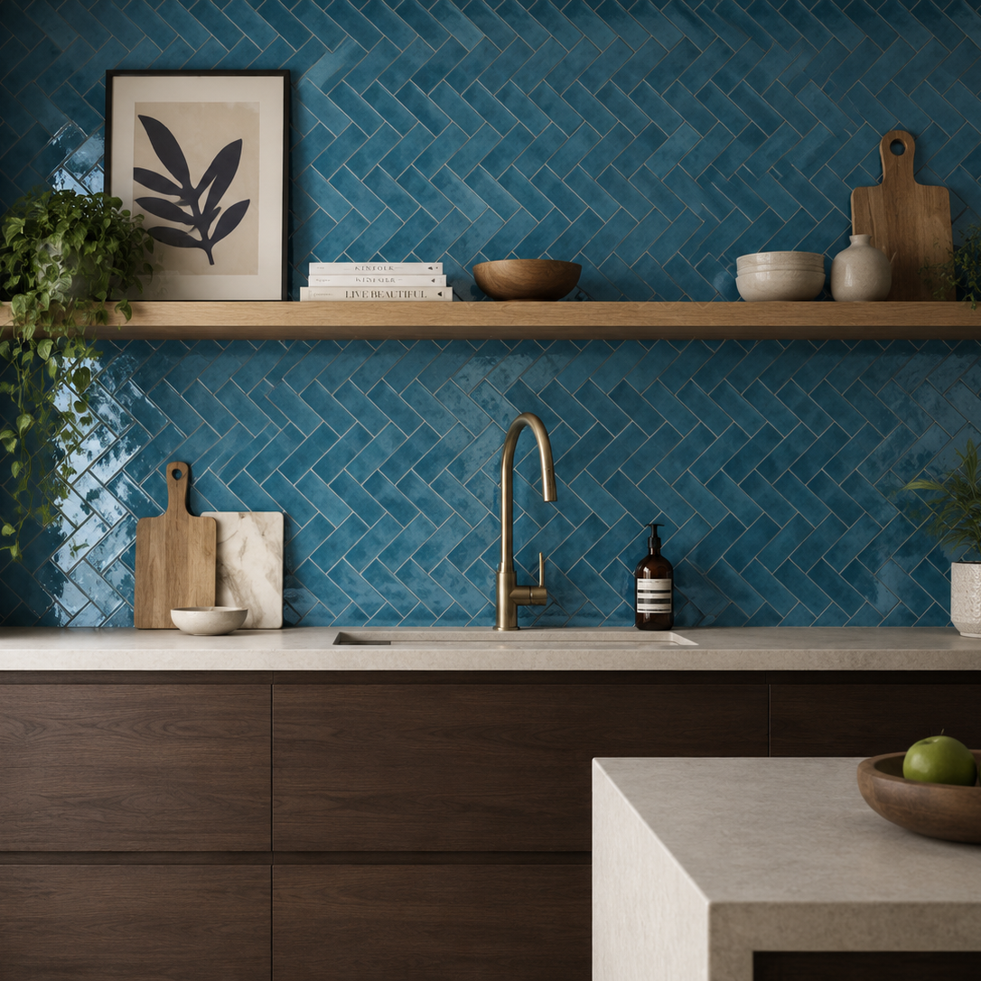
Palais Glacier Gloss Wall Tile 20x6.5cm
Cool, fresh and quietly sophisticated, Palias Glacier introduces a blue palette to the collection. The blue tone creates interiors that...
£31.19 -
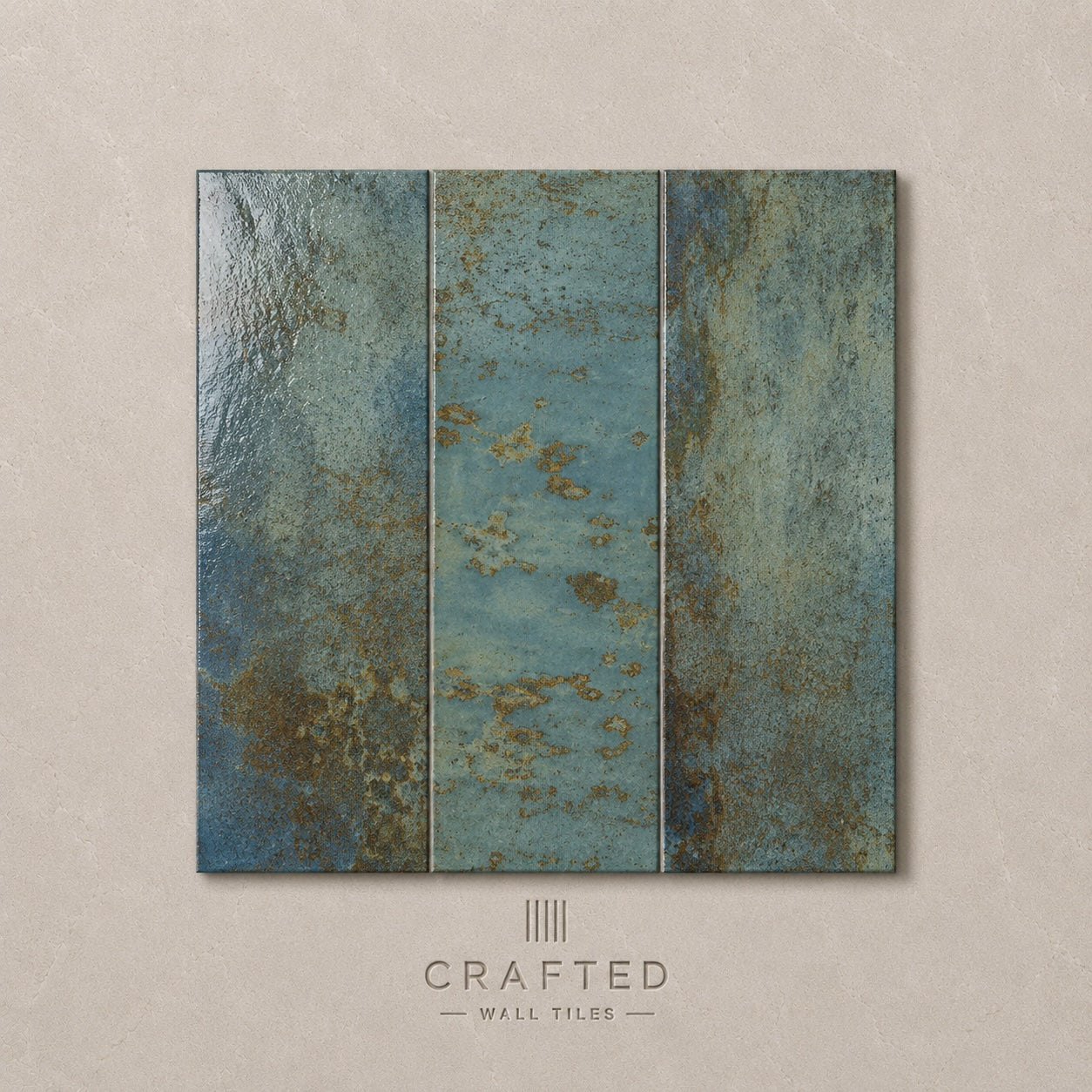
Precinct Aqua Wall Tile 10x30cm
Fresh and uplifting, Precinct Aqua captures the relaxed atmosphere of coastal interiors while maintaining a sophisticated, contemporary feel. The soft...
£44.99 -
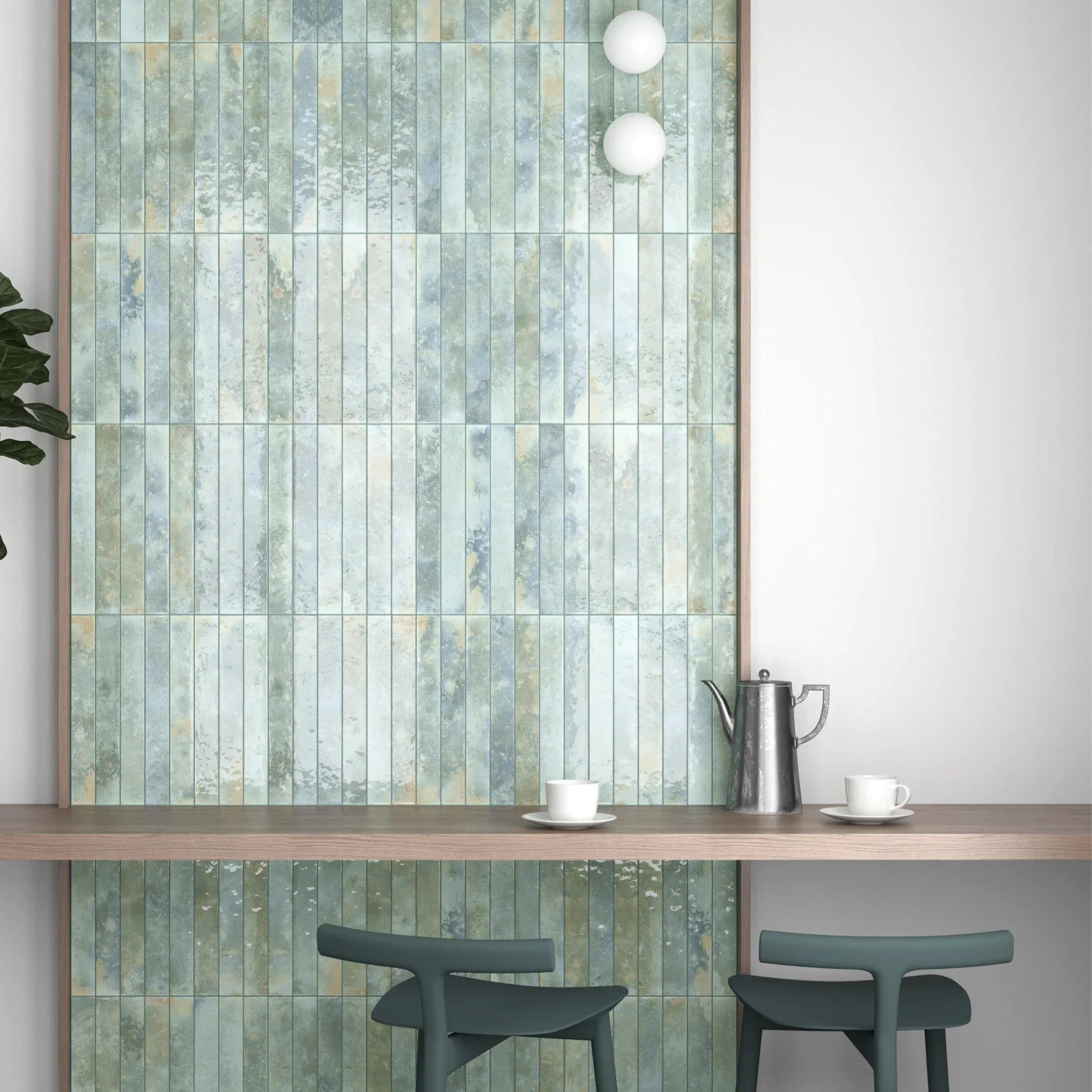
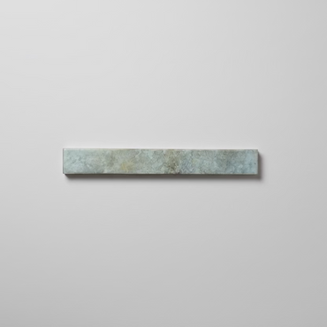
Bali Aqua Wall Tile 5x40cm
There is an effortless quality to Bali Aqua that feels instantly at home in light-filled interiors. Somewhere between blue and...
£24.99 -
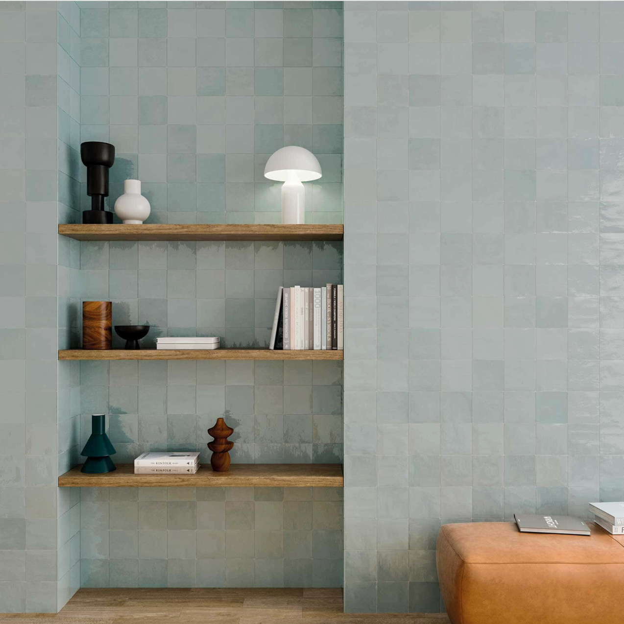
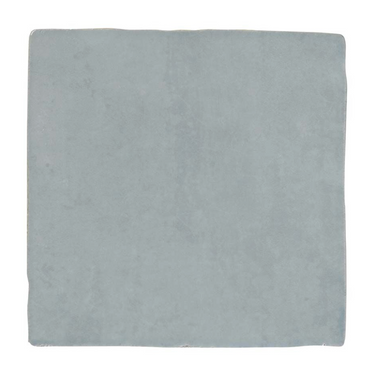
Zellige Light Blue Wall Tiles 13x13cm
A gentle blue wall tile inspired by coastal tones and traditional handcrafted ceramics. The glossy surface introduces depth and light,...
£31.99 -
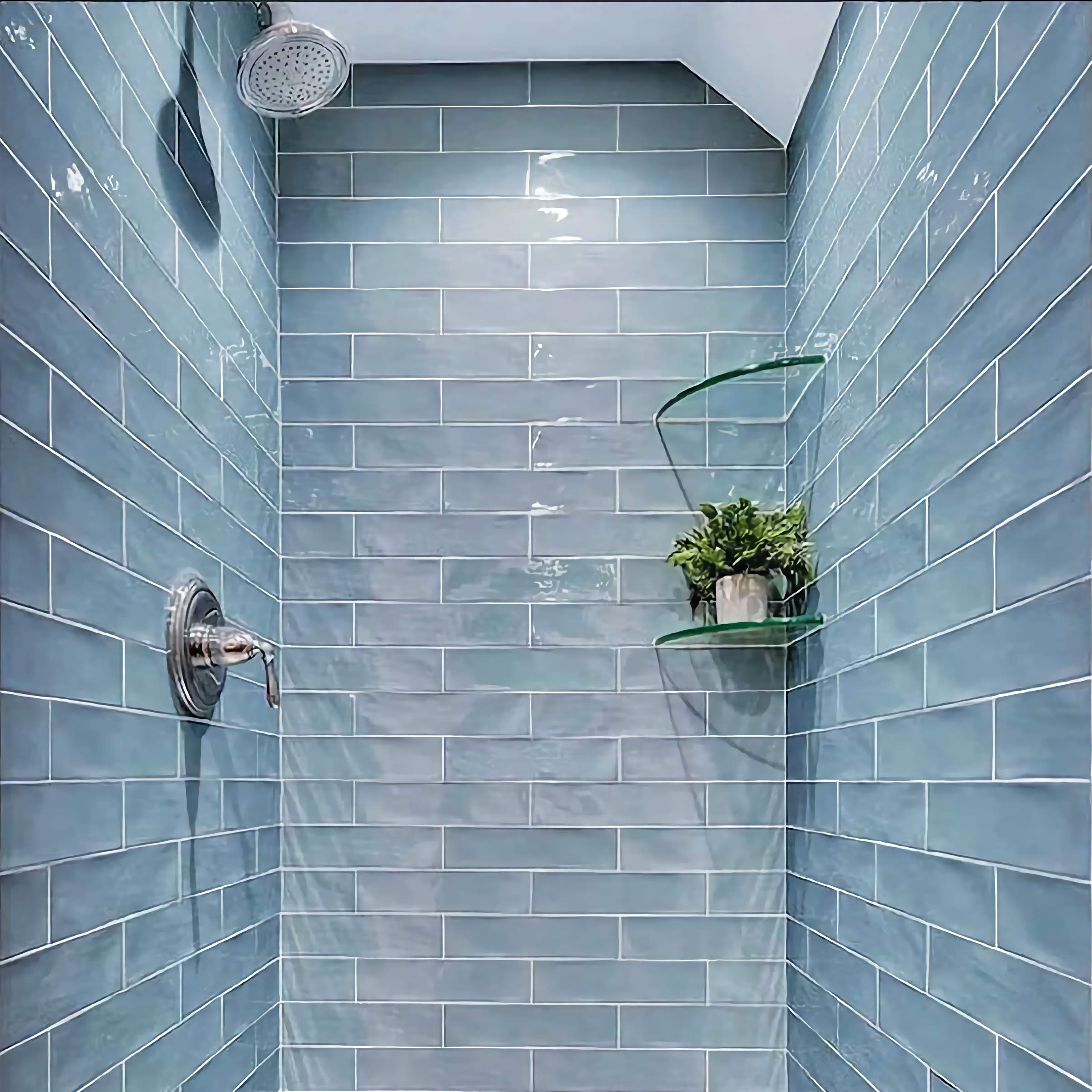
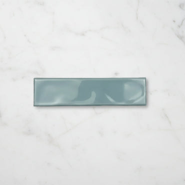
Handmade Aqua Ripple Gloss Wall Tile 7.5x30cm
A softened aqua wall tile with a gently rippled gloss surface that creates movement and variation across the wall. The...
£19.99 -
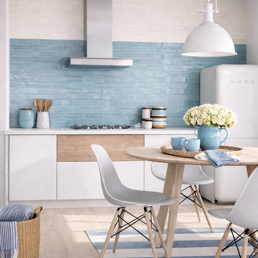
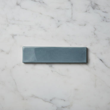
Opal Sky Gloss Wall Tiles 7.5x30cm
A softer interpretation of blue with a reflective gloss surface and lightly irregular finish. Opal Sky Blue feels bright and...
£19.99 -
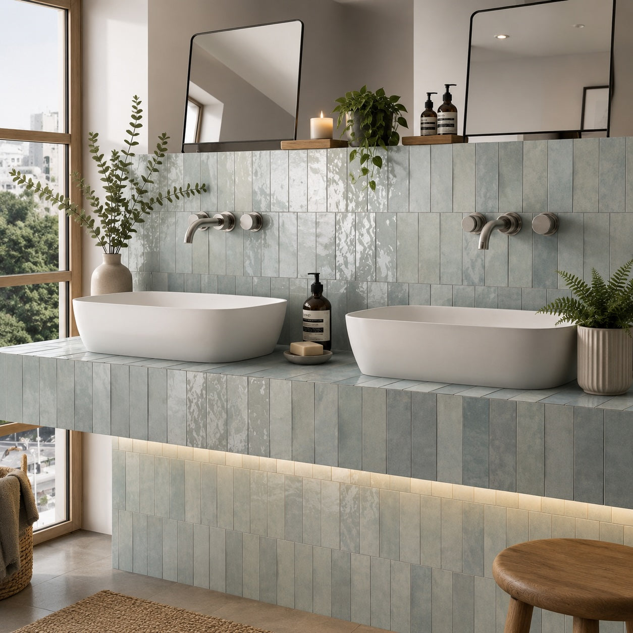
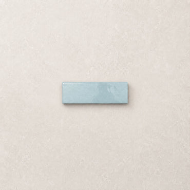
Artesano Aqua Wall Tiles 6.5x20cm
There’s something inherently calming about Aqua. Soft enough to feel timeless yet distinctive enough to bring personality into a space,...
£46.99 -
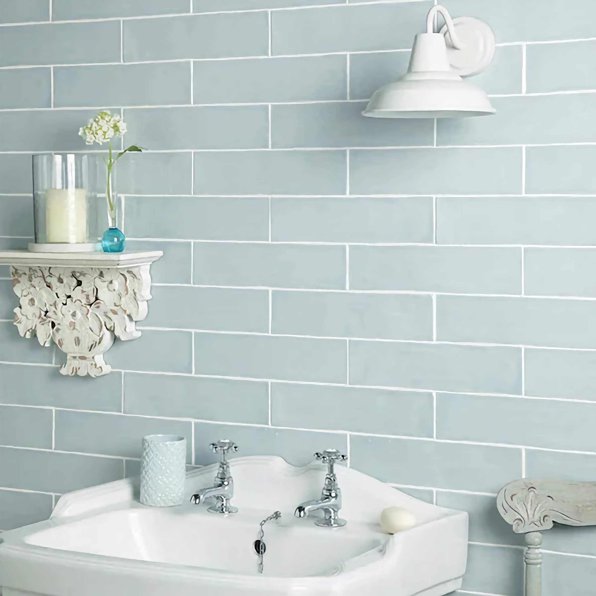
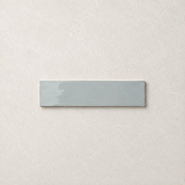
Countrywide Duck Egg Handmade Effect Wall Tile 7.5x30cm
A duck egg blue wall tile with a lightly glazed surface and subtle handmade detailing around the edges. The muted...
£22.99
Why does aqua feel so fresh?
Can aqua look sophisticated rather than coastal?
Where does aqua work particularly well?
How do you stop aqua becoming too cool?