

Collection: Neutral Tiles
Neutral wall tiles give you a quieter starting point, but that doesn't mean they have to produce a bland room. Creams, beiges, bones, taupes and softer stone tones can create anything from a warm, natural interior to a clean contemporary backdrop. The secret is usually in the undertone and texture, and in choosing contrasting materials that give the neutral palette some depth.

-
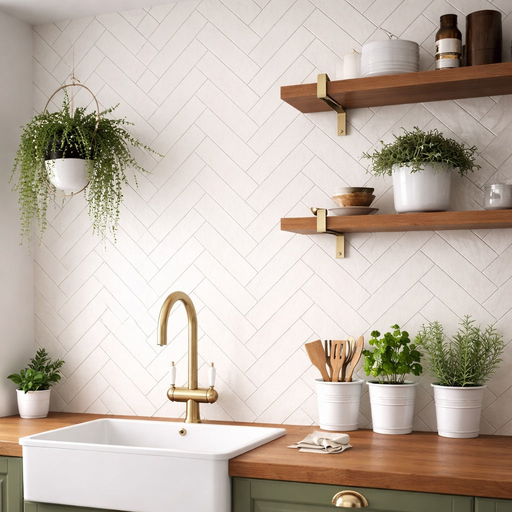
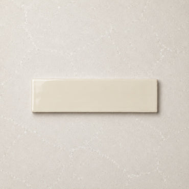
Countrywide Bone Handmade Effect Wall Tile 7.5x30cm
A warm neutral ceramic wall tile with a lightly glazed finish and softly uneven handmade-style edges. Countrywide Bone sits between...
£22.99 -
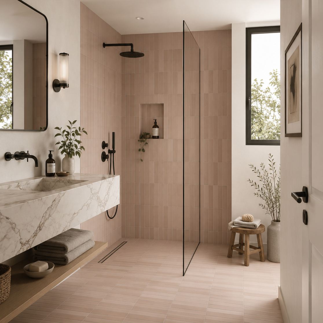
Sutton Taupe Matt Porcelain Wall Tile 6x30cm
Taupe has long been favoured by interior designers for its ability to bring warmth, sophistication and versatility to a space....
£22.49 -


Mediterrano Bone Porcelain Wall Tile 5x40cm
A pale mineral-toned porcelain tile with soft movement and a smooth matt surface. Mediterrano Bone feels understated and architectural, offering...
£46.99 -
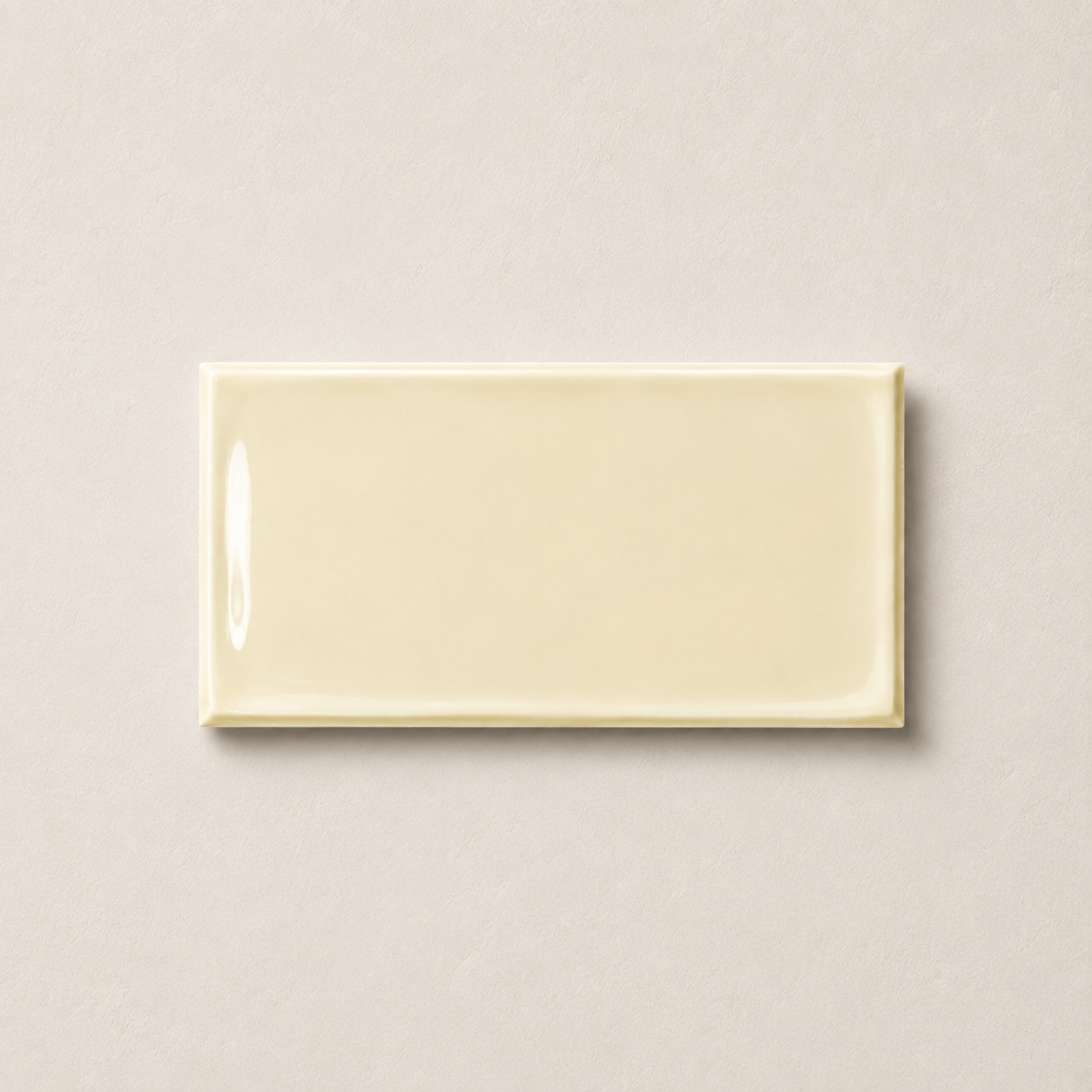
Victorian Bone Wall Tile 7.5x15cm
Bone offers a softer alternative to bright white, bringing warmth and subtle character into interior spaces. Sitting comfortably between ivory...
£17.99 -
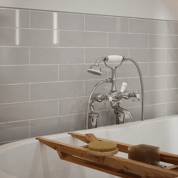
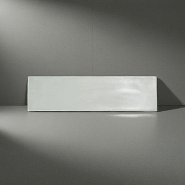
Countrywide Light Grey Handmade Effect Wall Tile 7.5x30cm
Countrywide Light Grey offers a softer, more understated approach to grey wall tiles. The smooth glazed surface and gently irregular...
£22.99 -
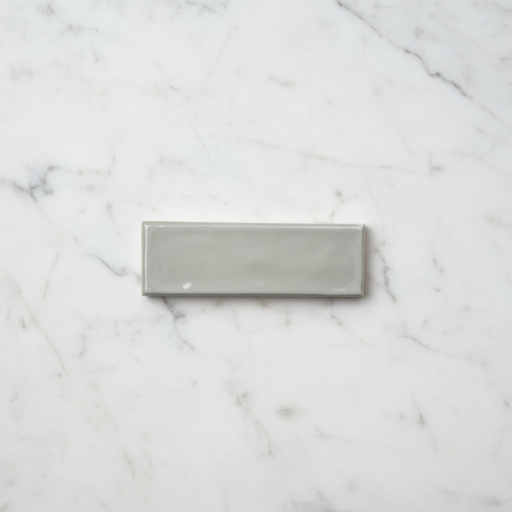
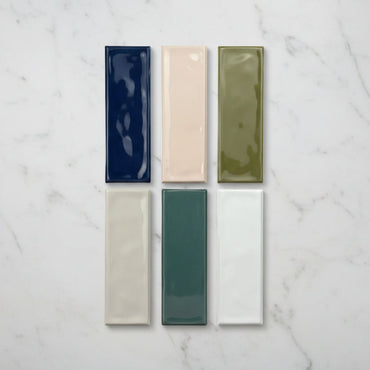
Riviera Pearl Ripple Gloss Wall Tile 6.5x20cm
Riviera Pearl sits between warm white and pale stone, offering a softer neutral with subtle depth through the undulating gloss...
£31.99 -
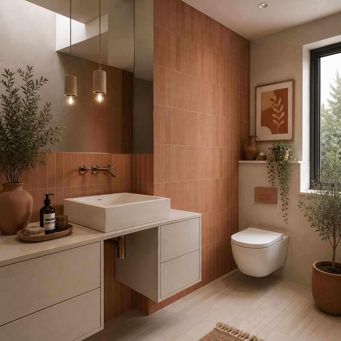
Sutton Clay Matt Porcelain Wall Tile 6x30cm
Warm and expressive, Sutton Clay draws inspiration from sun-baked earth and Mediterranean architecture. The rich terracotta tone brings an immediate...
£22.49 -
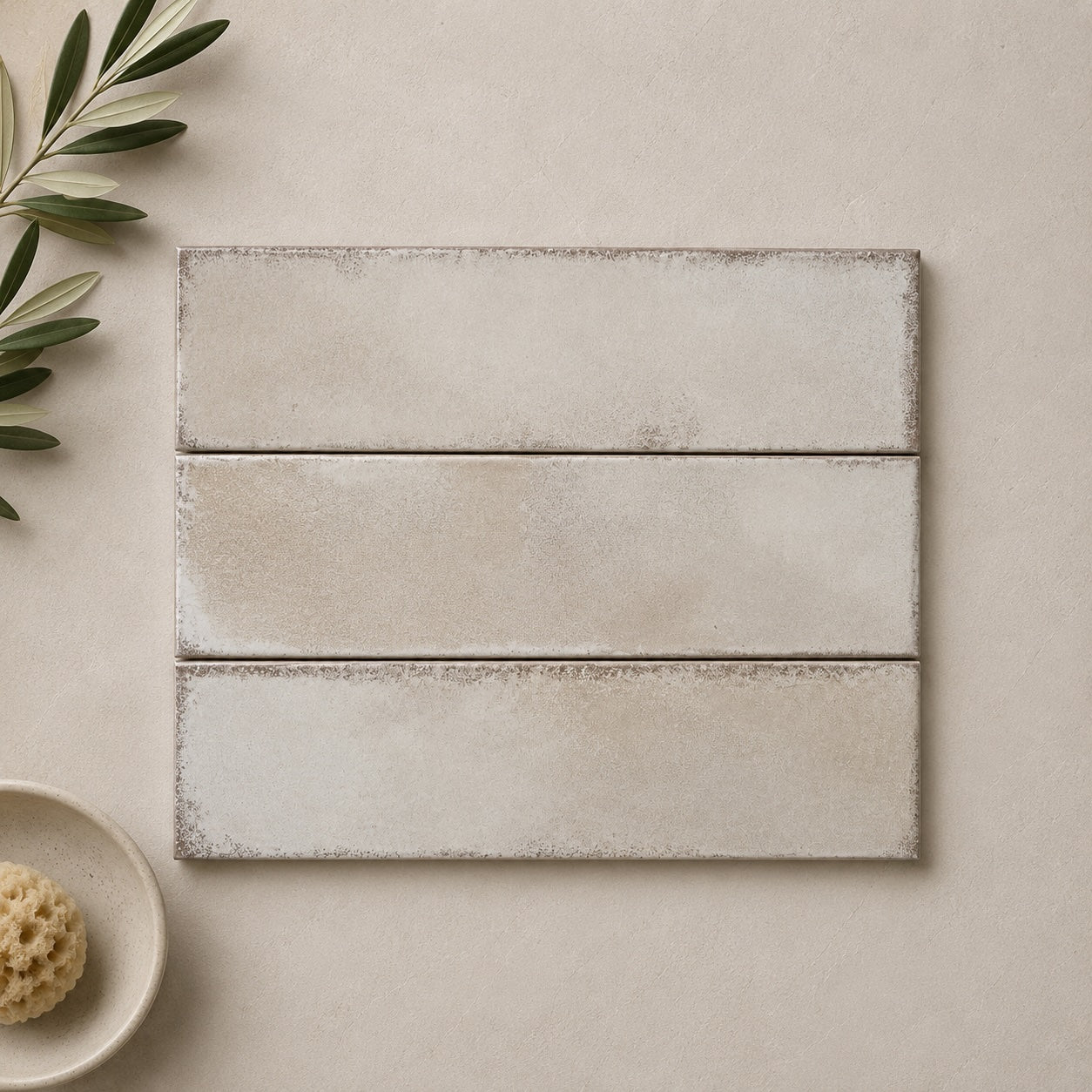
Realm Pearl Wall Tile 31.5x8cm
Realm Pearl captures the quiet beauty of weathered limestone, sun-bleached plaster and natural materials softened by time. Its gentle neutral...
£28.39


What actually makes a neutral feel warm or cool?
How do you stop a neutral room feeling flat?
When is a neutral better than white?
How to build a neutral scheme without making everything match