Skip to content
Code CRFTD15 for £15 off
Free Shipping on Orders over £399.

Collection: Palais

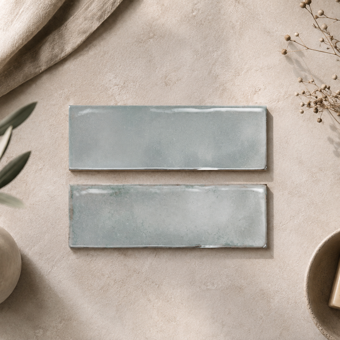
Palais has a quietly sophisticated look that comes from keeping the shape simple and letting colour take centre stage. The deeper shades - particularly Emerald, Olive and Denim Blue - create a much more enveloping wall, while Aloe, Glacier Blue and White offer a softer direction. Used across a large area, the repetition of the tiles creates a calm rhythm that feels considered rather than overly decorative.

6 products

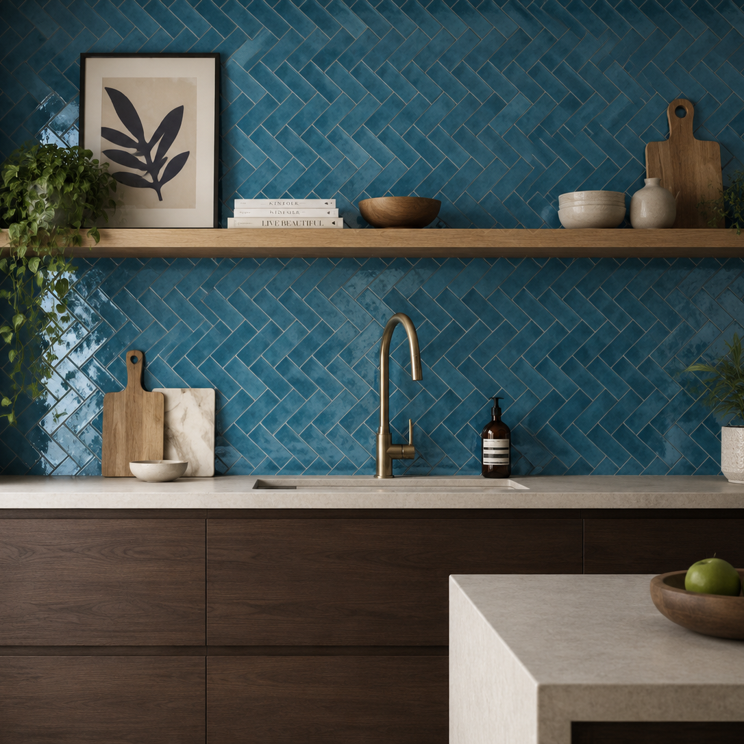
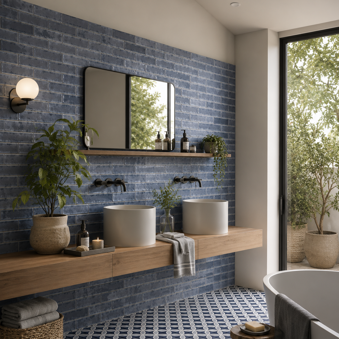
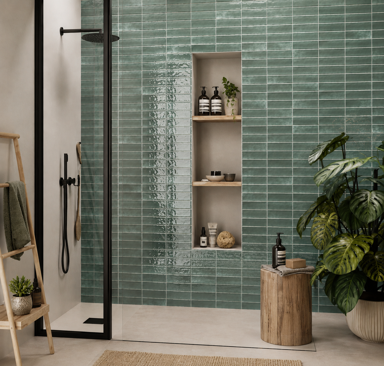
Palais is a good example of how the same tile can create very different rooms simply through colour. Emerald and Denim Blue have enough depth to become part of the architecture, especially when carried across a full shower or vanity wall. Olive feels more earthy and understated, while Aloe and Glacier Blue introduce colour without the same visual weight.

The surrounding materials can push those colours in different directions. Warm timber and brushed brass bring richness to the deeper shades, whereas pale stone, oak and soft neutrals can keep them feeling lighter.

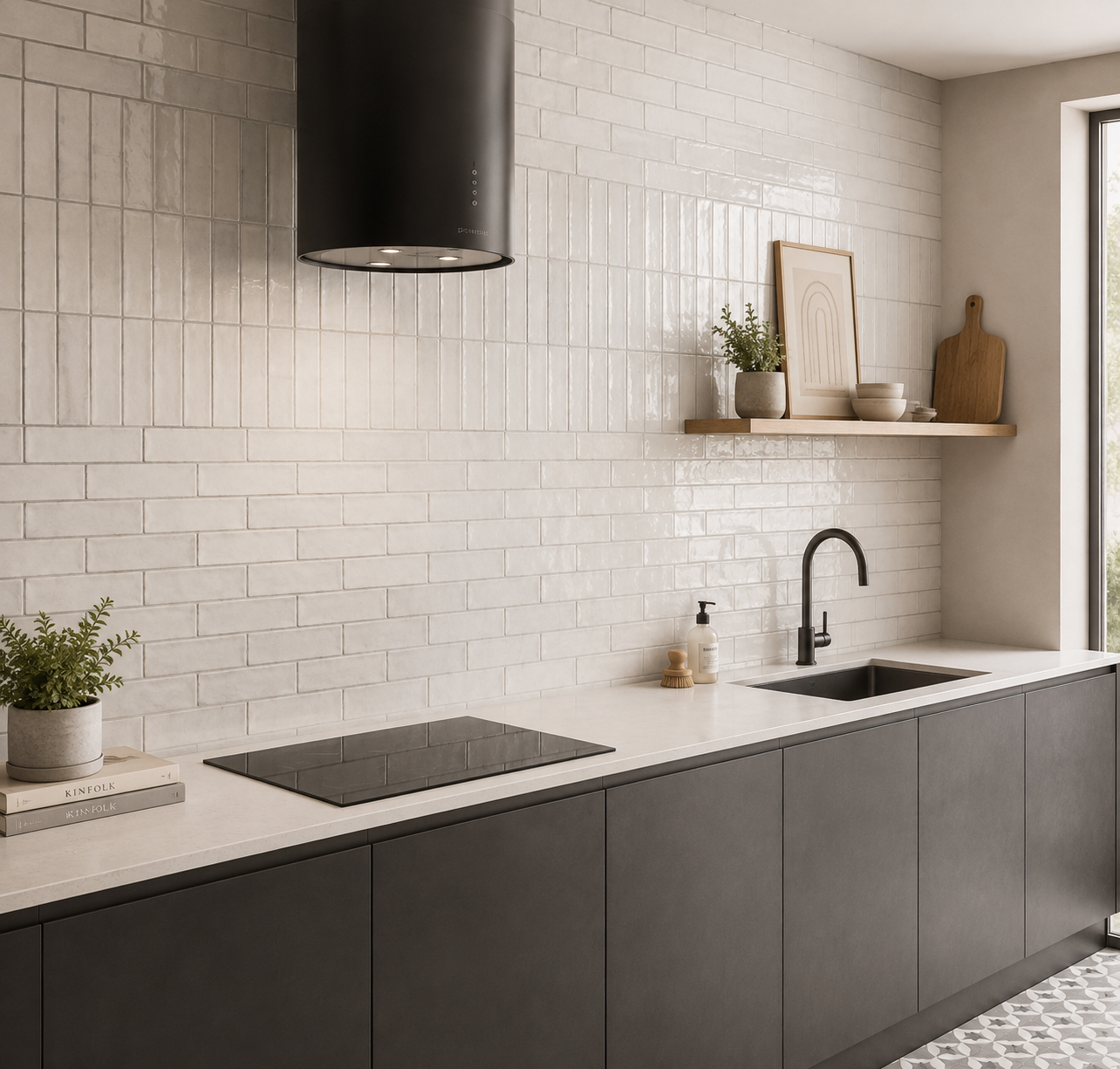
With White, you have almost the opposite opportunity. The tile can become a quieter backdrop, allowing fittings, cabinetry or other materials to provide the stronger contrast.

There is something quite powerful about repetition when the tile itself isn't overly complicated. Because the shape is relatively restrained, the eye starts to read the wall as a continuous rhythm rather than a collection of individual pieces.

That's particularly useful on large walls. Instead of needing a decorative pattern to create interest, the repeated lines and changes in colour provide enough structure on their own.

It also explains why Palais can feel quite different depending on how much of the wall you cover. A small splashback gives you a concentrated hit of colour; taking the same tile across a full wall makes the colour feel much more architectural and immersive.

With a long-format wall tile, orientation is worth deciding early because it affects how the whole room is read.

Horizontal installation naturally reinforces width and creates a calmer, more grounded rhythm. Vertical laying does the opposite, giving the wall a stronger upward direction and making it particularly effective where height is something you want to emphasise.

The important point is that you don't need an elaborate laying pattern to create interest. In a collection such as Palais, the combination of repeated format and rich colour can already provide plenty of visual structure.

I'd therefore consider the architecture of the room first: which direction helps the space feel more balanced? The tile should work with the proportions of the room rather than simply being laid in whichever direction is easiest.

Palais is a good example of how the same tile can create very different rooms simply through colour. Emerald and Denim Blue have enough depth to become part of the architecture, especially when carried across a full shower or vanity wall. Olive feels more earthy and understated, while Aloe and Glacier Blue introduce colour without the same visual weight.

The surrounding materials can push those colours in different directions. Warm timber and brushed brass bring richness to the deeper shades, whereas pale stone, oak and soft neutrals can keep them feeling lighter.

With White, you have almost the opposite opportunity. The tile can become a quieter backdrop, allowing fittings, cabinetry or other materials to provide the stronger contrast.

You might like