Skip to content
Code CRFTD15 for £15 off
Free Shipping on Orders over £399.

Collection: Lume

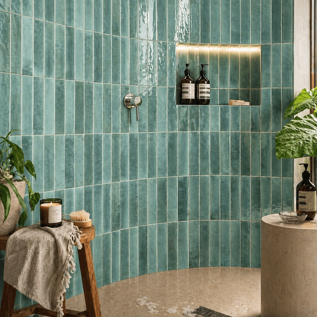
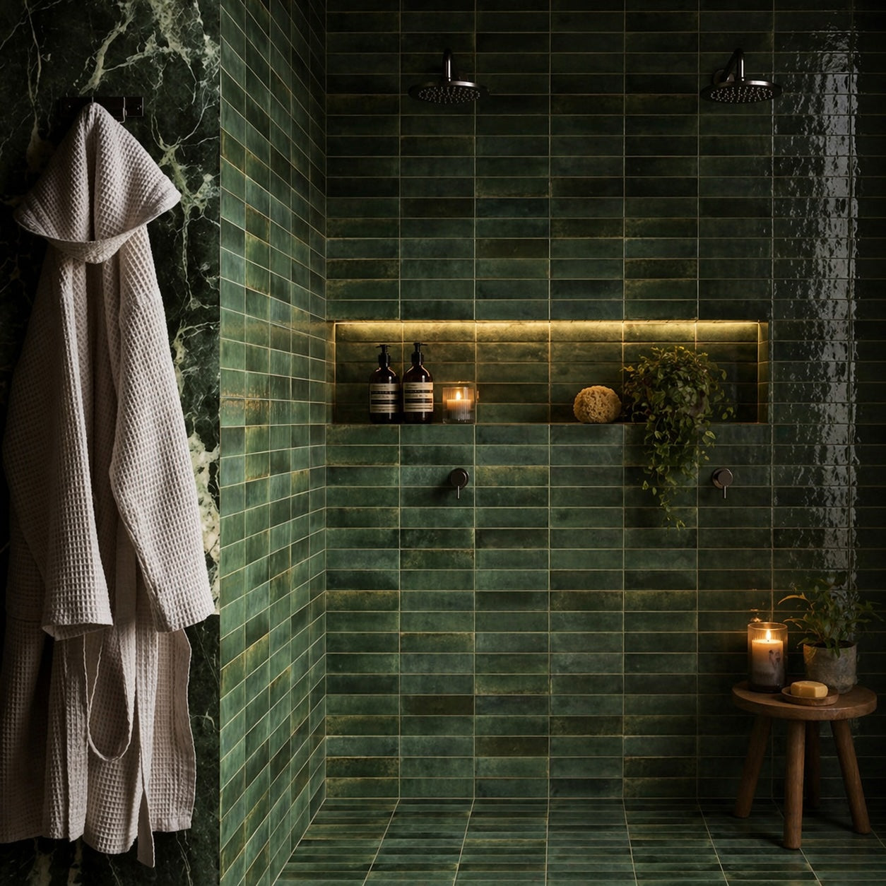
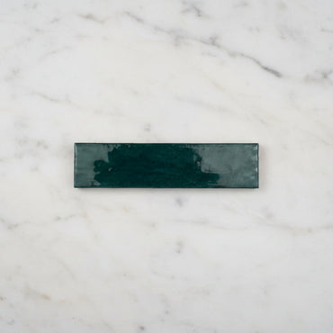
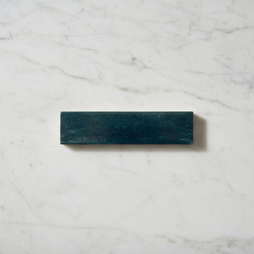
Lume has a lovely artisan feel, with the character and colour movement you might associate with traditional Zellige tiles, but in a practical porcelain format. Its elongated shape gives the wall a clean rhythm, while subtle variation and a glossy, uneven-looking surface keep it from feeling too perfect. The result is a tile with plenty of personality, particularly when light moves across the wall.


4 products

Lume works particularly well when you want colour and character without introducing a busy pattern. The 6 × 24cm format has a strong sense of direction, but the variation between tiles softens the regularity of the layout.

Its more substantial feel also gives the finished wall a little more presence than a very flat, lightweight-looking tile. This suits spaces where you want the wall to feel like an important part of the room rather than simply a practical surface.

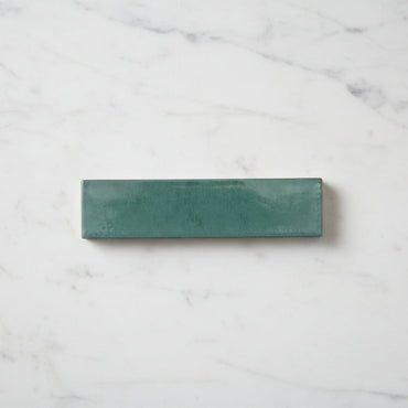
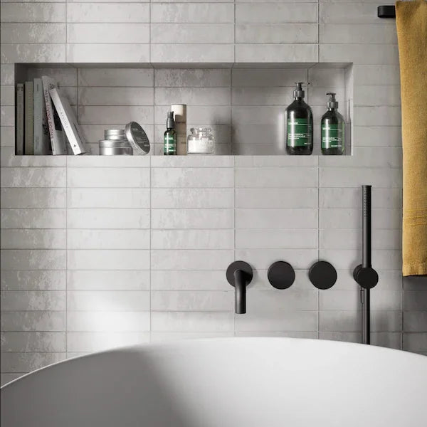
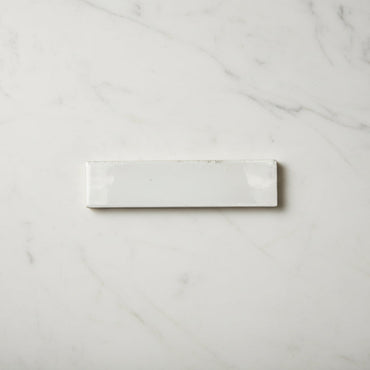
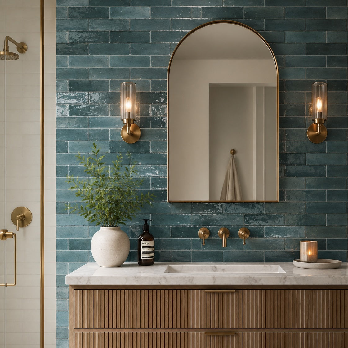
The deeper Green, Turquoise and Ink Blue shades can create an immersive backdrop in bathrooms and kitchens, while White offers a much quieter starting point. Because the glaze reflects its surroundings, it is worth considering how much natural and artificial light reaches the wall before choosing your colour.

Lume's artisan character works beautifully alongside materials that have some warmth or natural variation of their own. Timber, stone, warm whites and natural fabrics can stop stronger colours from feeling too stark, particularly when using Green, Turquoise or Ink Blue.

There is no need to match the tile exactly to your worktop, cabinetry or paint. In fact, picking up one of the quieter tones within the tile can produce a much more natural-looking scheme. A blue-green tile alongside warm timber, for example, can feel far more considered than trying to find an identical blue elsewhere in the room.

White Lume gives you more freedom to introduce colour through cabinetry or accessories, but its variation means it can still provide plenty of interest when used across a larger wall.

Part of Lume's appeal is that it doesn't have the perfectly uniform appearance of a mass-produced flat glazed surface. There is gentle variation from tile to tile, and the glaze creates subtle changes in reflection across the wall.

That is where the Zellige-like quality comes through. Traditional Zellige is loved for its individual variation, irregularity and the way its glazed surfaces catch light differently. Lume offers some of that visual richness while using a porcelain body and a more consistent format.

The variation is therefore something to embrace rather than try to disguise. When several tiles are installed together, small differences in tone and reflection create movement across the wall, helping a strong colour feel layered rather than one-dimensional.

It's also why we recommend viewing a physical sample before choosing a colour. A screen cannot fully show how the glaze and tonal variation respond to the light in your own room.

Lume's long, narrow proportions give you plenty of scope to change its personality simply by changing the direction or pattern.

Laying it vertically creates a strong upward rhythm, which can work particularly well on shower walls or behind a vanity where you want to emphasise height. Turn the same tile horizontally and the emphasis becomes more relaxed, allowing the wall to feel wider.

Grout plays an equally important role. A closely matched grout lets the changing colour and glaze flow together, giving you more of that continuous, artisan-tile feel. A contrasting grout creates stronger lines between each piece and makes the regularity of the format much more obvious.

Because Lume already has variation and surface character, I'd generally decide on the grout and layout at the same time as the tile. They aren't finishing touches; they can fundamentally change how the collection reads once it's on the wall.

You might like