

Collection: Verona
The Verona collection brings together characterful glazed wall tiles in Forest Green, Ink Blue, White, Pink, Ochre Orange and Clay. Each colour has its own personality, while subtle tonal variation between individual tiles gives the finished wall depth and movement.

-
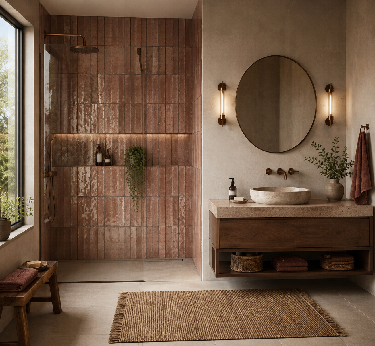
Verona Clay Ceramic Wall Tiles 7.5x30cm
Verona Clay Gloss Wall Tiles Bring warmth, texture and understated character to your interior with Verona Clay Gloss. Inspired by...
£44.99 -
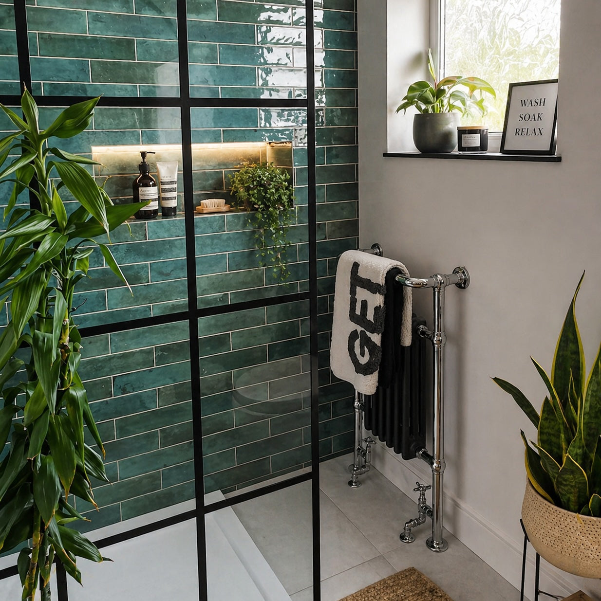
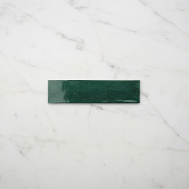
Verona Forest Green Wall Tiles 7.5x30cm
Deep and expressive, Verona Forest Green brings the richness of jewel-toned ceramics into the home. The glossy surface enhances the...
£44.99 -
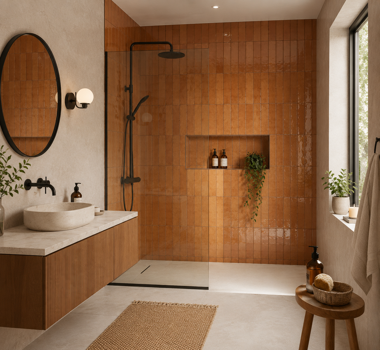
Verona Ochre Orange Ceramic Wall Tiles 7.5x30cm
Verona Ochre Orange Ceramic Wall Tiles 7.5x30cm Bring warmth and character to your walls with Verona Ochre Orange Gloss, a...
£44.99 -
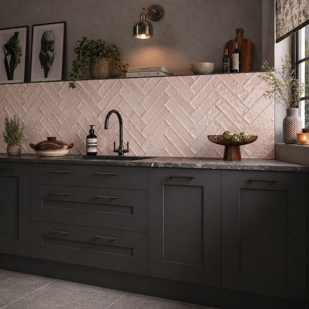
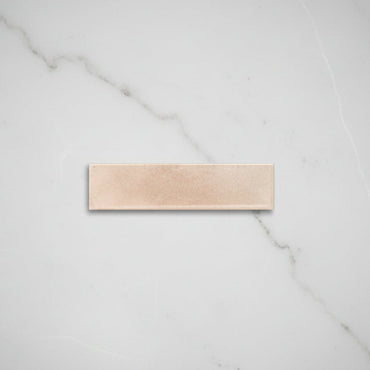
Verona Baby Pink Wall Tiles 7.5x30cm
Soft, warm and understated, Verona Baby Pink introduces colour in a more subtle and considered way. The glossy finish enhances...
£44.99 -
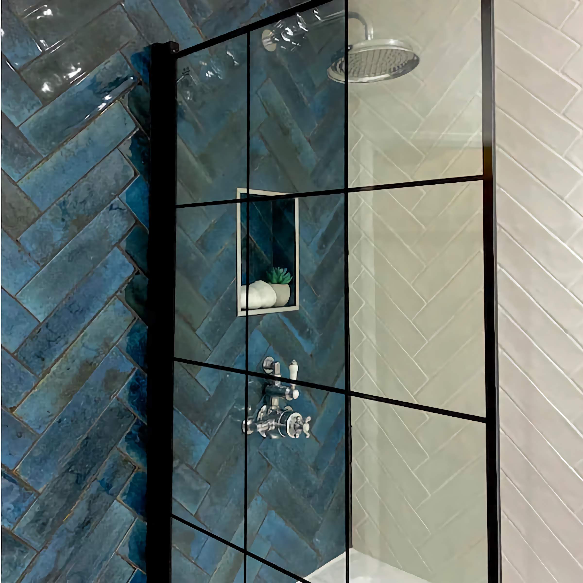
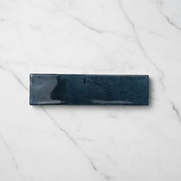
Verona Ink Blue Wall Tiles 7.5x30cm
Inspired by deep inky pigments, Verona Ink Blue offers a sophisticated alternative to traditional navy tiles. The glossy glaze gives...
£44.99 -
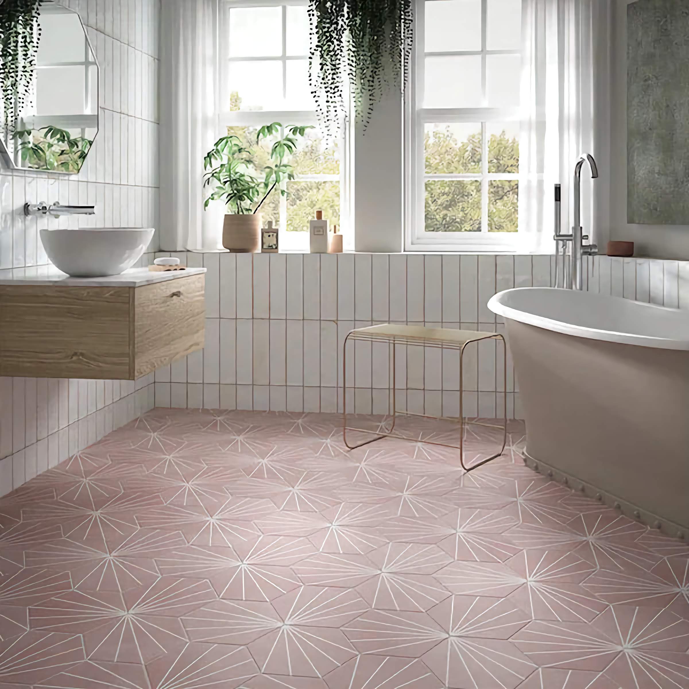
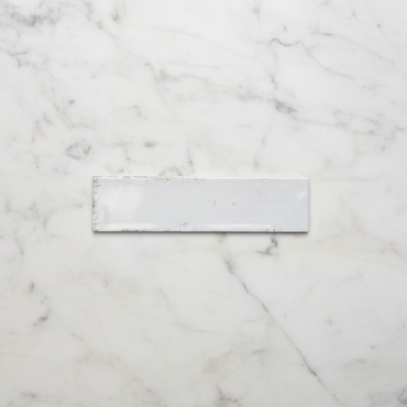
Verona Antique White Wall Tiles 7.5x30cm
Clean, bright and endlessly versatile, Verona White offers a fresh interpretation of the classic gloss brick tile. The reflective glazed...
£44.99
Choosing Verona for your space
How to style Verona wall tiles
Understanding Verona's glazed finish
Grout, layout & the finished look