

Collection: Blue Tiles
Blue wall tiles can take a room in surprisingly different directions. Softer blues create a light, relaxed feel, while deeper Denim, Cobalt and Ink shades can make a space feel richer and more atmospheric. The difference isn't simply how dark the tile is, either - undertones, natural light, finish and the colours around it all influence whether a blue feels crisp, coastal, moody or sophisticated.

-
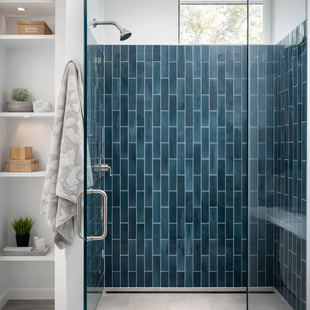
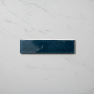
Opal Marine Gloss Wall Tiles 7.5x30cm
Deeper blue tones and a rich reflective glaze give Opal Marine a moodier, more dramatic feel than the lighter colours...
£19.99 -
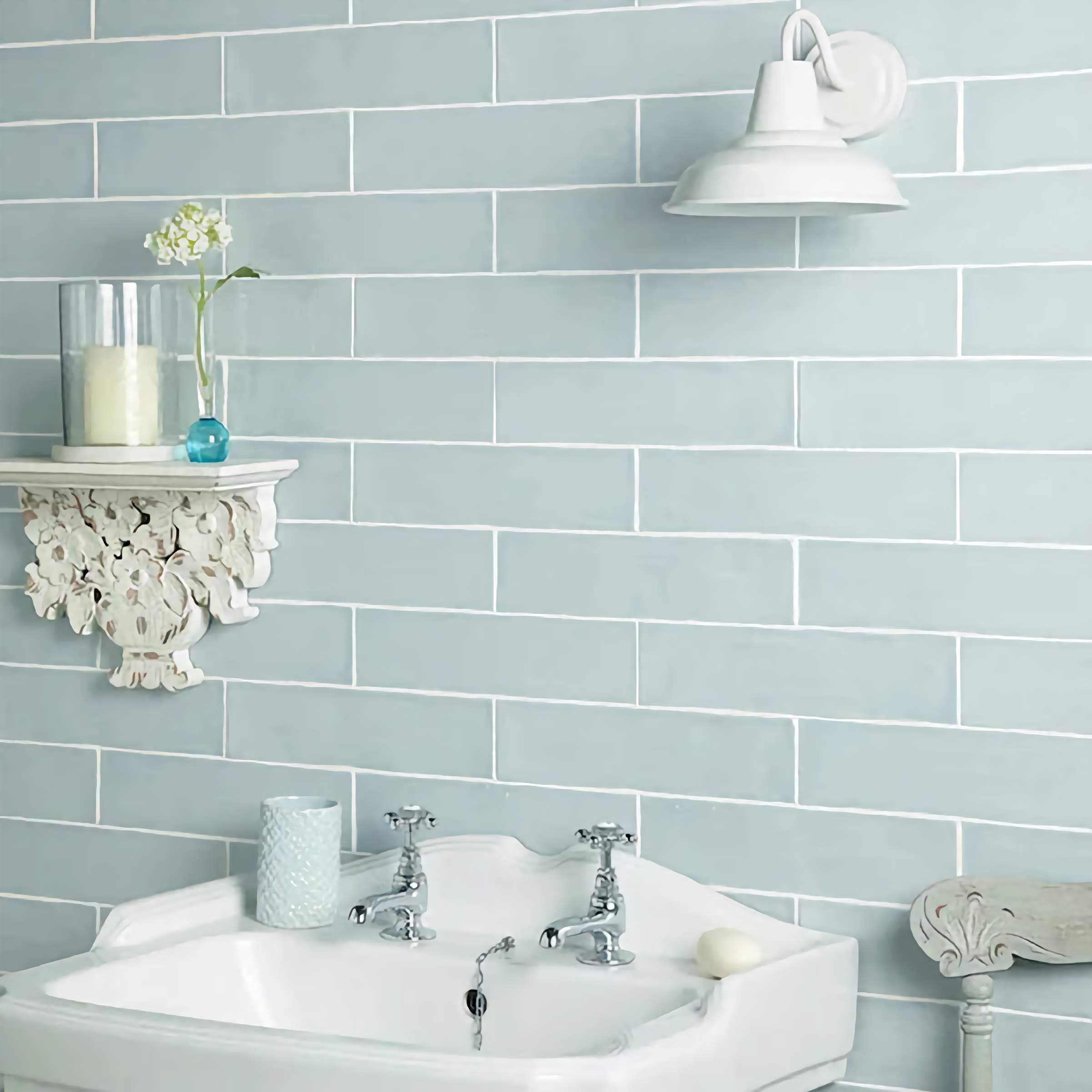
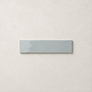
Countrywide Duck Egg Handmade Effect Wall Tile 7.5x30cm
A duck egg blue wall tile with a lightly glazed surface and subtle handmade detailing around the edges. The muted...
£22.99 -
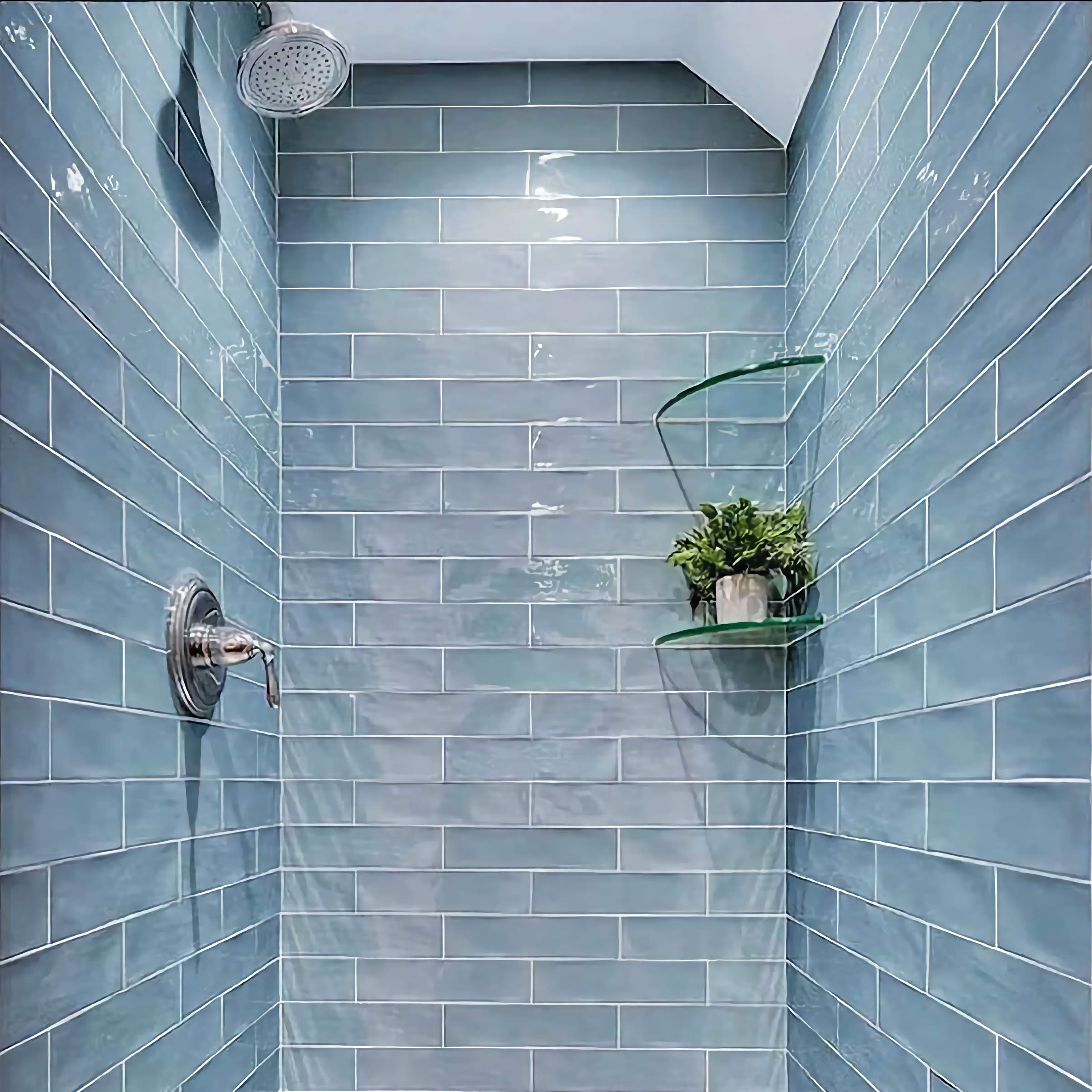
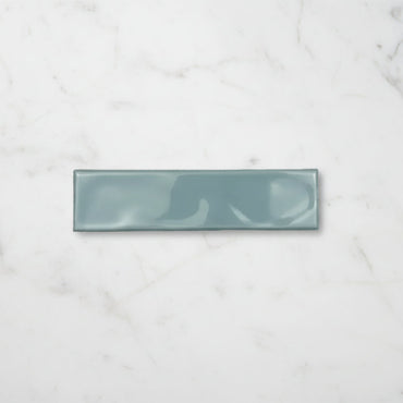
Handmade Aqua Ripple Gloss Wall Tile 7.5x30cm
A softened aqua wall tile with a gently rippled gloss surface that creates movement and variation across the wall. The...
£19.99 -


Mediterrano Blue Porcelain Wall Tile 5x40cm
A muted blue porcelain tile with soft tonal movement and a smooth matt finish. The colour feels washed and relaxed...
£46.99 -
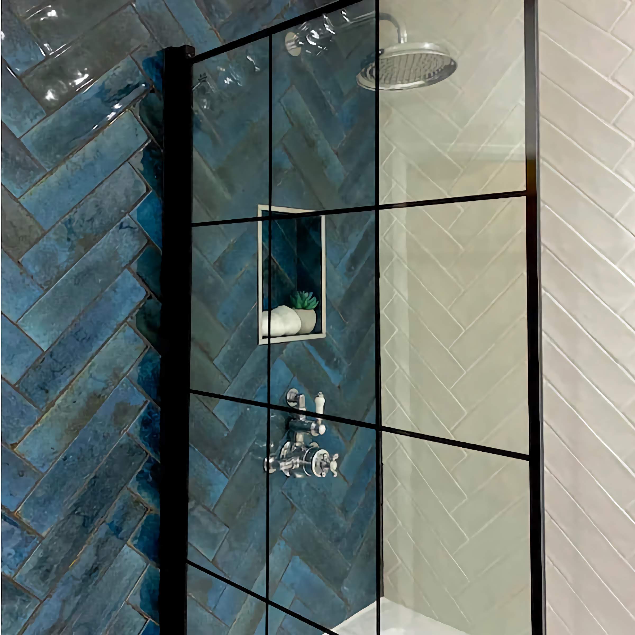
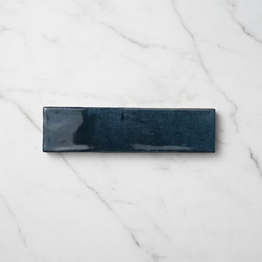
Verona Ink Blue Wall Tiles 7.5x30cm
Inspired by deep inky pigments, Verona Ink Blue offers a sophisticated alternative to traditional navy tiles. The glossy glaze gives...
£44.99 -
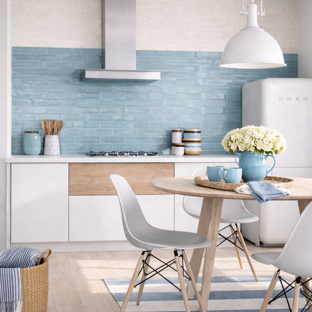
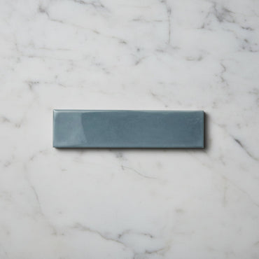
Opal Sky Gloss Wall Tiles 7.5x30cm
A softer interpretation of blue with a reflective gloss surface and lightly irregular finish. Opal Sky Blue feels bright and...
£19.99 -
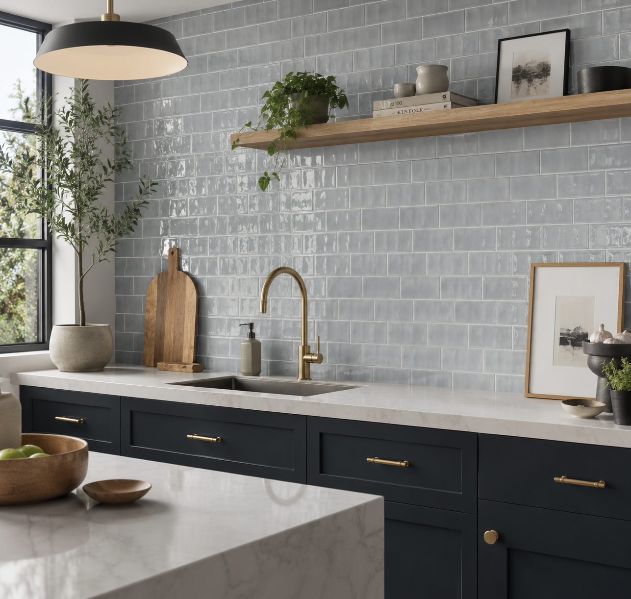
Countrywide Duck Egg Gloss Hand Made Effect Wall Tiles 7.5x15cm
Countrywide Duck Egg Mini Wall Tiles Create a soft backdrop with Countrywide Duck Egg Mini, a charming ceramic wall tile...
£17.99 -
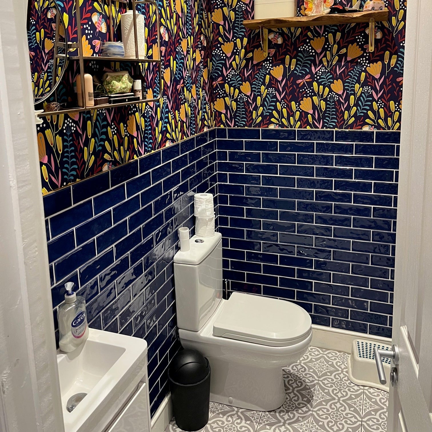
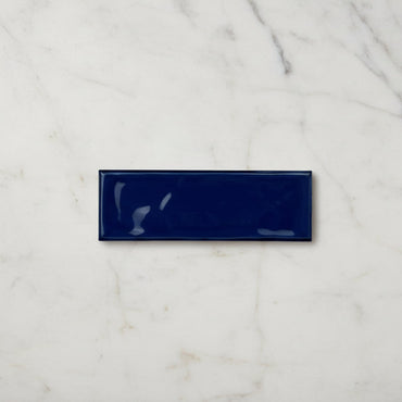
Riviera Blue Ripple Gloss Wall Tile 6.5x20cm
A softened blue ceramic wall tile with a reflective rippled surface inspired by coastal ceramics and weathered Mediterranean tones. The...
£31.99 -
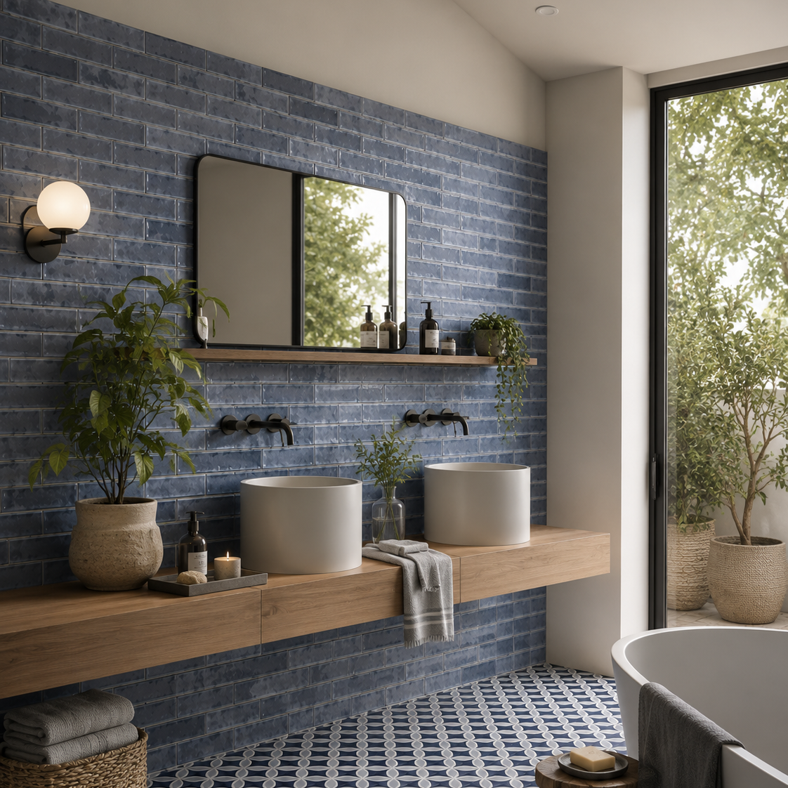
Palais Blue Gloss Wall Tile 20x6.5cm
Inspired by coastal architecture and artisan ceramics, Palias Blue brings a sense of effortless elegance to interior walls. The rich...
£31.19 -
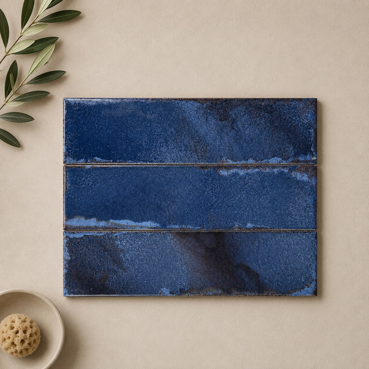
Realm Blue Wall Tile 31.5x8cm
Realm Blue captures the charm of traditional handcrafted ceramics with a colour that feels both timeless and effortlessly relaxed. Reminiscent...
£28.39 -
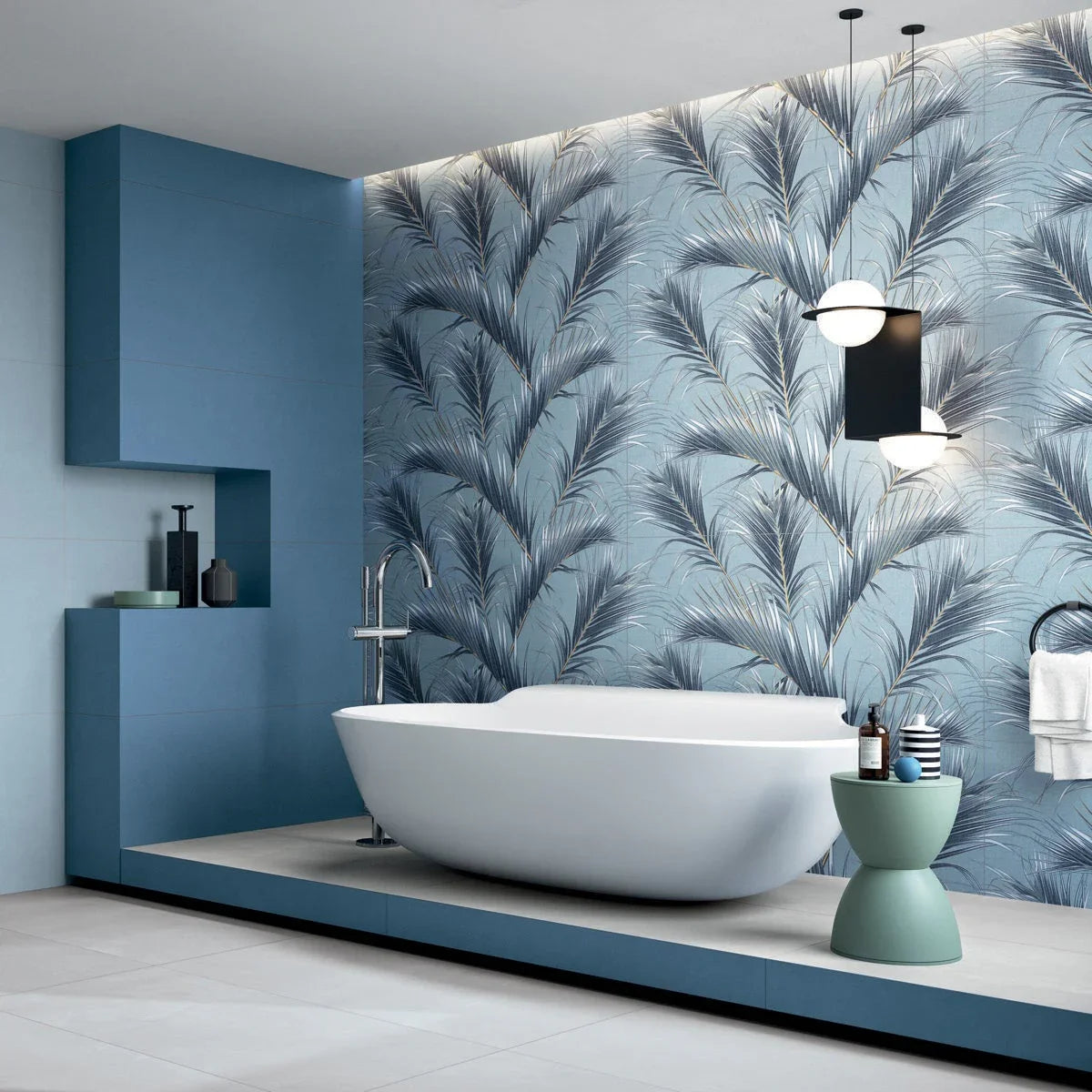
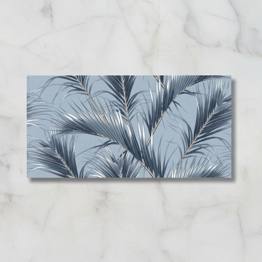
Oasis Tropics Porcelain Wall Tile 120x60cm
Oasis Tropics Porcelain Wall Tile 120x60cm: Bring the Tropical Breeze to Your Home Introducing the Oasis Tropics Porcelain Wall Tile...
£49.99 -
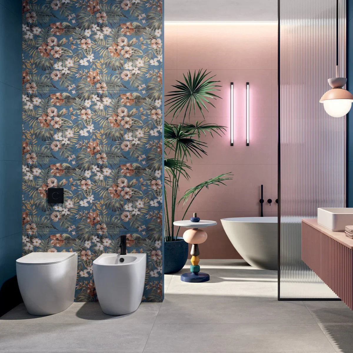
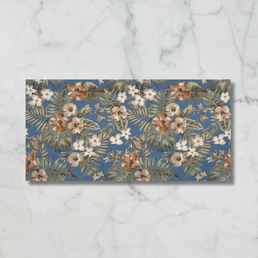
Oasis Hawaii Porcelain Wall Tile 120x60cm
Oasis Hawaii Porcelain Wall Tile 120x60cm: A Coastal Escape for Your Home Transform your living space with the Oasis Hawaii...
£49.99 -
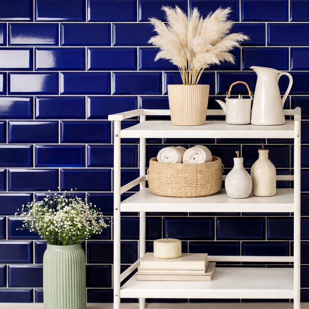
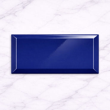
London Cobalt 10x20cm
London Cobalt 10x20cm Bold, vibrant, and full of energy. The Metro Cobalt Blue Gloss 10x20cm tile brings a striking burst...
£22.99 -
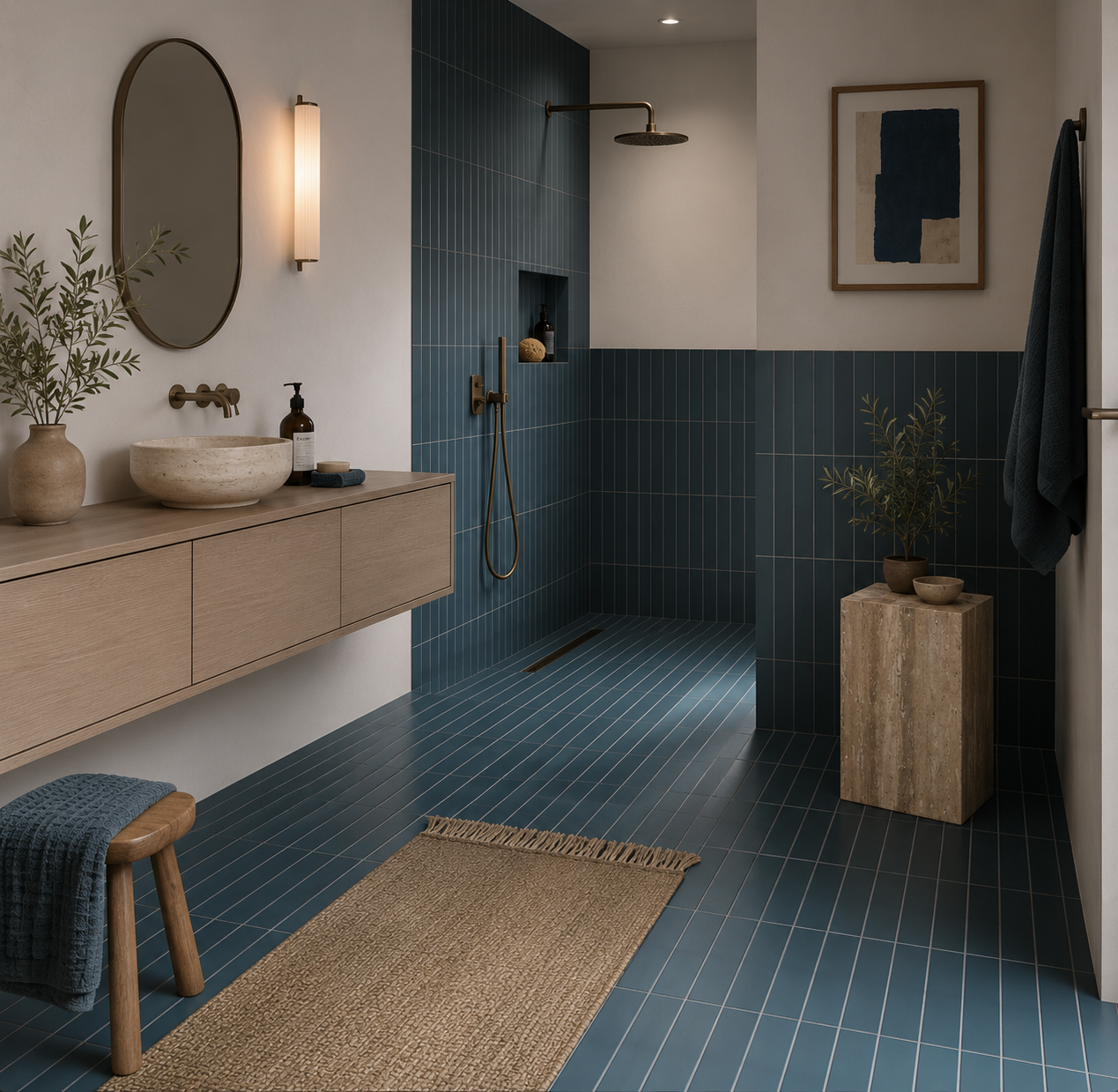
Sutton Blue Matt Porcelain Wall Tile 6x30cm
Blue has a unique ability to feel both familiar and distinctive. Sutton Blue captures that balance perfectly, introducing colour in...
£22.49 -
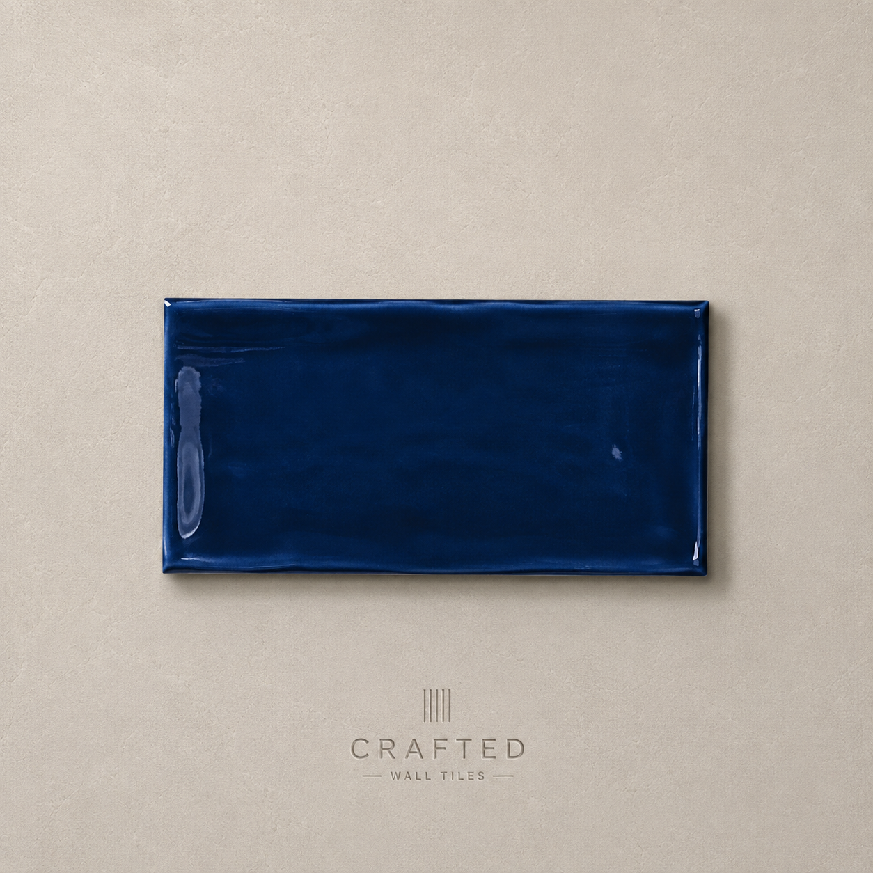
Victorian Blue Wall Tile 7.5x15cm
Victorian Blue strikes a balance between classic and contemporary, offering a rich colour that feels both familiar and fresh. The...
£17.99 -
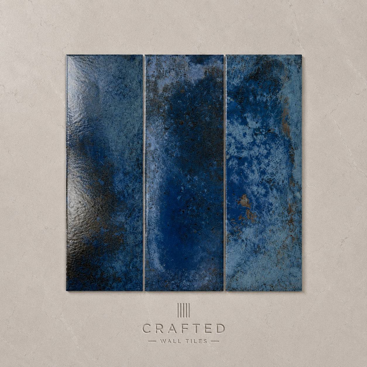
Precinct Blue Wall Tile 10x30cm
Confident without being overpowering, Precinct Blue introduces depth and atmosphere into interior spaces. The rich colour brings a sense of...
£44.99 -
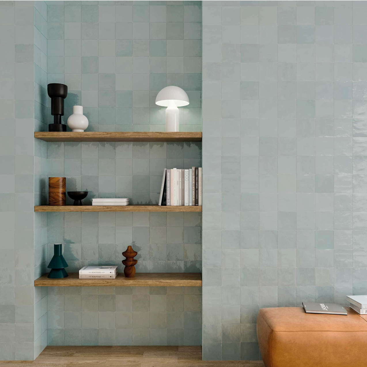
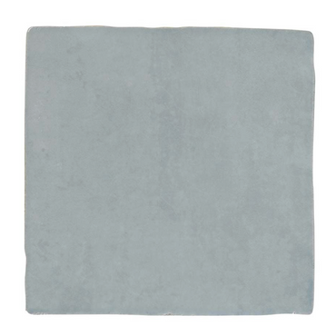
Zellige Light Blue Wall Tiles 13x13cm
A gentle blue wall tile inspired by coastal tones and traditional handcrafted ceramics. The glossy surface introduces depth and light,...
£31.99 -
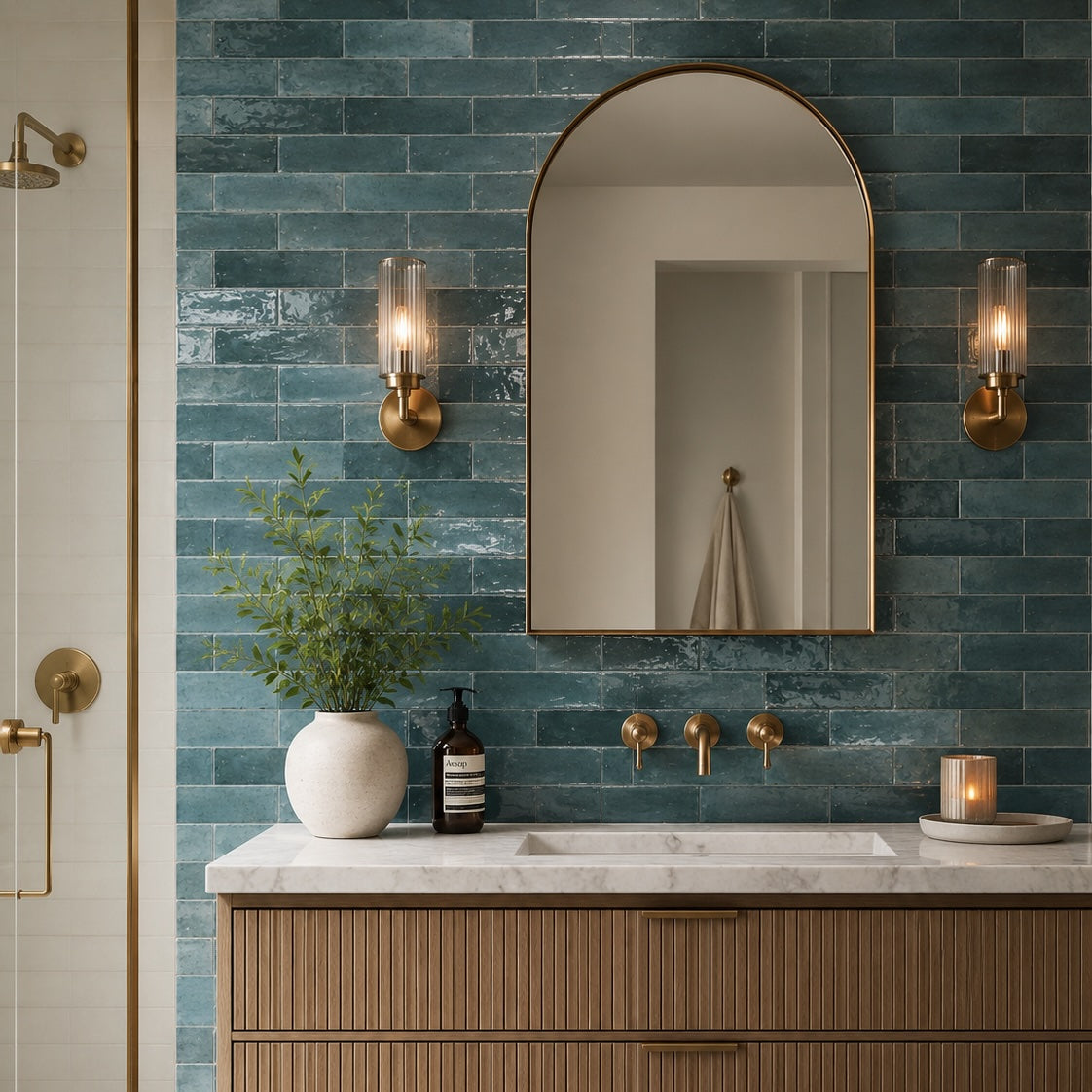
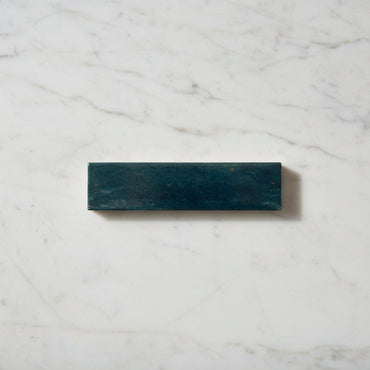
Lume Ink Blue Wall And Floor Tiles 6x24cm
A deep blue porcelain wall tile with a richly glazed surface and pronounced variation throughout the collection. The reflective finish...
£32.99 -
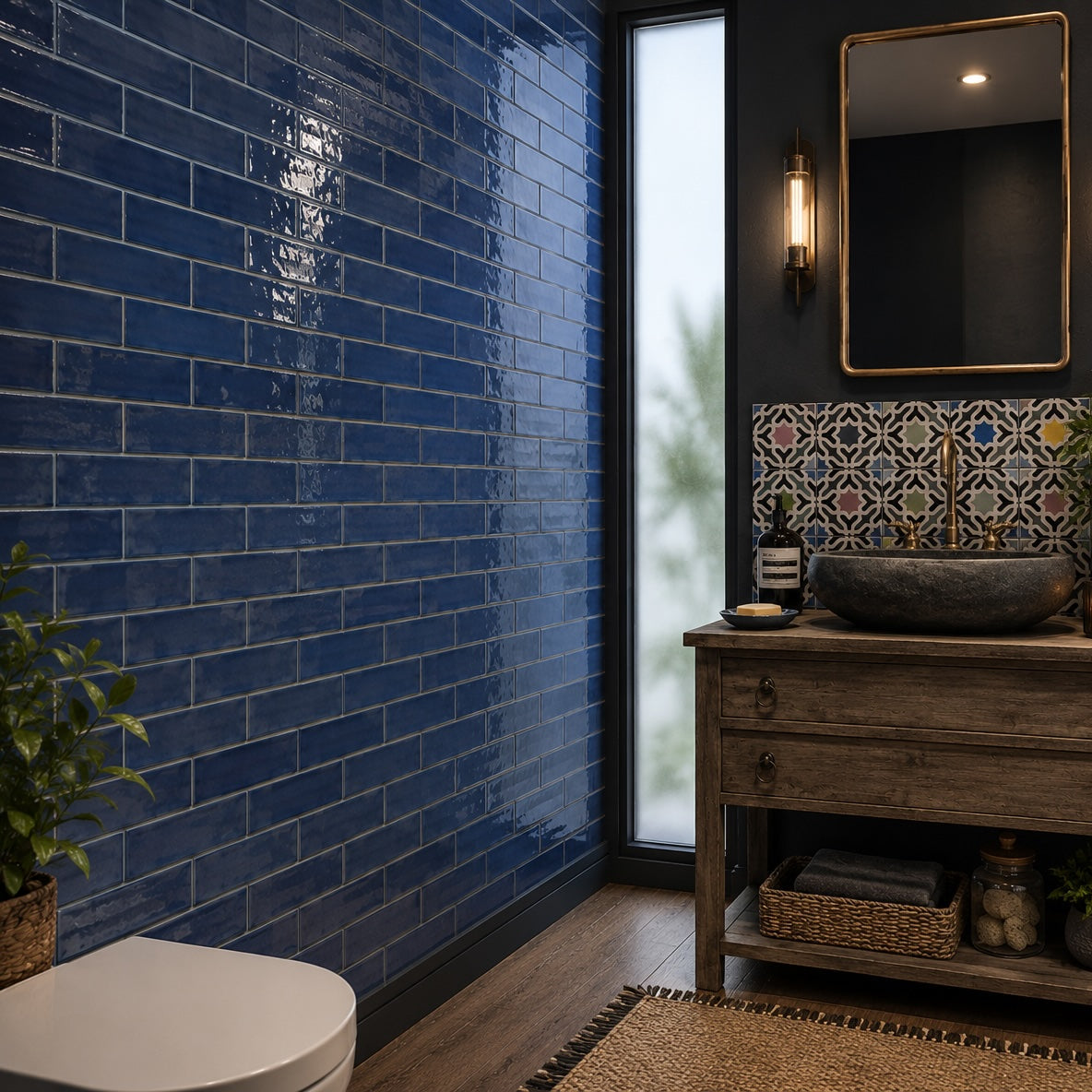
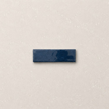
Artesano Blue Wall Tiles 6.5x20cm
Artesano Blue brings a richer, more confident presence to the collection. Deep and expressive without feeling overly formal, it introduces...
£46.99 -
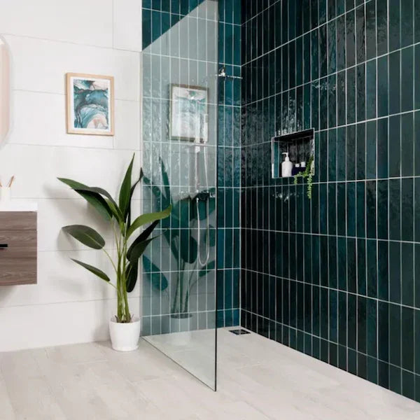
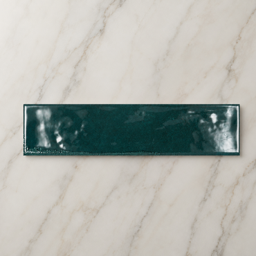
Rustic Porcelain Blue Wall Tile 30x7.5cm
Deep blue tones and reflective glazing give Rustic Porcelain Blue a rich, expressive character inspired by artisan ceramics. The varied...
£27.99


How does the shade of blue change the room?
Why blue can look completely different in the evening
What colours work best with blue tiles?
How much blue should you use?