

Collection: Cream Tiles
Cream wall tiles bring warmth without the heaviness of a deeper colour. They can make a room feel softer than crisp white, while still providing a light backdrop that works beautifully across kitchens, bathrooms and utility spaces. The subtle differences between ivory, warm cream, biscuit and softer stone-like tones can have a surprisingly large effect on the finished room.

-
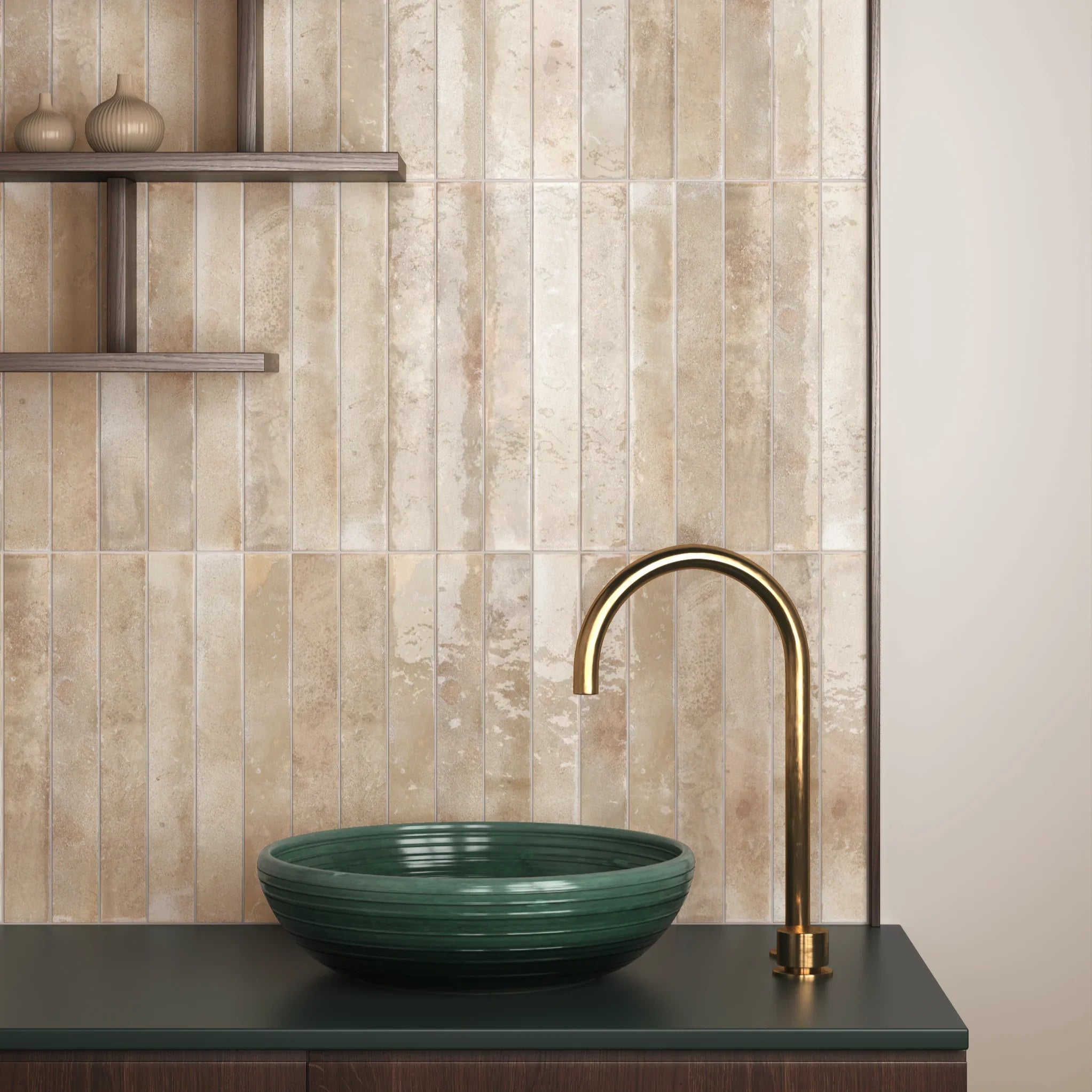
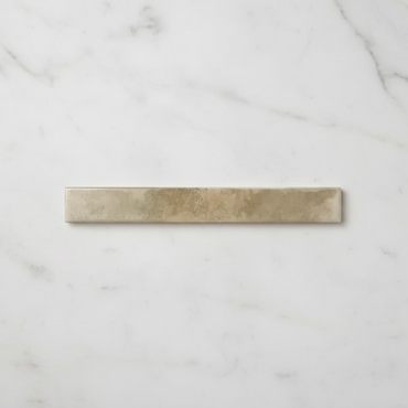
Bali Cream Wall Tile 5x40cm
Understated and versatile, Bali Cream offers a softer alternative to bright white. The warm neutral tone creates a gentle backdrop...
£24.99 -
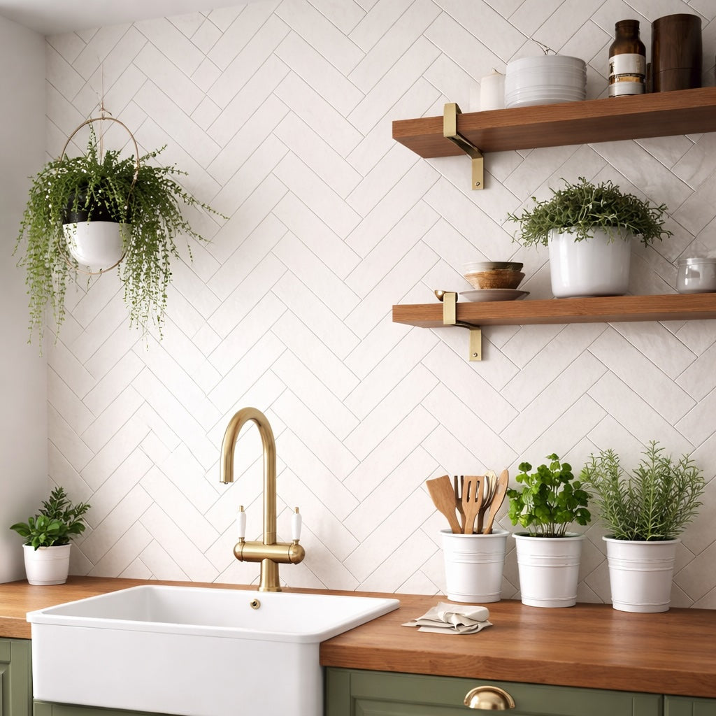
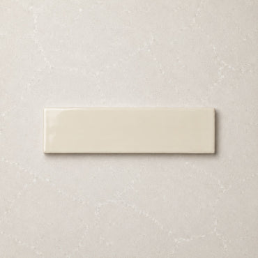
Countrywide Bone Handmade Effect Wall Tile 7.5x30cm
A warm neutral ceramic wall tile with a lightly glazed finish and softly uneven handmade-style edges. Countrywide Bone sits between...
£22.99 -
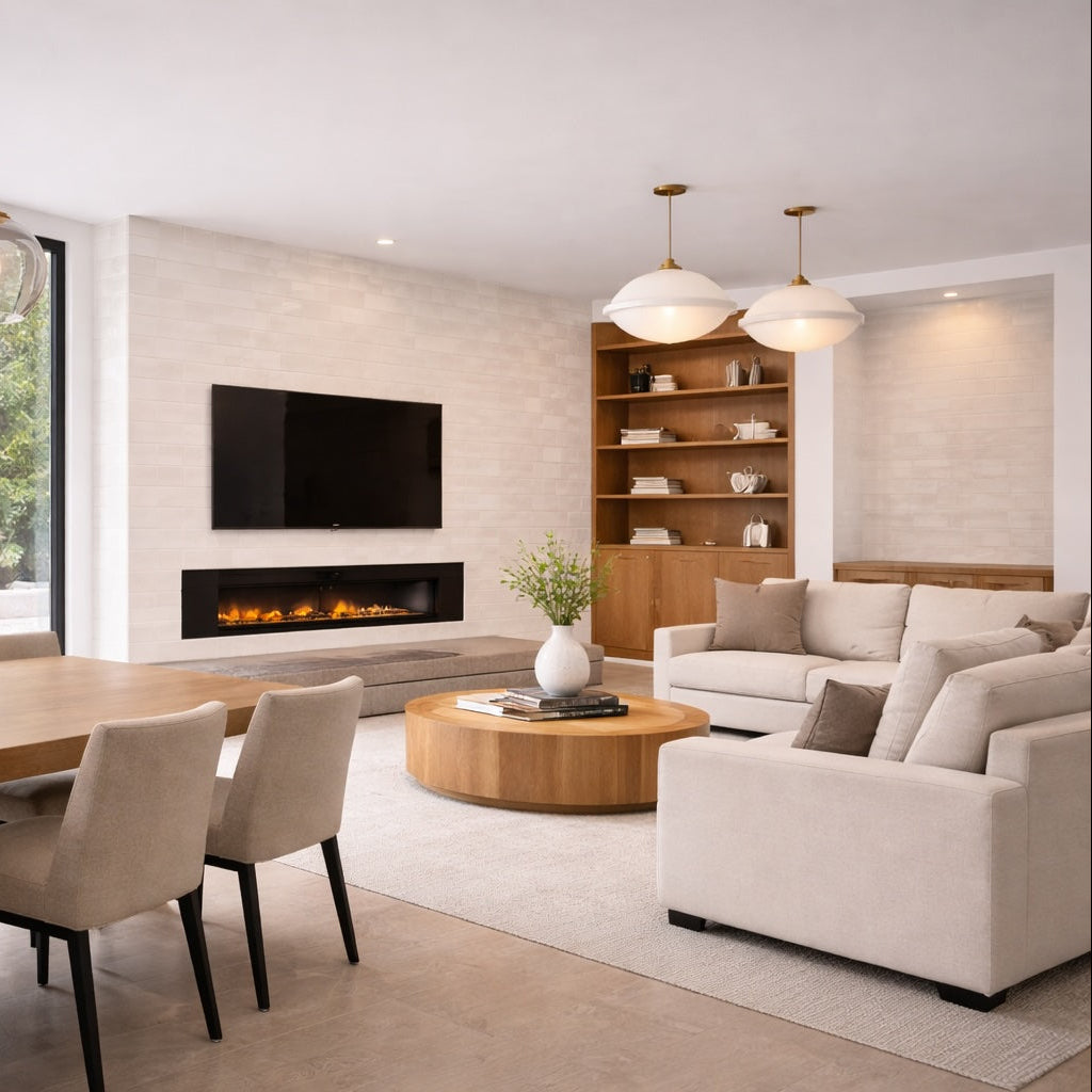
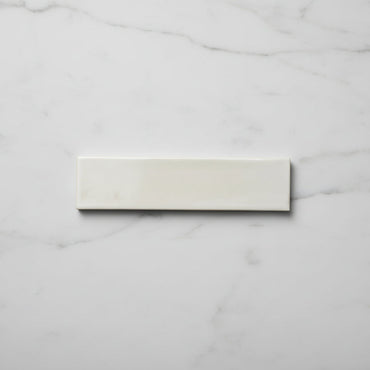
Opal Ivory Gloss Wall Tiles 7.5x30cm
Opal Ivory offers a softer alternative to bright white, combining warm neutral tones with a reflective glazed finish and subtle...
£19.99 -
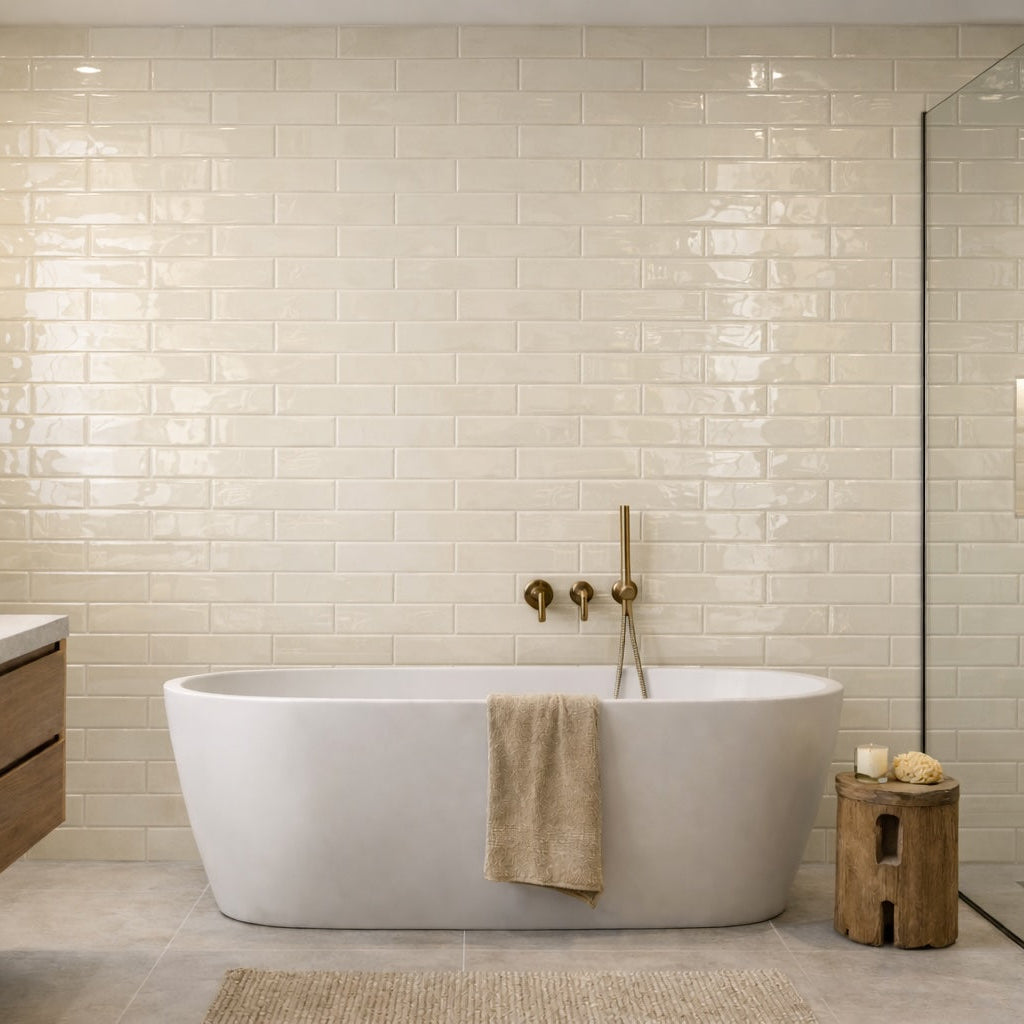
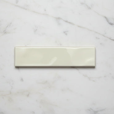
Handmade Sand Ripple Gloss Wall Tile 7.5x30cm
Handmade Sand combines warm neutral tones with a softly undulating gloss surface inspired by handcrafted ceramics and natural mineral textures....
£19.99 -
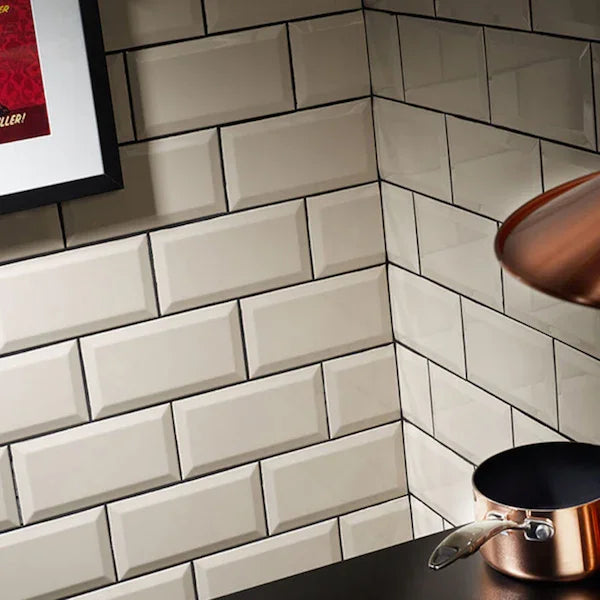
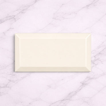
London Cream 10x20cm
London Cream 10x20cm Warm, soft and effortlessly elegant — the Metro Cream Gloss tile brings timeless charm to kitchens and...
£22.99 -


Mediterrano Cream Porcelain Wall Tile 5x40cm
Mediterrano Cream sits somewhere between warm white and soft stone, offering a gentle neutral base with understated tonal movement throughout...
£46.99 -
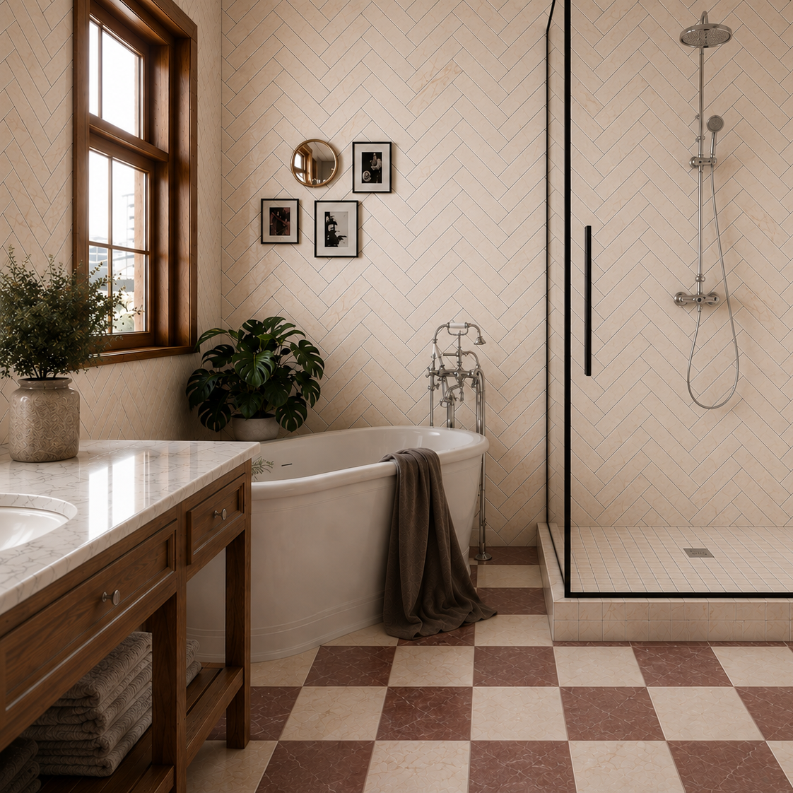
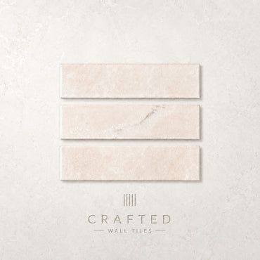
Chelsea Cream Marble Porcelain Tile 6x25cm
There is a quiet warmth to Chelsea Marble Cream that immediately softens a space. Sitting comfortably between ivory and natural...
£36.99 -
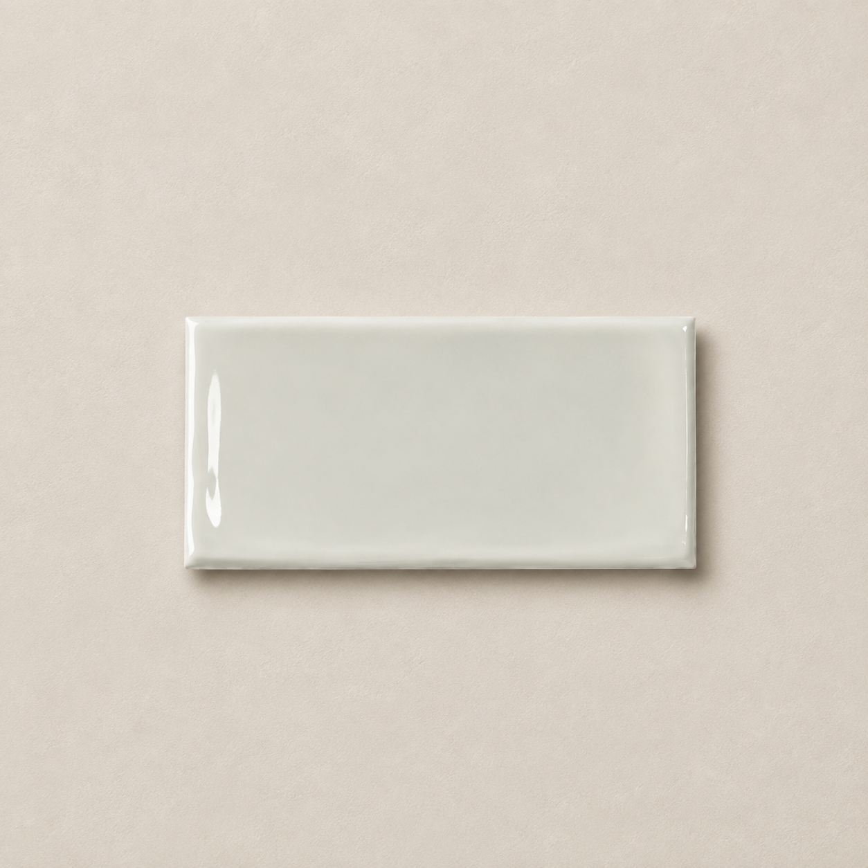
Victorian Cream Wall Tile 7.5x15cm
Soft, warm and inviting, Victorian Cream brings a gentle sense of comfort to interior walls. The colour feels relaxed and...
£17.99 -
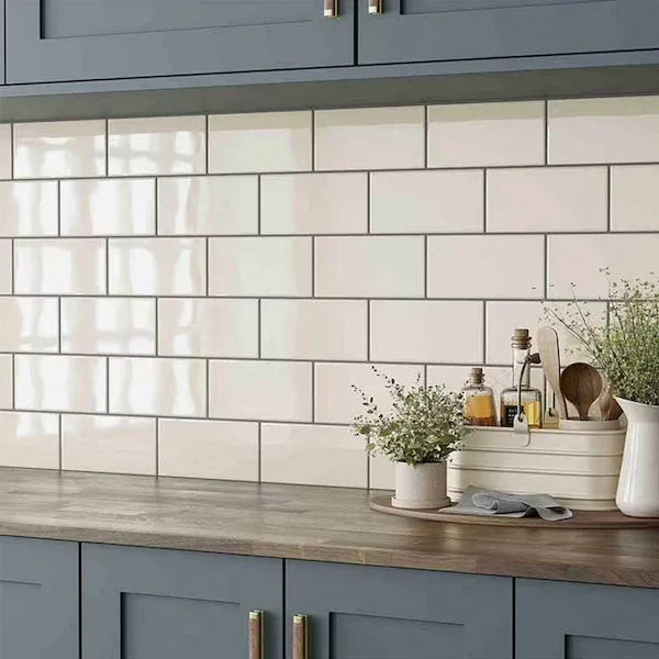
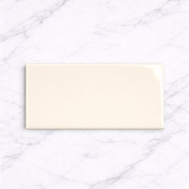
Underground Cream 10x20cm
Metro Cream Flat Gloss Wall Tiles 10x20cm Bring warmth and simplicity to your space with the Metro Cream Flat Gloss...
£22.99 -
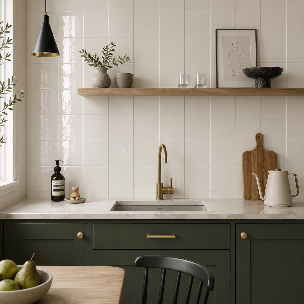
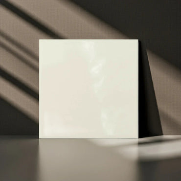
Modern Square Cream Flat Gloss 15x15cm
Modern Square Cream Flat Gloss 15x15cm Create a warm, timeless interior with our Modern Square Cream Flat Gloss Wall Tiles...
£22.99 -
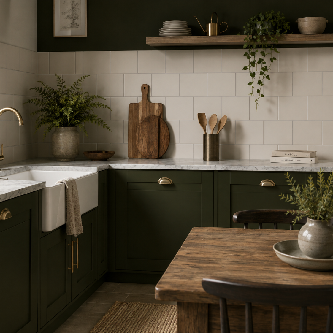
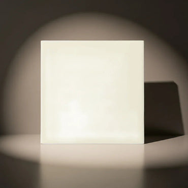
Modern Square Cream Flat Matt 15x15cm
Modern Square Cream Flat Matt 15x15cm Keep things soft, subtle, and effortlessly elegant with the Modern Square Cream Flat Matt...
£22.99


What makes cream different from white?
Which materials work best with cream tiles?
How does lighting affect cream?
How to stop a cream tiled room feeling too beige