

Collection: Turquoise Tiles
Turquoise wall tiles can bring an instant sense of colour and energy to a room, but they are far more versatile than a purely coastal palette might suggest. Depending on the balance of blue and green, turquoise can feel crisp and refreshing, soft and watery, or much deeper and more sophisticated. The finish and surrounding materials play a big part in deciding which direction it takes.

-
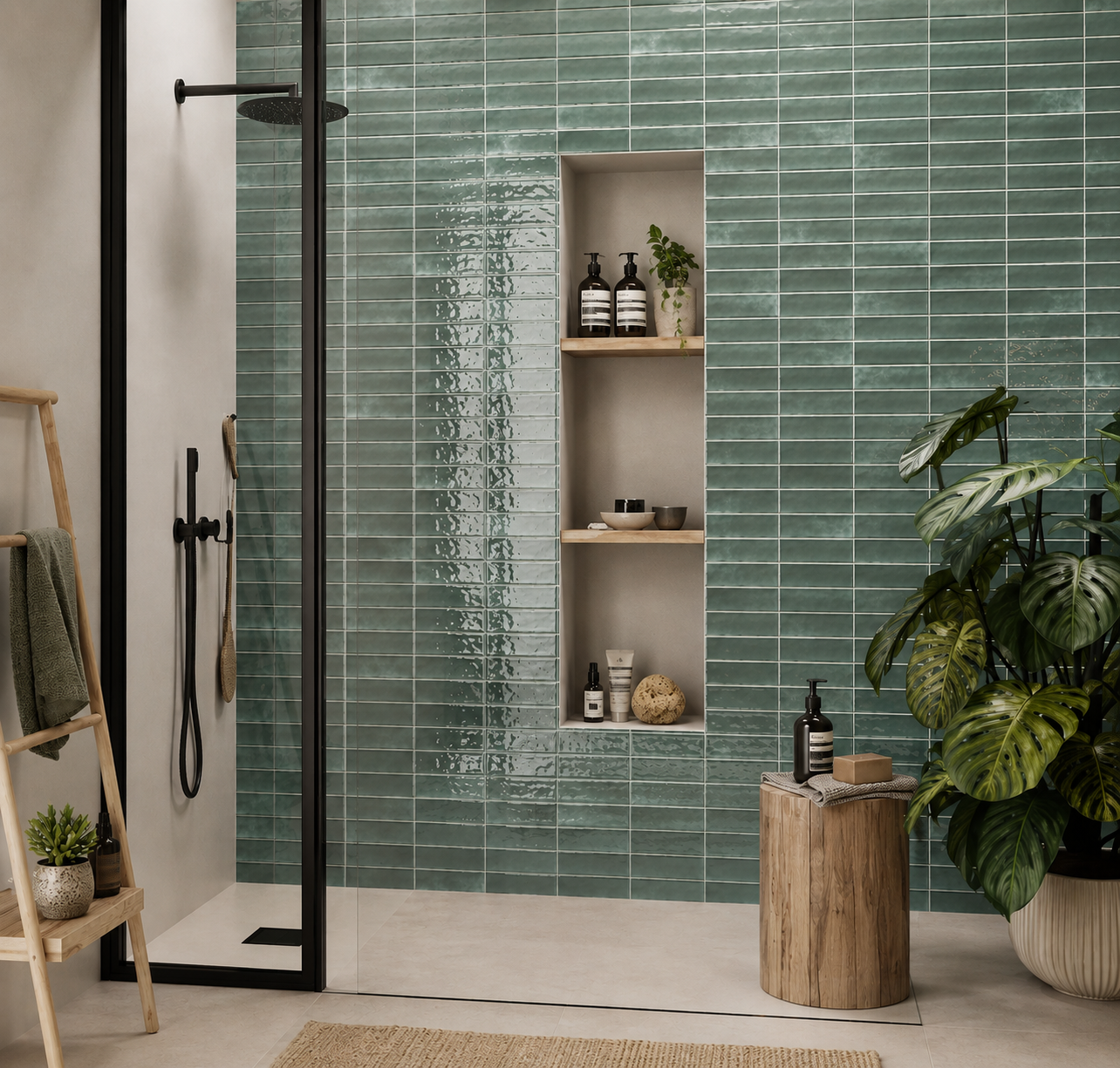
Palais Emerald Gloss Wall Tile 20x6.5cm
Rich and expressive, Palias Emerald brings a sense of luxury without losing its handcrafted charm. The jewel-like green tone creates...
£31.19 -
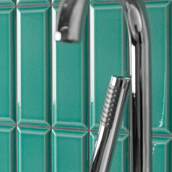
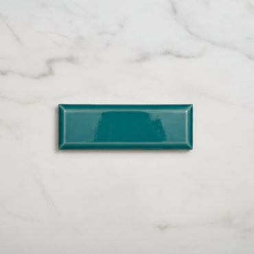
New York Metro Crackle Emerald Wall Tiles
Straight from the subway and into your home, our New York Metro tiles are the epitome of vintage-meets-modern. In a...
£56.99 -
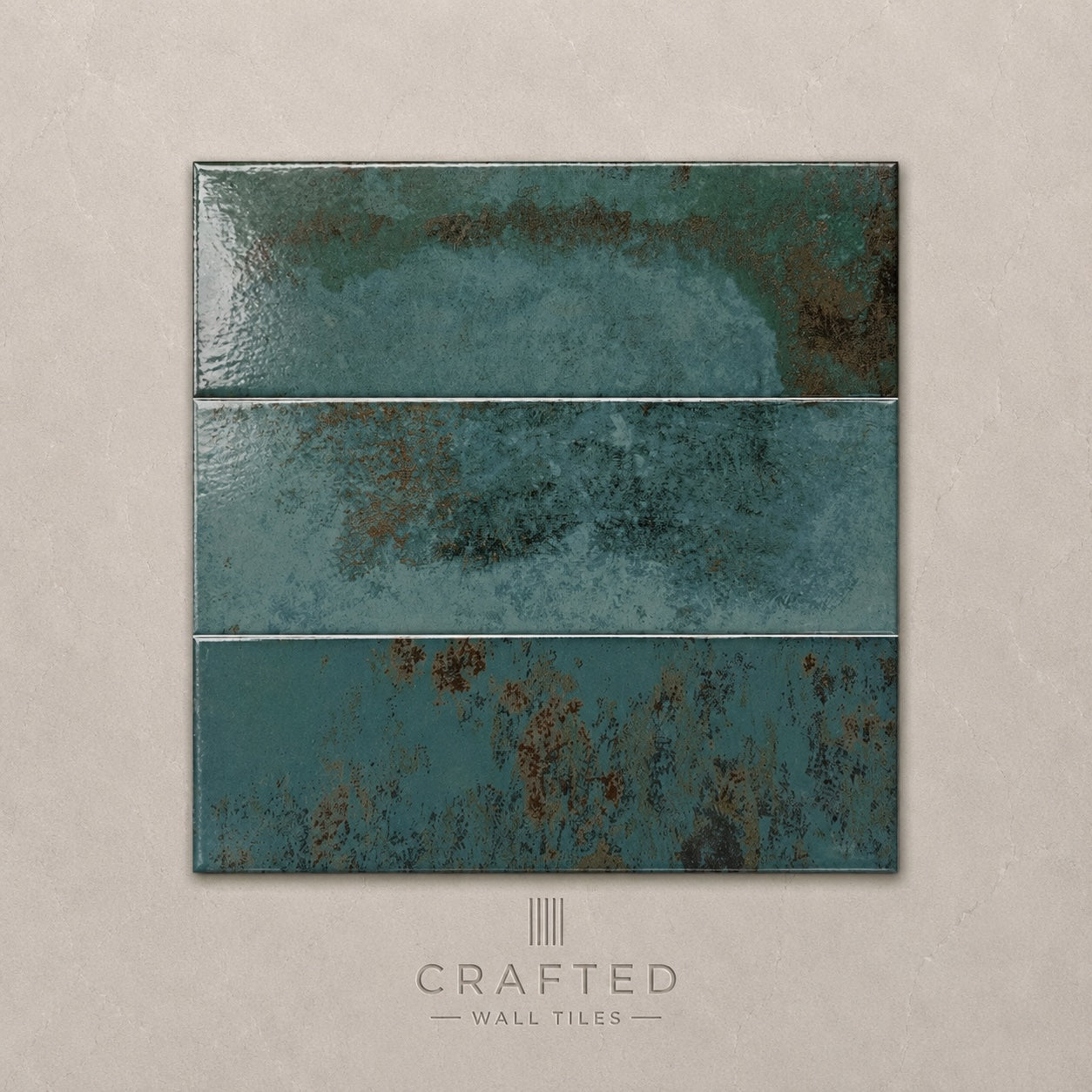
Precinct Turquoise Wall Tile 10x30cm
Vibrant, expressive and full of personality, Precinct Turquoise is designed for interiors that embrace colour with confidence. Inspired by artisan...
£44.99 -
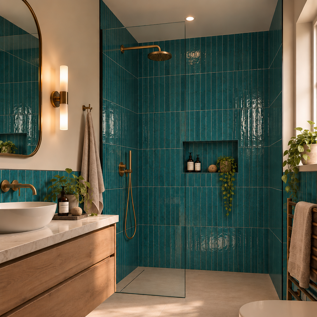
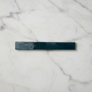
Bali Turquoise Wall Tile 5x40cm
Energetic yet refined, Bali Turquoise brings a sense of vibrancy that instantly lifts an interior. The colour recalls handcrafted ceramics...
£24.99 -
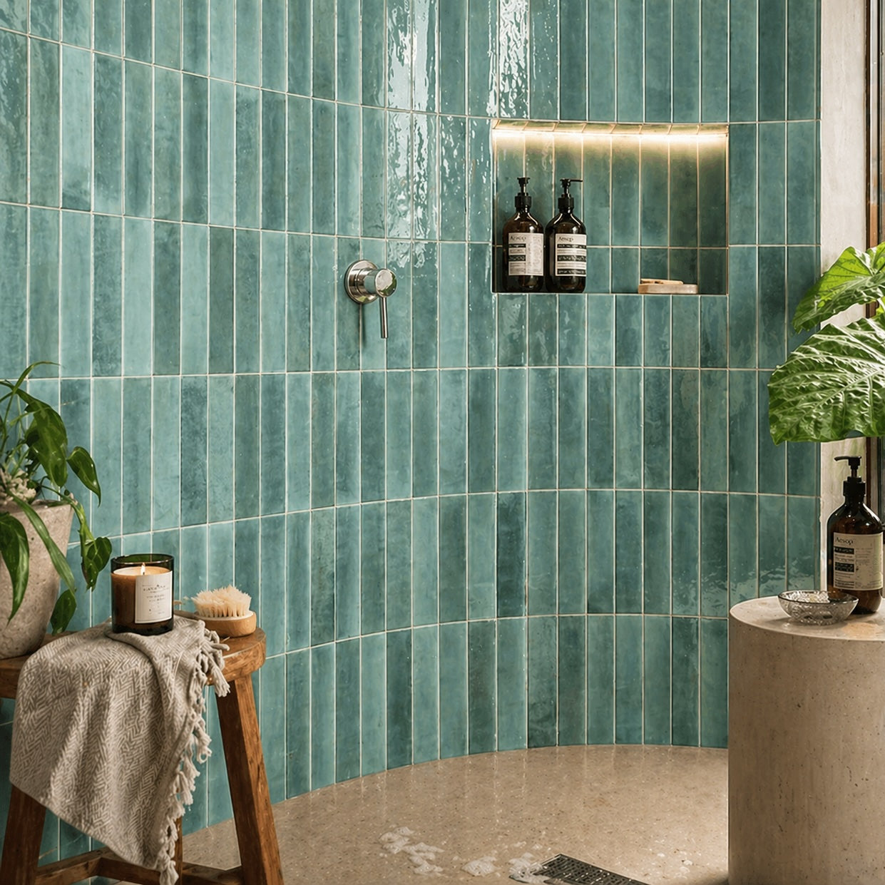
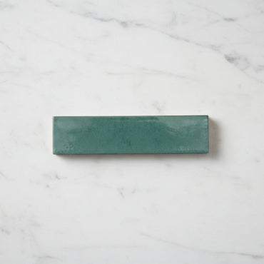
Lume Turquoise Wall And Floor Tiles 6x24cm
Vibrant turquoise tones and layered gloss glazing give Lume Turquoise a distinctly expressive feel. Inspired by weathered coastal ceramics, the...
£32.99 -
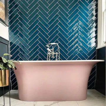
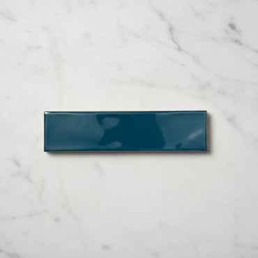
Handmade Turquoise Ripple Gloss Wall Tile 7.5x30cm
Rich turquoise tones and a gently rippled surface give Handmade Turquoise a more expressive artisan feel. The gloss finish enhances...
£19.99 -
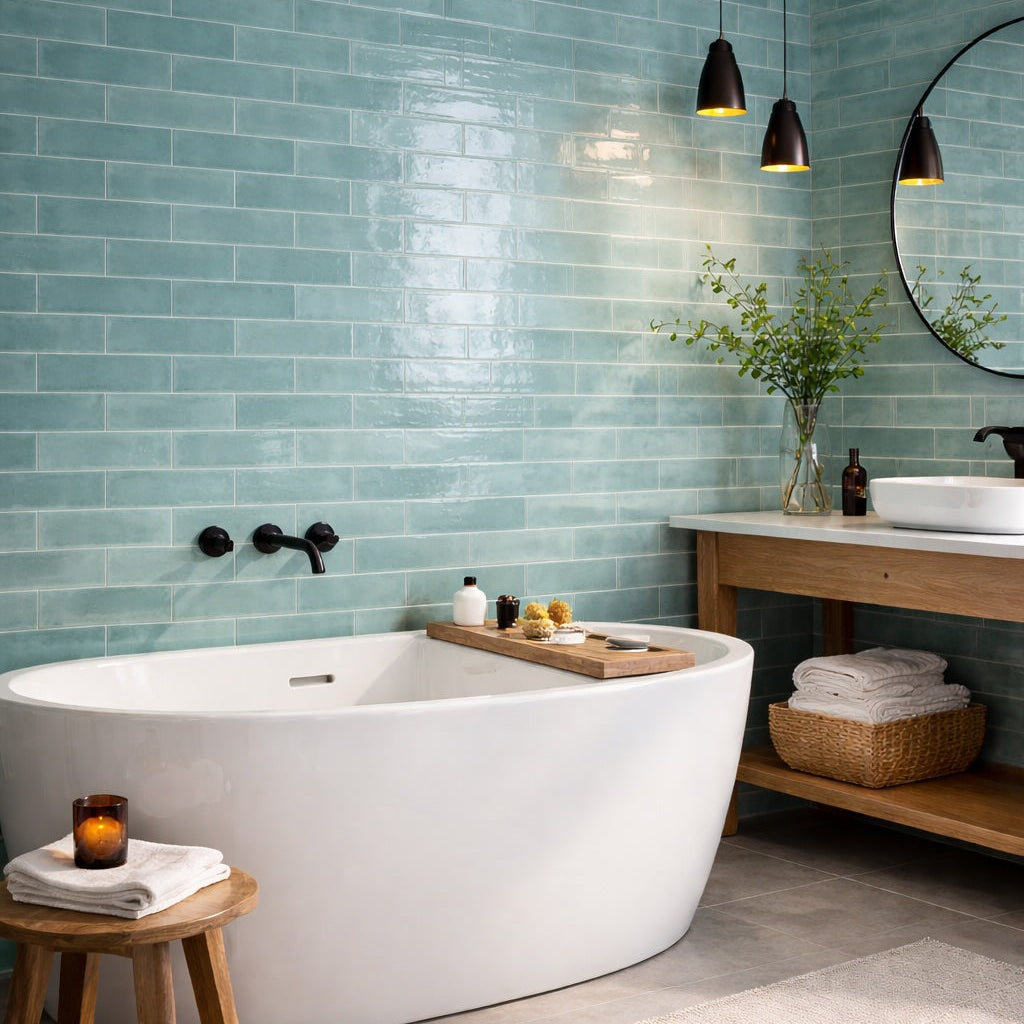
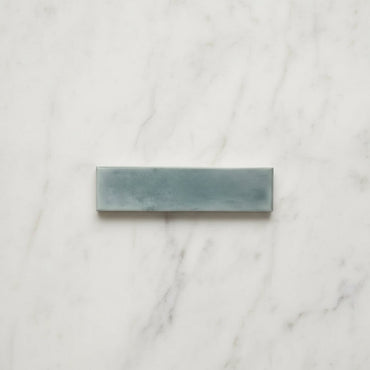
Opal Turquoise Gloss Wall Tiles 7.5x30cm
Opal Turquoise combines vibrant coastal tones with a richly glazed surface that brings movement and depth across the wall. The...
£19.99
Is turquoise a warm or cool colour?
How do you use turquoise without making a room feel too coastal?
Where does turquoise work best?
Why does turquoise change so much in different light?