Skip to content
Code CRFTD15 for £15 off
Free Shipping on Orders over £399.

Collection: Opal

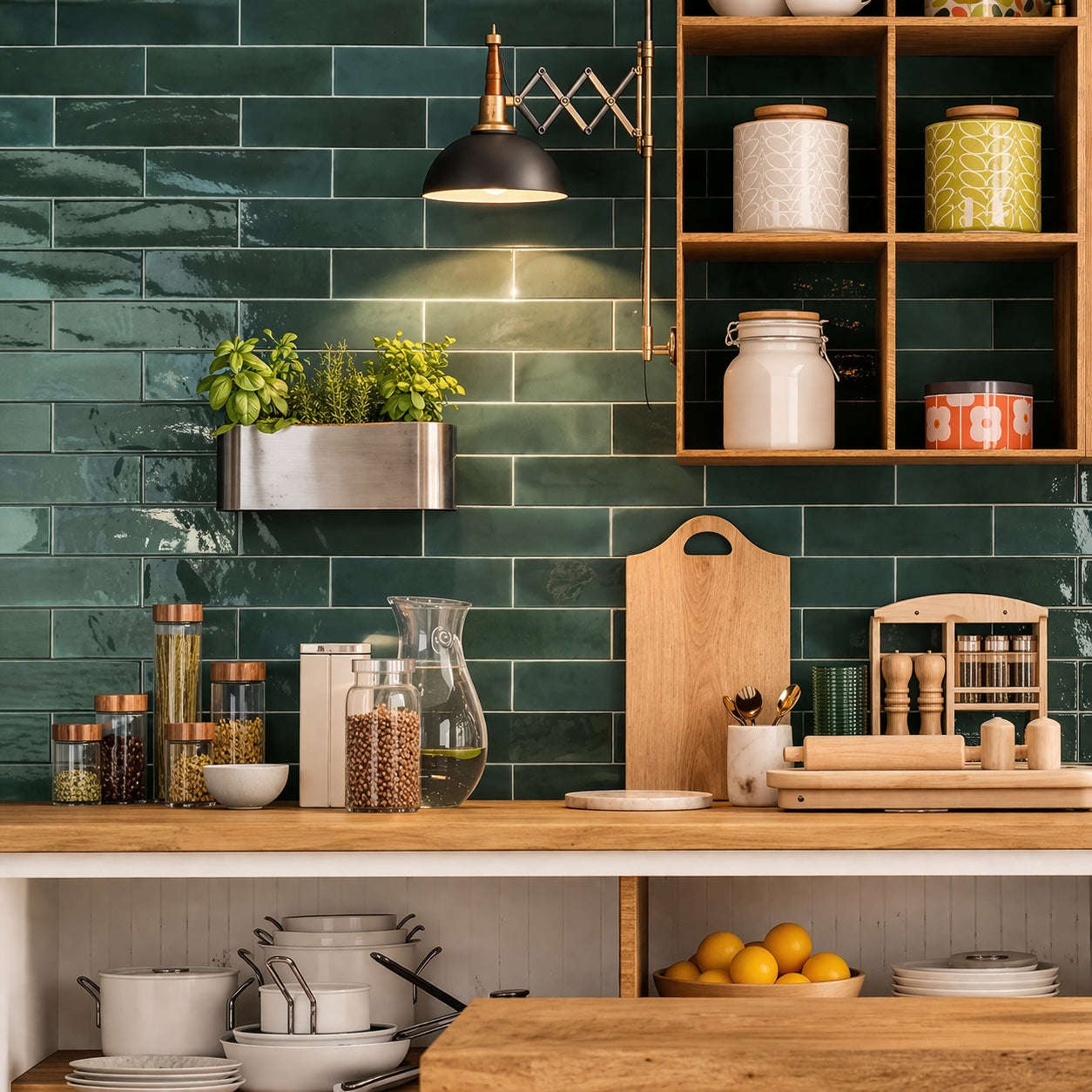
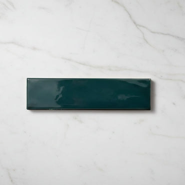
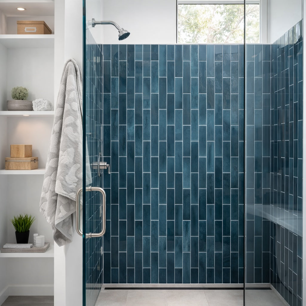
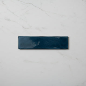
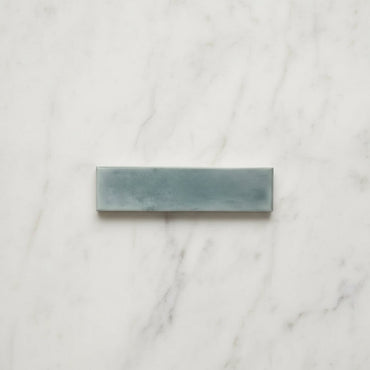
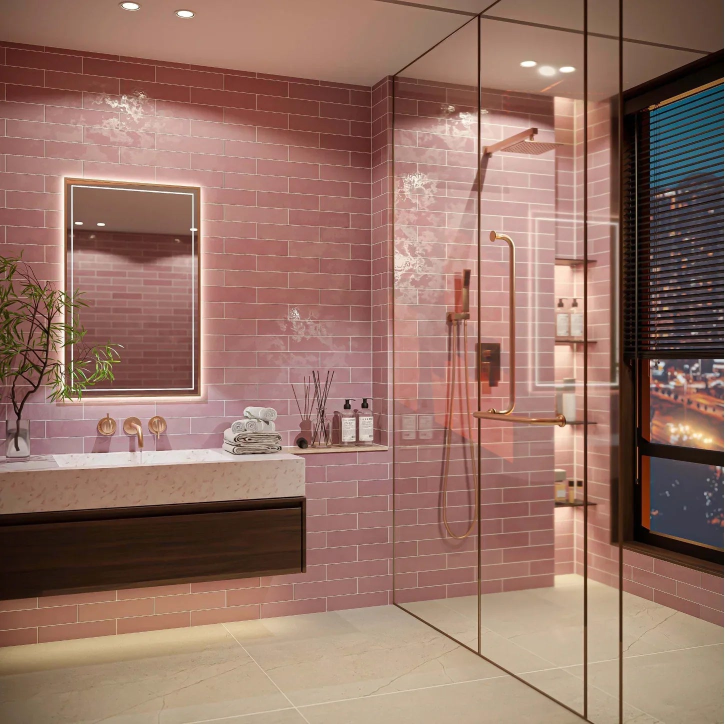
Opal has a beautifully soft quality that comes from the relationship between its colour and glossy surface. Rather than looking completely flat, the gentle variation gives the wall subtle changes in tone as the light moves across it. The result is a finish that can feel wonderfully calm in lighter shades, while colours such as Emerald, Turquoise and Marine create a much deeper, more enveloping backdrop.

7 products

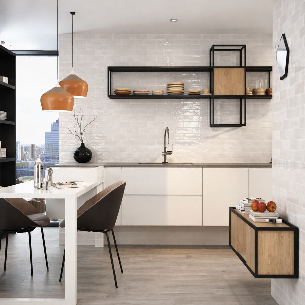
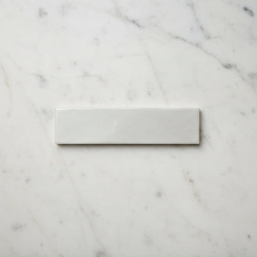
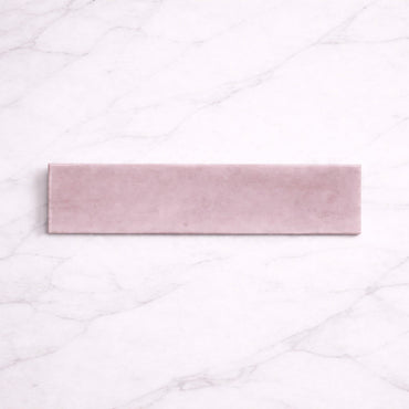
One of the nice things about Opal is how differently the same style can feel depending on the colour you choose. Ivory, White and Sky can keep a room feeling light and airy, while Emerald, Turquoise and Marine give the walls much more presence. Pink sits somewhere in between, bringing colour without necessarily becoming the dominant feature.

It's worth thinking about the amount of wall you're covering, too. A stronger colour can be surprisingly effective across a whole bathroom when the surrounding finishes are kept simple. The colour becomes part of the architecture of the room rather than looking like a small decorative accent.

The gloss surface also means that the light in the room matters. A colour that looks relatively soft in daylight can feel richer under warmer artificial lighting, so a sample is particularly useful when you're choosing between similar shades.

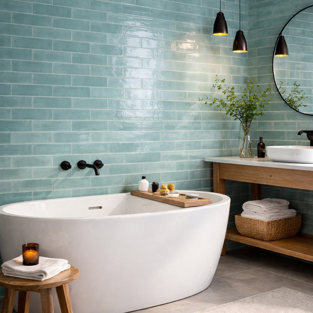
Opal's glossy surface does more than add sheen. It gives the colour somewhere to move, reflecting windows, lighting and nearby surfaces back into the room.

This is particularly noticeable across a larger wall. Instead of seeing exactly the same colour from one end to the other, small changes in reflection and tonal variation give the surface a little more depth. In a bathroom, for example, this can work beautifully alongside natural light, mirrors and polished fittings.

It's also why a gloss tile doesn't necessarily make a room feel cold or overly bright. The surrounding materials have a big influence on what is reflected back from the wall. Warm timber, natural stone and softer textiles can introduce enough contrast to keep the overall scheme feeling balanced.

With a colour-led tile, it's tempting to find an exact match for the walls, cabinetry or accessories. Opal is often more interesting when you don't.

Look closely at the tile and you'll usually find that the colour isn't quite as simple as its name suggests. Those quieter tones can provide much better inspiration for the rest of the room. A soft neutral alongside a stronger Opal shade can allow the tile to retain its depth without making the whole scheme revolve around one colour.

The same principle works with materials. Natural timber can warm the cooler greens and blues, while stone and off-whites can give stronger shades some breathing space. The aim isn't to make every element coordinate perfectly; it's to give the colour enough contrast to be noticed.

Grout can subtly change the balance between the individual tiles and the wall as a whole. A closely matched grout allows the colour to flow across the installation, making Opal feel more like one continuous surface. A contrasting grout introduces a stronger grid, making each individual tile more obvious.

That distinction can be particularly useful with the softer shades. Matching grout can create a quiet, almost seamless backdrop, while a stronger joint gives the same colour more definition.

With the deeper colours, I'd consider the surrounding scheme before automatically choosing contrast. The tile already has plenty of visual depth through its glaze and variation, so a quieter grout can sometimes produce a more sophisticated result

You might like