Skip to content
Code CRFTD15 for £15 off
Free Shipping on Orders over £399.

Collection: Underground

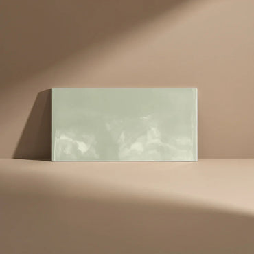
Underground is a clean-lined take on the familiar metro tile, with a flat surface that keeps the finished wall feeling calm and orderly. Its understated colours from Sage, Cream and Beige to White, Green and Pink make it particularly easy to build around, whether you want the tile to quietly support the room or give a stronger colour some space to shine.

6 products

  • Underground Beige 10x20cm

    Metro Beige Flat Gloss 10x20cm Add soft sophistication with the Metro Beige Flat Gloss Tile. This 10x20cm Metro Tile features...

    £22.99
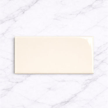
  • Underground Cream 10x20cm

    Metro Cream Flat Gloss Wall Tiles 10x20cm Bring warmth and simplicity to your space with the Metro Cream Flat Gloss...

    £22.99
  • Underground Sage 10x20cm

    Metro Sage Flat Gloss Wall Tiles 10x20cm Add calm and contemporary character to your walls with the Metro Sage Flat...

    £22.99
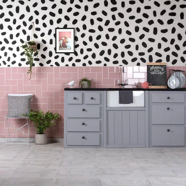
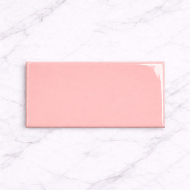
  • Underground Pink 10x20cm

    Underground Pink 10x20cm Add a soft pop of colour with the Metro Pink Flat Gloss Wall Tiles 💗. These stylish 10x20cm...

    £22.99
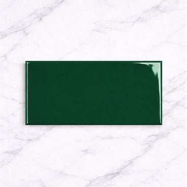
  • Underground Bottle Green 10x20cm

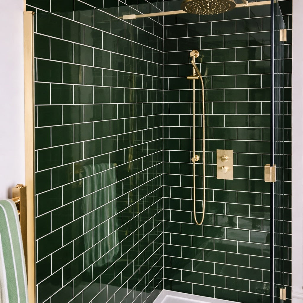
    Metro Bottle Green Flat Gloss Wall Tiles 10x20cm Bring a bold, botanical vibe to your space with the Metro Bottle...

    £22.99
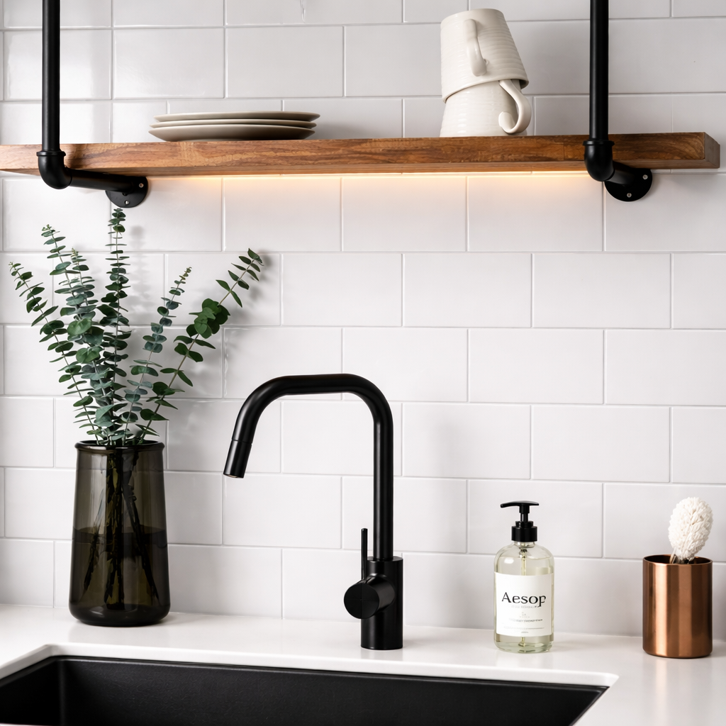
  • Underground White 10x20cm

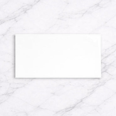
    Underground White 10x20cm The Metro White Flat Gloss Tile is a modern take on the classic metro look. With its smooth,...

    £22.99
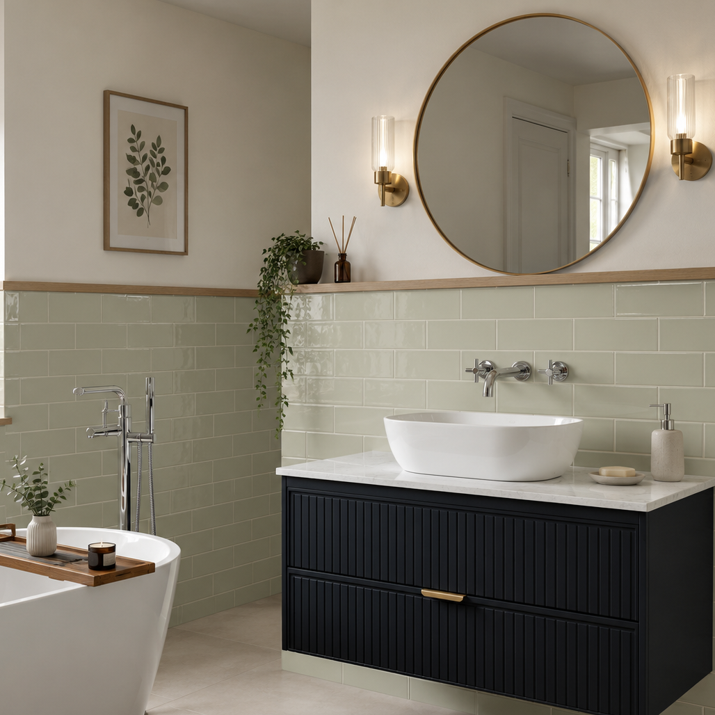
The absence of a rippled or heavily textured surface changes the way Underground behaves on a wall. There is less competing with the colour, the grout or the surrounding finishes, so the overall result feels more deliberate and architectural.

That makes Underground useful when the rest of the room already has plenty going on. Detailed cabinetry, patterned flooring, strong worktops or interesting fittings can sit alongside it without the wall becoming another source of visual noise.

It can also be a good choice if you're aiming for a very clean tiled backdrop. The flat face and straightforward proportions create a consistent surface, allowing the colour to carry more of the design.

The lighter colours can be used almost as an architectural backdrop. White keeps things crisp, while Cream and Beige introduce a little more warmth without demanding much attention. Sage and Pink sit comfortably between neutral and expressive, while Green gives the wall more visual weight.

With a flat tile, the surrounding colours become particularly important because there is less surface variation to alter how the shade is perceived. A warm cream wall beside natural timber will feel very different from the same tile beside cool grey cabinetry, for example.

Rather than trying to match the tile exactly, think about whether you want the room to feel tonal or contrasted. Softly related shades produce a quieter result; stronger differences give a simple tile much more definition.

Underground doesn't have a decorative surface to dictate the look of the wall, which means the laying pattern can take centre stage.

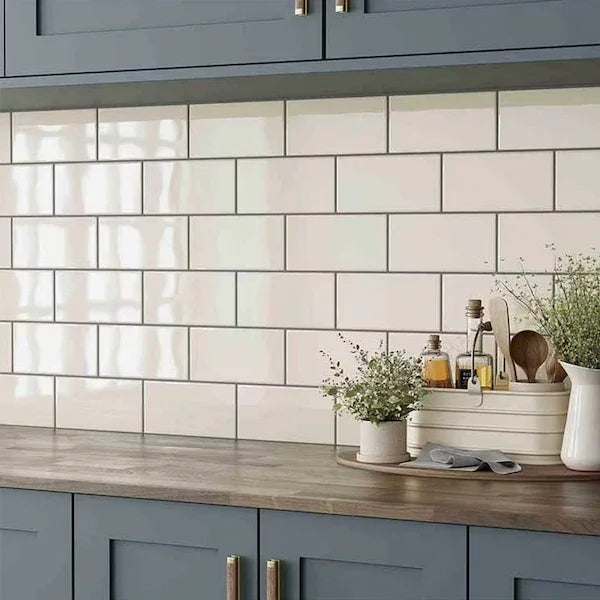
A traditional brick bond gives it a familiar, relaxed rhythm. Stack the tiles and the installation becomes much more precise, with the horizontal and vertical joints forming a stronger grid. A vertical layout changes the emphasis again, helping to draw the eye upwards on taller or narrower walls.

Herringbone is another option when you want to introduce more movement without changing the tile itself. Because Underground is visually restrained, the pattern becomes much more noticeable.

This is one of the advantages of a simple tile: you can alter the character of the entire wall without changing the product.

With a flat-faced tile, grout is one of the main things controlling how strongly the individual pieces are perceived.

A closely matched grout allows the tiles to blend together and makes the wall feel more continuous. Contrast the joint and the 10 × 20cm format becomes much more obvious, creating a defined rectangular grid.

That can be especially effective with White Underground. A darker joint turns the otherwise understated tile into a much stronger graphic feature, while a soft neutral keeps the same wall considerably quieter.

With coloured shades, I'd usually start by deciding whether the colour or the tile pattern should be the main visual feature, then choose the grout accordingly.

You might like