Skip to content
Code CRFTD15 for £15 off
Free Shipping on Orders over £399.

Collection: Handmade

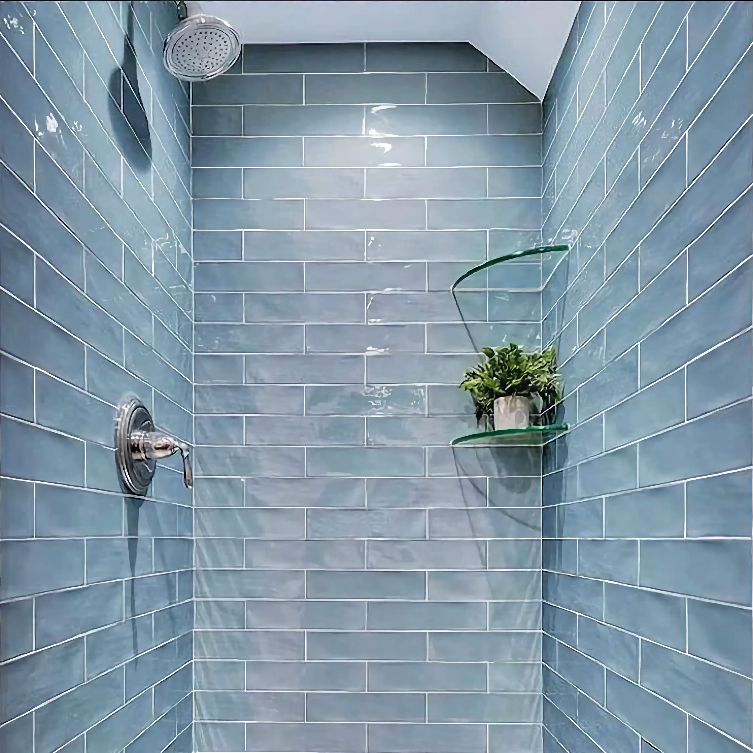
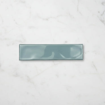
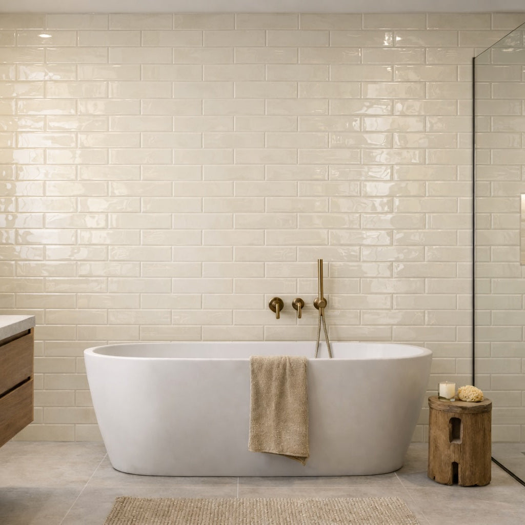
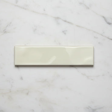
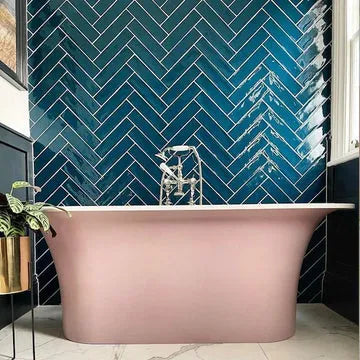
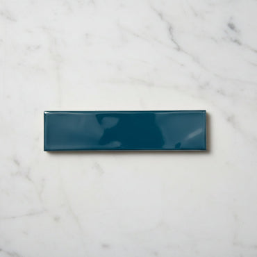
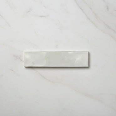
Handmade gets much of its appeal from the surface rather than the shape. The 7.5 × 30cm tile has a beautiful rippled gloss that catches the light unevenly, creating the kind of gentle movement associated with traditional handmade tiles. Aqua, Turquoise, Sand and White keep the palette soft and easy to work with, letting the texture become just as important as the colour.

4 products

It is the way light moves across the ripple that really changes the character of the tile. On a completely flat gloss tile, reflections tend to travel fairly evenly across the surface. Here, the subtle changes in the surface interrupt that reflection, creating little highlights and darker areas as you move around the room.

That means Handmade can look noticeably different depending on the time of day and where the light is coming from. A wall beside a window may have a completely different quality to one lit directly from above, even though the same tiles are being used.

The ripple also means you don't need a complicated pattern to create interest. The surface itself is doing much of the visual work, which is why Handmade can look particularly effective when used across a larger uninterrupted wall.

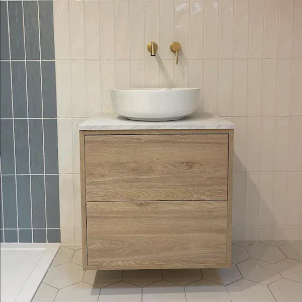
With a tile this tactile, restraint elsewhere can be a good thing. Natural timber, simple stone, warm whites and uncomplicated cabinetry give the surface enough space to stand out without competing for attention.

Aqua and Turquoise can take a bathroom towards a cooler, coastal or more natural palette, particularly alongside pale stone and timber. Sand brings more warmth, while White gives you the opportunity to introduce stronger colours elsewhere without the wall becoming visually heavy.

One of the more useful things to look for is contrast in texture rather than contrast in colour. Pairing a rippled wall with smooth cabinetry or a simple worktop can make both surfaces more noticeable. Adding several heavily textured finishes at once can have the opposite effect, as the eye has nowhere quiet to rest.

The ripple is particularly important when choosing a colour because it prevents the shade from reading as one completely consistent surface.

As light catches the raised and recessed parts of the glaze, some areas appear brighter while others sit slightly deeper. This can give Aqua and Turquoise a more watery quality, while Sand and White can develop subtle warmth and shadow rather than looking completely flat.

It's worth remembering when looking at samples, too. A small tile viewed straight on won't necessarily give you the same impression as an entire wall with light moving across it. If you're choosing between two similar shades, seeing the sample in the room where it will actually be used can reveal differences that aren't obvious under showroom lighting.

The 7.5 × 30cm proportions are a useful counterbalance to the rippled surface. The longer tile creates a relatively calm rhythm across the wall, so the texture can provide the interest without the installation becoming visually busy.

A horizontal layout emphasises the length and gives the wall a broad, flowing quality. A vertical arrangement makes the tile more directional and can work particularly well on shower walls or narrower sections where you want to draw the eye upwards.

Grout makes another surprisingly big difference. A close-coloured grout allows the ripples to dominate, while a contrasting joint introduces a stronger grid around every tile. With Handmade, I'd generally decide whether the surface or the pattern is supposed to be the main feature before choosing the grout.

Because the tile already has plenty of movement, a quieter joint can be a particularly effective way of keeping the finished wall feeling relaxed rather than overly busy.

You might like